From Woodstock to Broadway: The Poster Art of David Byrd
Even if you don’t know his name (and you should – he’s a legend), David Edward Byrd’s work is some of the most instantly-recognizable in modern poster history. Our curator had the privilege of meeting up with him and his husband, Jolino, in Los Angeles, and subsequently falling down the rabbit hole of his marvelously wild, poster-filled life.
Below is the product of their conversation, edited slightly for clarity.
Poster House: I feel like I’ve seen your work my entire life. When and why did you first start designing posters?
David Byrd: Well, I was a painting major at Carnegie Tech (Carnegie Mellon as it’s called now), and I wanted to be the next Francis Bacon. But things didn’t quite work out that way because I came to New York and found it very difficult to get a job in any sort of way. After I got my Master’s, I went to Boston – I had lived there before, and I thought it would be a good place as I was a little iffy about New York. So, I went to Boston and stayed with my friend Candice, and the only job I could get was washing underwear in an Armenian laundry – but I also got to eat at the Armenian restaurant next door. So there I was with a Master’s washing poopy underwear, when I got a call from Peter Nevard, my roommate from Carnegie, saying that he was starting a light show company and that he was driving up to get me because I was going to be the art director.
So I was rescued from the Armenian laundry and we went to New York City where I stayed with Peter and his girlfriend Nina. We rented this house in upstate New York where we would build all our equipment for the light show. Peter had a lot of connections in the commercial world, doing promotions and such for larger companies; so, basically we did promotions for Clairol’s “Innocence of Blonde” and the “Yardley London Look.” They would be in the Plaza Ballroom, complete with runways, models, dancers, bubbles, strobe lights, and liquid projections, which was all the rage at the time. We were very successful doing it, and I was the art director. One of the things I did was a giant ten foot face of Jean Shrimpton, which she would crash through – and there she would be in the “Yardley London Look.” It was the typical stuff of the day.
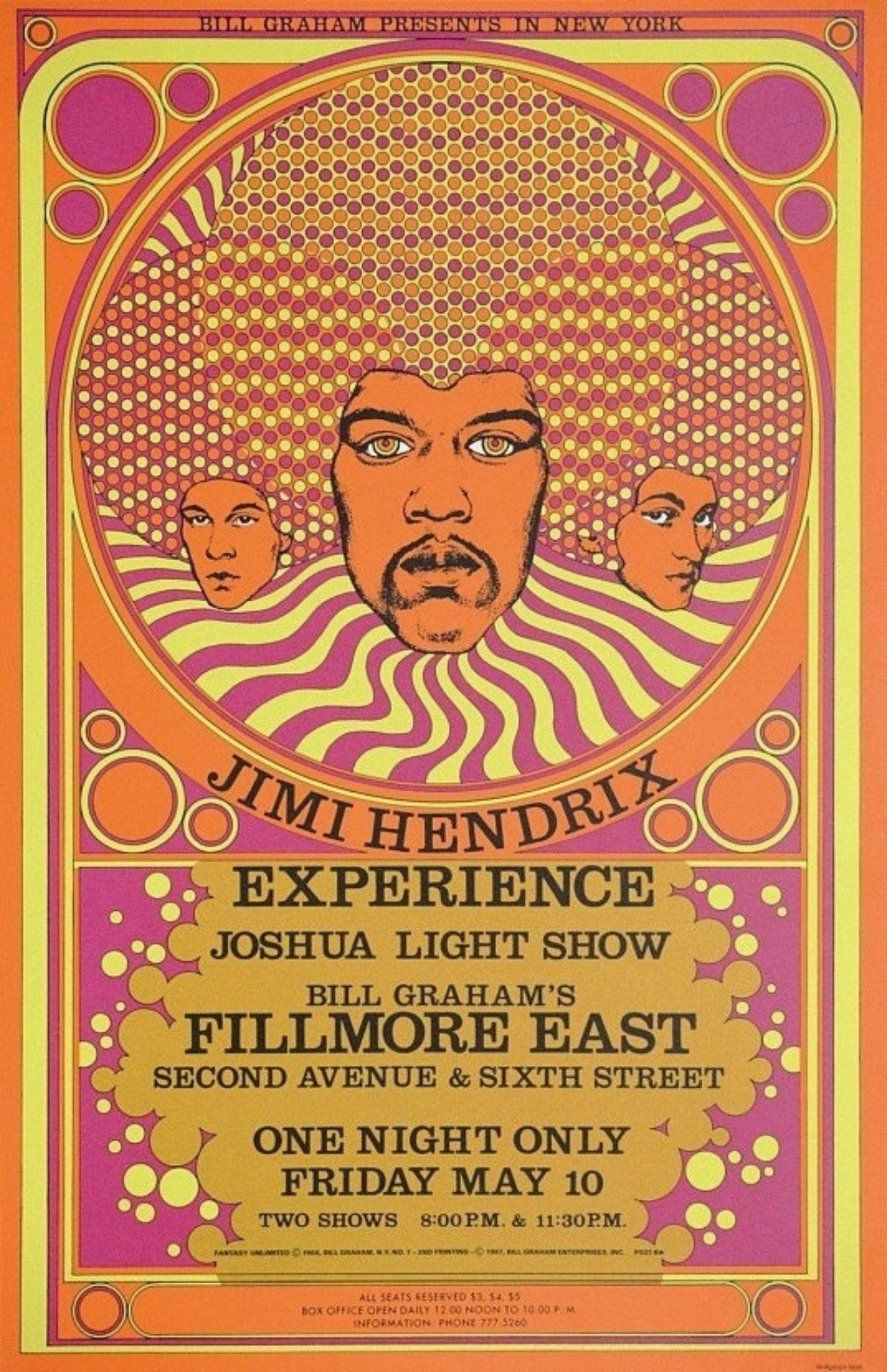
Meanwhile, we had a lot of friends from Carnegie Tech who were working with this guy Bill Graham to open a rock performance venue in New York in the old Yiddish theater on 2nd Avenue and 6th Street. Bill asked the general manager and the light show guy if they knew someone who could do a poster, and they said “well, call David Byrd.” So I got a call in the country where I was building the light show sets, and Josh White of the Joshua Light Show said “we need a poster for our next show.” I had no idea how to do a poster, but I thought to myself, I’m an artist, I’ll figure it out. So, I said “oh fine. I’m great with that.” I looked around and I found some people who had a couple of posters from the Fillmore West, which was the first venue out in California (the Fillmore East was the New York version). Now, New York City is very different from San Francisco – San Francisco had like five hippie ballrooms where light shows and dancing and music was occurring, but in New York City it was bada-bing-bada-boom, the Fillmore East. That’s it. So, I did my first poster for Traffic, Blue Cheer, and Iron Butterfly, and they said all right, our next show is …. and that’s it!
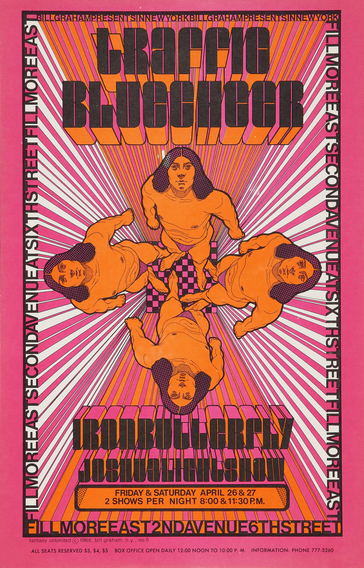
Traffic, Blue Cheer, & Iron Butterfly with the Joshua Light Show at the Fillmore East on April 26, 1968
PH: Were you inspired at all by the posters made for the original Fillmore, or did you make a point of just doing your own thing?
DB: Oh no, no, I wanted to be just like them. I figured that’s the job, here I go! So, the one poster I’d seen was Sopwith Camel by Victor Moscoso for the Fillmore Auditorium. I was just in love with it. So I said ok, I get it, and I went on from there. That poster had an airplane on it against a hot pink sky – a Sopwith Camel is a biplane from the early 20th century. And that image influenced my second poster which was for The Jefferson Airplane. I was so impressed with Victor’s work that I put the airplane coming out at you, with the band standing on the wing. It was an Egyptian airplane. If you study that you’ll figure it out. So, that was kind of my beginning.
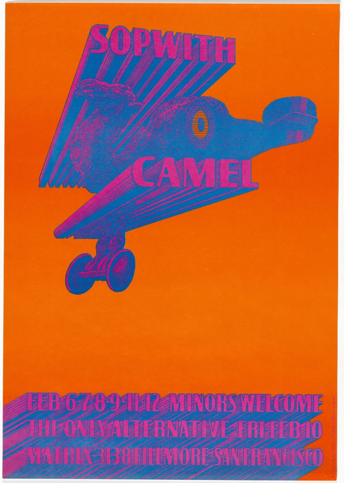
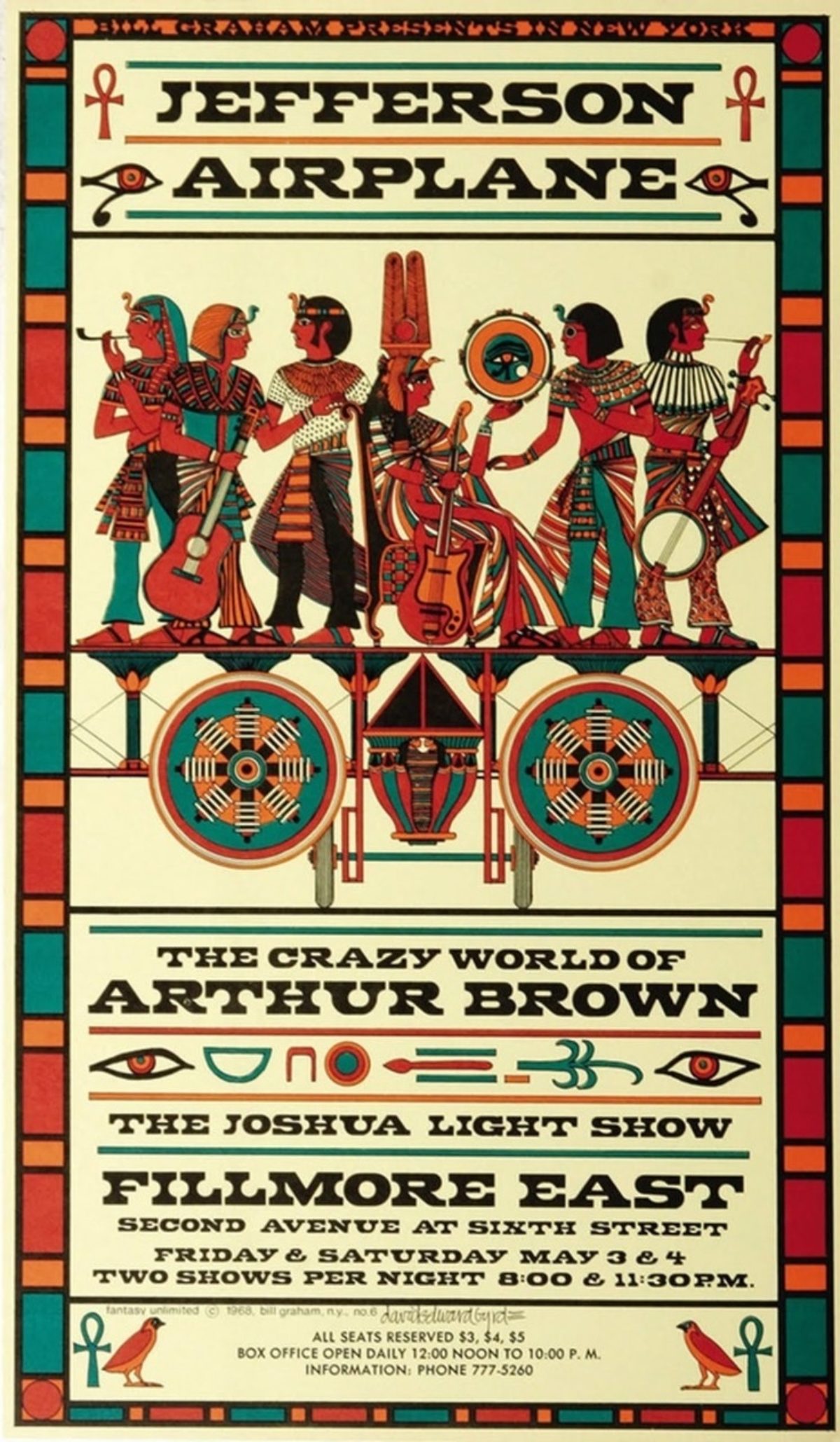
Left: The Sopwith Camel by Victor Moscoso, February 6, 1967
Right: Jefferson Airplane & The Crazy World of Arthur Brown by David Byrd, May 3, 1968
PH: Unlike the Fillmore West who had a ton of artists making posters, the Fillmore East only used you. Why?
DB: That’s mainly because there was a plethora of these new psychedelic artists in San Francisco, and they were just cranking it out. There was no one like that in New York City. New York was not a poster town. You’d put up posters and hope they’d be there the next day, or hope that they wouldn’t be covered up by an ad for a girdle or whatever. Instead, we kind of gave them away and put them in people’s friendly stores. But essentially, New York was not a poster town – it was a “look for it in the Sunday Times” town. And I just happened to be in the right place at the right time. The only reason they called me was because they knew me. There were a lot of guys at the Fillmore East from Carnegie Tech, and I was the only guy any of them knew who was an artist. They were all drama majors. They considered I could probably do it because I was doing like 8 to 10 foot figurative paintings at the time. I really wanted to be a famous painter. Things changed, though, because I got $100 for doing that one poster, and that to me in 1968 was quite a lot of money. Cuz you figure a six pack of beer was $1.50 – you could get a lot of beer out of $100.
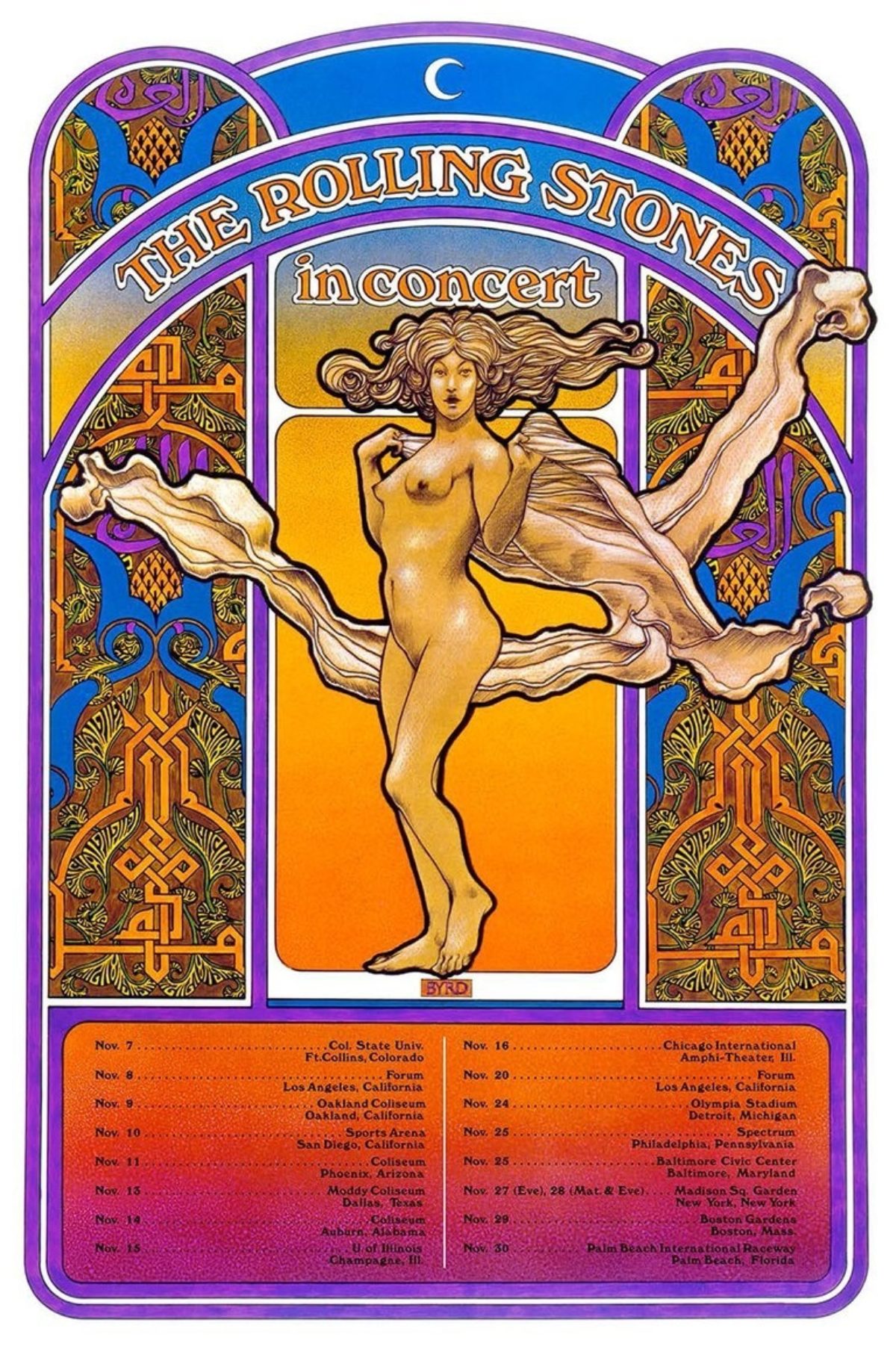
Left: The Rolling Stones in Concert, 1969
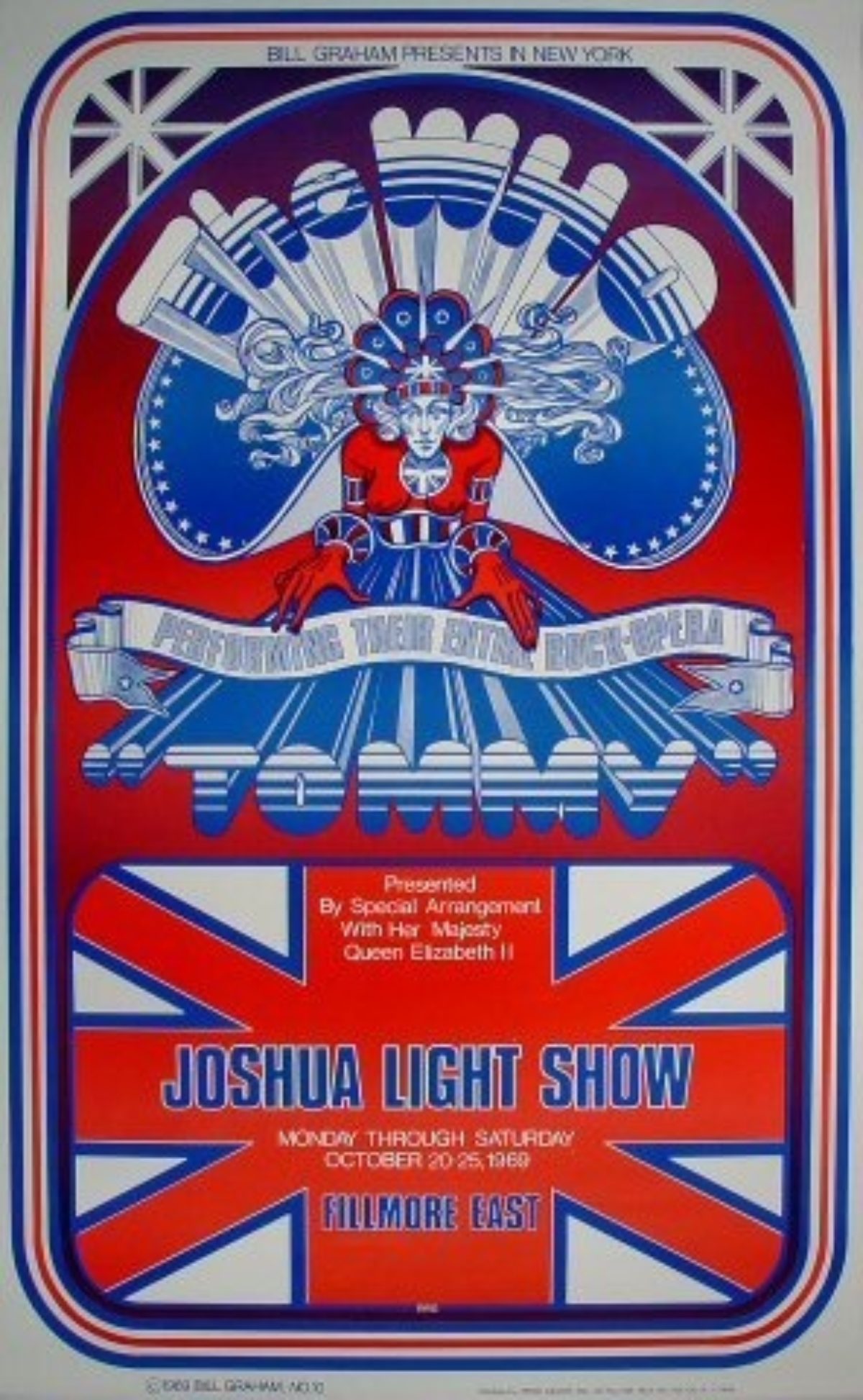
Right: The Who & Joshua Light Show, October 20, 1969
PH: Given how far away you were from the action out West, how did you get that psychedelic style down?
DB: There’s that old cliché, “fake it til you make it” – so, I was just totally faking it. I had said to myself, “well, I’ve got to look nutty,” so I did that poster. I could only use three or four colors because full-color CMYK printing was way expensive, whereas spot color was cheaper; so, you had the black screen, and then two or three other colors. Pantone PMS had just been invented.
PH: One of the projects you’re working on now is creating posters for concerts at the Fillmore East that never got posters. Can you talk about how that happened?
DB: Well, mainly that was because of what I had previously said about New York not being a poster town. So, except for the beginning – say the first three or four shows – they didn’t do posters for every show or big act (or who they thought was a big act or whatever). They had an ad agency, Wilson & Frissora, and they did ads in the Times. They had like a standard look – a block in which they put the acts that were to appear that week or that day. So we didn’t do posters for every show. We only did them rarely, and after a while we didn’t really do much at all except for special occasions, like Tommy at the Met, Tommy at the Fillmore, etc.
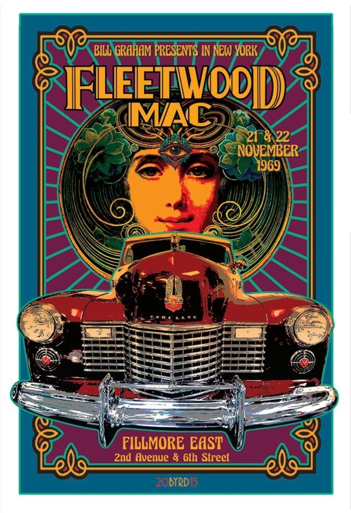
But to answer the other part of your question, after Bill died, I was speaking with David Graham – Bill’s son. At the time, he said wouldn’t it be great if there were posters for the shows at the Fillmore East that never had posters? There were, of course, hundreds of acts – just so many of them that I could just pick and choose names that by that time had become larger than life. So I pretty much chose those groups like Iron Butterfly, Fleetwood Mac, Led Zeppelin – household names. So that’s how a project I started, and I sorta kept doing it – and now that I have my own printer, I can print these out and sell them, which I do!
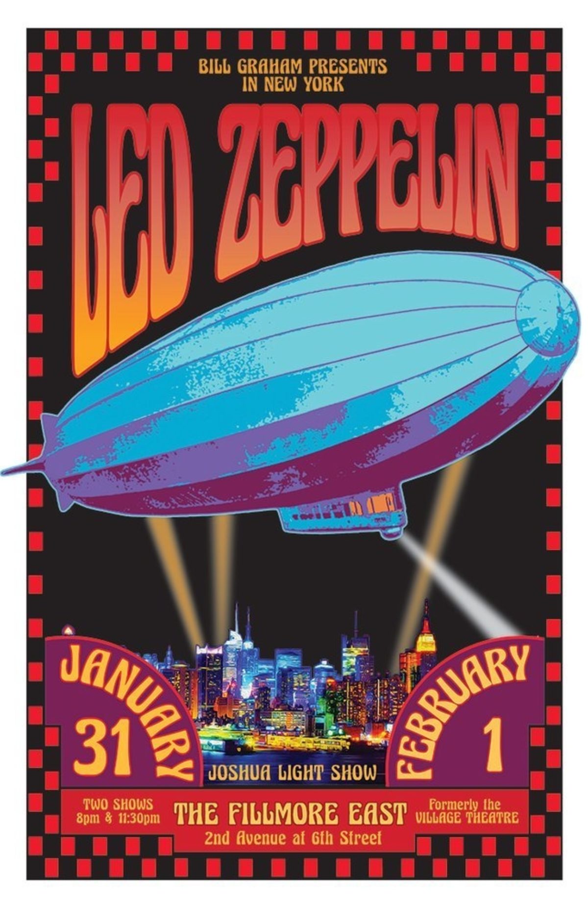
Left: Led Zeppelin at the Fillmore East, 1969 (contemporary design)
Right: Fleetwood Mac at the Fillmore East, 1969 (contemporary design)
PH: You were the original choice for the Woodstock poster. I’d love to hear the story about how that happened, and why your design wasn’t ultimately used.
DB: Well, that once again is Bill Graham! Bill and I got along really well, and John Roberts and Artie Kornfeld and those guys asked Bill if he knew a poster artist, and he said oh yeh, call David Byrd. Woodstock Ventures was actually around the corner from my loft – they were on 16th & 5th, and I was on 17th & 5th. I went over there to see them, and they said ok, we’re doing a big concert and we need a poster. And I said well, Bob’s your uncle, that’s me! So, I got the job to do this poster. It was in late May of 1969. The show was scheduled for August, and I did the Wallkill poster because that’s where the show was supposed to be. I thought, well, it’s just another show and it probably won’t happen. I quoted $500, and they paid me $500!
I had just finished a big job with the light show where I had to do a 15 minute animation – which is a LOT of drawings. I had to have a staff and all that, which we hired at minimum wage – they were all friends of mine. So I was just exhausted from that. My friend who worked on the animation with me said let’s go somewhere, and I said oh great! We immediately thought of the Caribbean because I’m from Miami and I used to go to Havana in high school over winter break. We would all go down there because you could drink and hire prostitutes and all that, so it was like wild youth or something. Anyway, we decided to do this while we both had horrible hangovers. So we went to a travel agent and we quickly chose Saint Martin because it looked like nobody lived there, which pretty much was true. We ended up in an apartment over the Neptune Bar and Grill in Grand Case, which was one of the towns. It had 100 people more or less. We spent June and July there.
Meanwhile, back at the ranch, in New York they were having big troubles with the Wallkill City Council because they were very trepidatious of young people and a rock concert in their shady little town. The group didn’t like the poster, saying it was obscene because there was a nude woman on it. I think they were just using that as an excuse to get out of having a rock concert. Finally, they said, well, we can’t have more than 5,000 people and we can’t have this poster – it’s just full of sex and drug related images. I’m still trying to find those images. But at any rate, they were adamant. So then John and Artie and everybody did another poster overnight. They tried to get in touch with me to do this, but I was lying in the sun in Saint Martin drinking Cuba Libres. God, gin was so cheap I can’t believe it – it was cheaper than the tonic. Tonic was expensive. A quart of Tanqueray was like $2, so we drank a lot of gin.
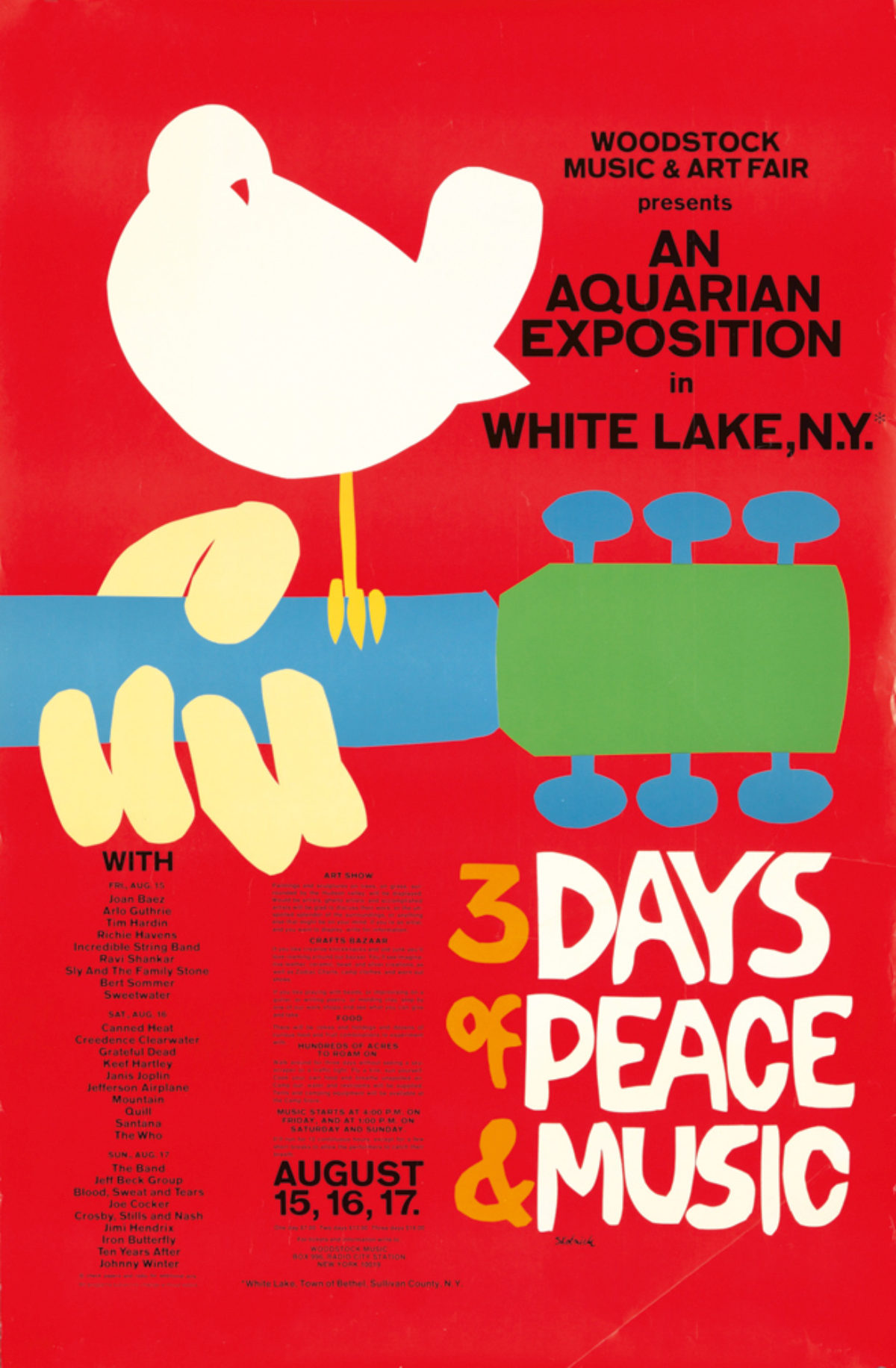
Anyway, they couldn’t get in touch with me, and someone knew this guy who I now know, Arnold Skolnick, and he did it overnight out of cut paper. Then they brought it to the Wallkill City Council, and they still said no. There would be no kind of show in their town. This was getting really close to the day of the show, which was August 15 – “three days of love and music” – and they had to find a place. They scouted locations and they found Max Yasgur’s dairy farm, which was near Bethel, NY (which is about 40 minutes from Woodstock). Woodstock (the festival) had already been called Woodstock, and they already had tickets printed up for it to be in Wallkill, but they went with it. They paid Max Yasgur $75,000 to rent this big pasture, which was kind of a bowl shaped thing where one side of it was low and the side by the highway was high. And that’s where they quickly built the stage and put up the light towers. And of course, the rest is history as the cliché says!
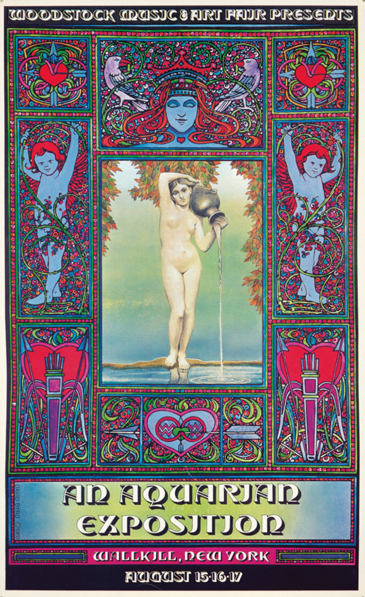
Left: David Byrd’s original poster design
Right: Arnold Skolnick’s now iconic Woodstock poster
PH: I see your Woodstock poster come up for sale a lot at auction. Did they really print that many of them?
DB: Yeh. They figured it would be in Wallkill. They were kind of naive because John Roberts was a Wall Street investment banker, and he was the money. He had this big chunk of money – like $100k to invest – so he invested in this, and lost his shirt. That’s neither here nor there, but that’s where the money came from. They printed 10,000 of those posters. Some burned in a fire at Bill Graham Presents; some are still stuck in a warehouse as far as I know. Woodstock Ventures, which is now part of Live Nation, now contends they have the rights to the poster. I contend that I have the rights because I put the “copyright David Byrd” on the poster in 1969. So it’s a moot point. I sort of ignore them and sell it anyway. So that’s that. There are probably a lot of originals out there.
PH: Why would Bill Graham have had the surplus Woodstock posters? I didn’t realize he was even part of Woodstock.
DB: He was secretly a part of it (this is strictly my version of what went down – the stories are many and varied). He was unannounced, I should say. He was part of the investment. He never got his money back. I would occasionally use the word “Woodstock,” and he would say “don’t use that word!” So I think he got screwed financially.
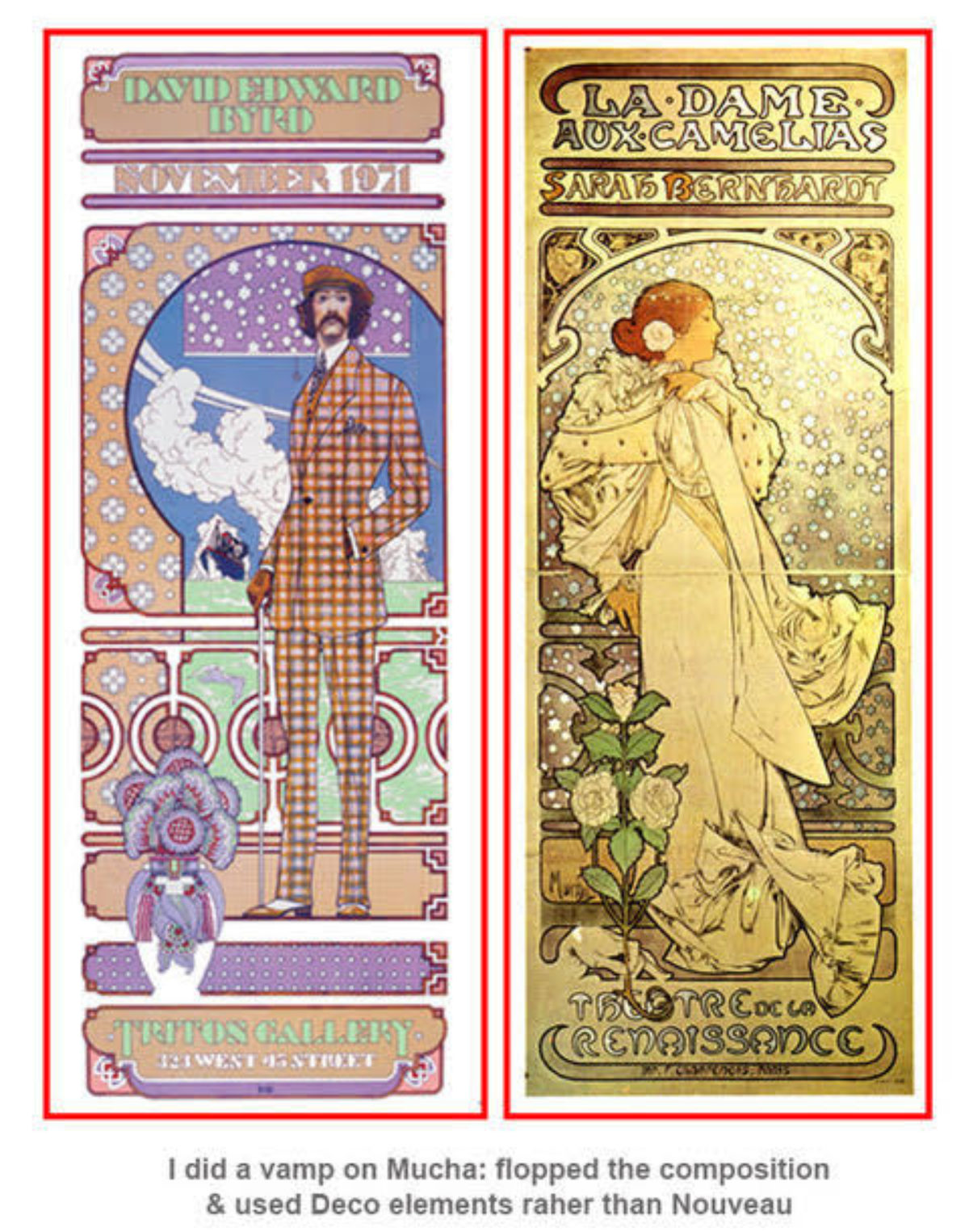
PH: I’ve seen your exhibition poster for a show you did at the Triton Gallery in New York. Clearly you were inspired by Mucha. Does his work figure in to other designs you’ve done? What other artists inspire your poster art?
DB: Well, let’s see – there was Mucha and the French poster movement. I didn’t particularly like Chéret, but he had the printing studio, and that’s why he did so many posters (and he printed everyone else’s posters). So Chéret was a big deal, but his posters, aesthetically, I’m not into them. Then there’s the German Expressionists – Northern Expressionists in Berlin, and Southern Expressionists like Hohlwein in Munich. And there was the Jugendstil in Vienna – Klimt and such – since Austria was a big part of poster business. So I was really influenced by all these early people. Someone had given me a book about a huge poster auction in the mid-70s in Munich, so I had a lot of little thumbnails of posters that I could look at, and that was a big influence.
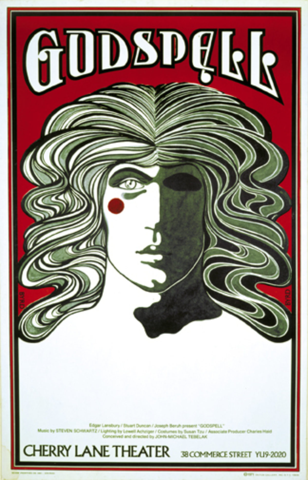
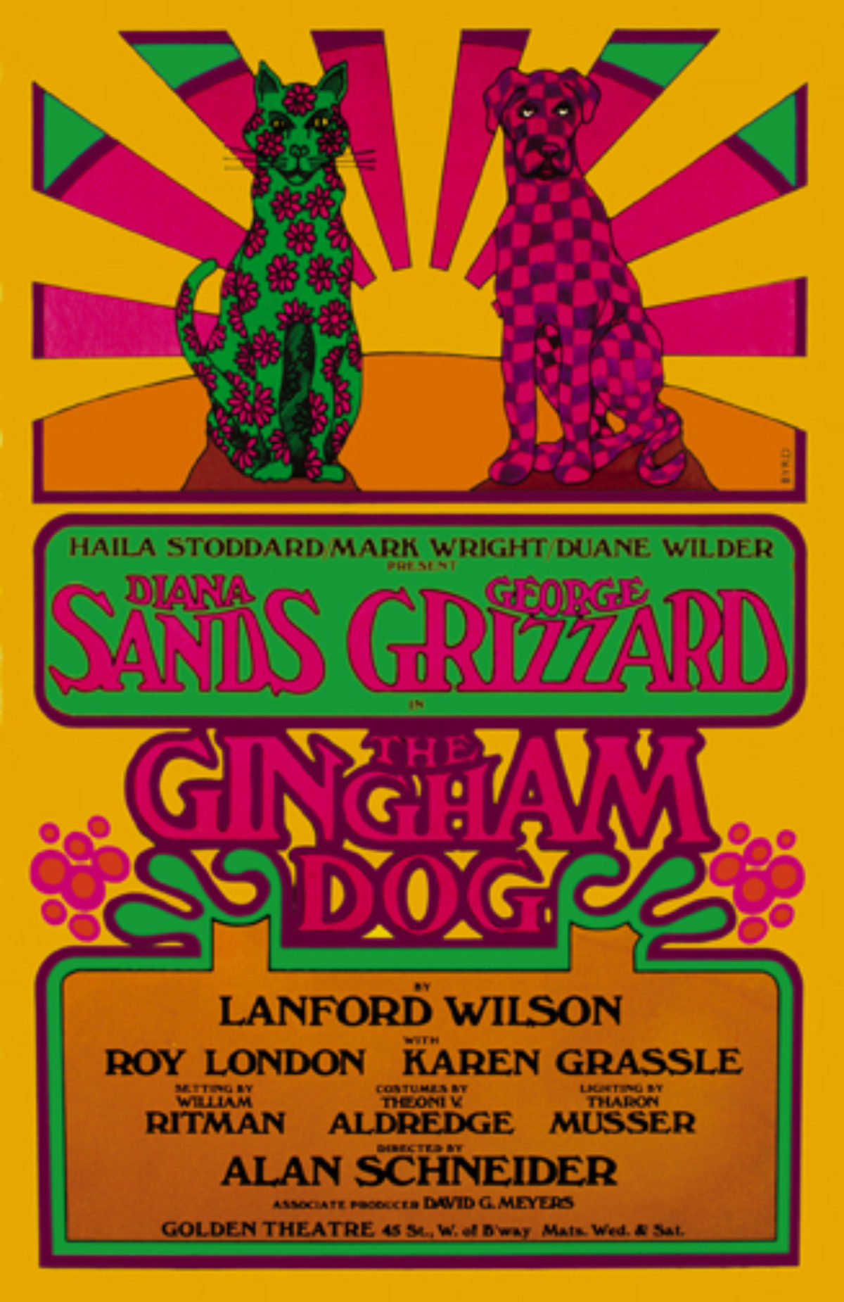
Left: Godspell, 1971
Right: The Gingham Dog, 1969
PH: After the Fillmore East and Woodstock, you created a ton of posters for Broadway. How did you make that transition from concert posters to theatrical posters? Did that have different restrictions or rules, or were you given free reign?
DB: That’s a good question. I was not given any freedom on Broadway. For Broadway, you sometimes had to go into a meeting and listen to everybody who was involved with the poster. Otherwise, you’d get a call from Blaine-Thompson – that was the big poster printer in New York City. They would call and say we need a poster for this or that. The way I was able to get into Broadway was this crazy dame Haila Stoddard. She’d been on As the World Turns for 20 years, and she had made all this money which she wanted to invest in Broadway. Her first investment was the first play by Lanford Wilson, who later became a famous playwright. But at the time he was new and Haila was presenting a drama of his called The Gingham Dog. It was about an interracial marriage that’s coming apart at the seams, with Diana Sands – who was a famous black actress at the time – and George Grizzard. I did these serious sketches, you know, that were about the end of an affair and the death of love and blah blah blah. And Haila said no, no, no – we wanted it to look like a rock poster. And I said, “what?!” And they said if they were going to get anyone in the door it’s got to look spiffy. So I did the poster.
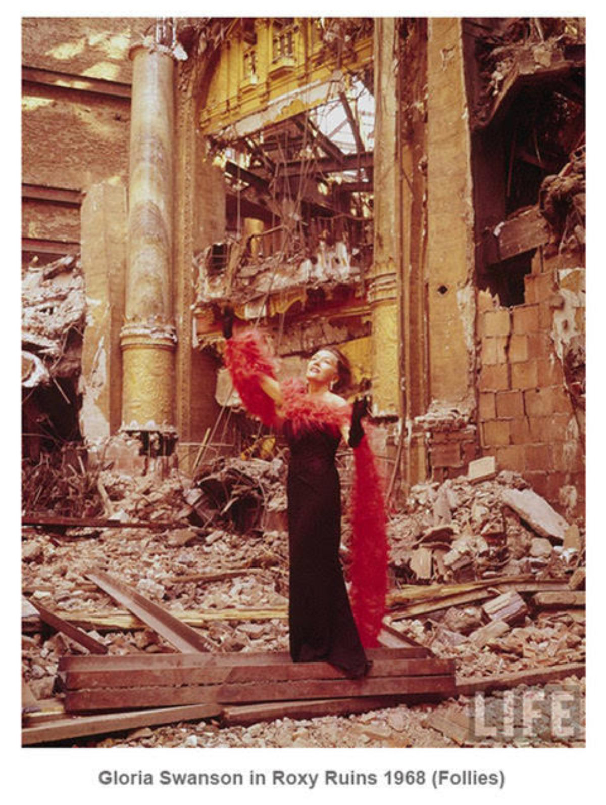
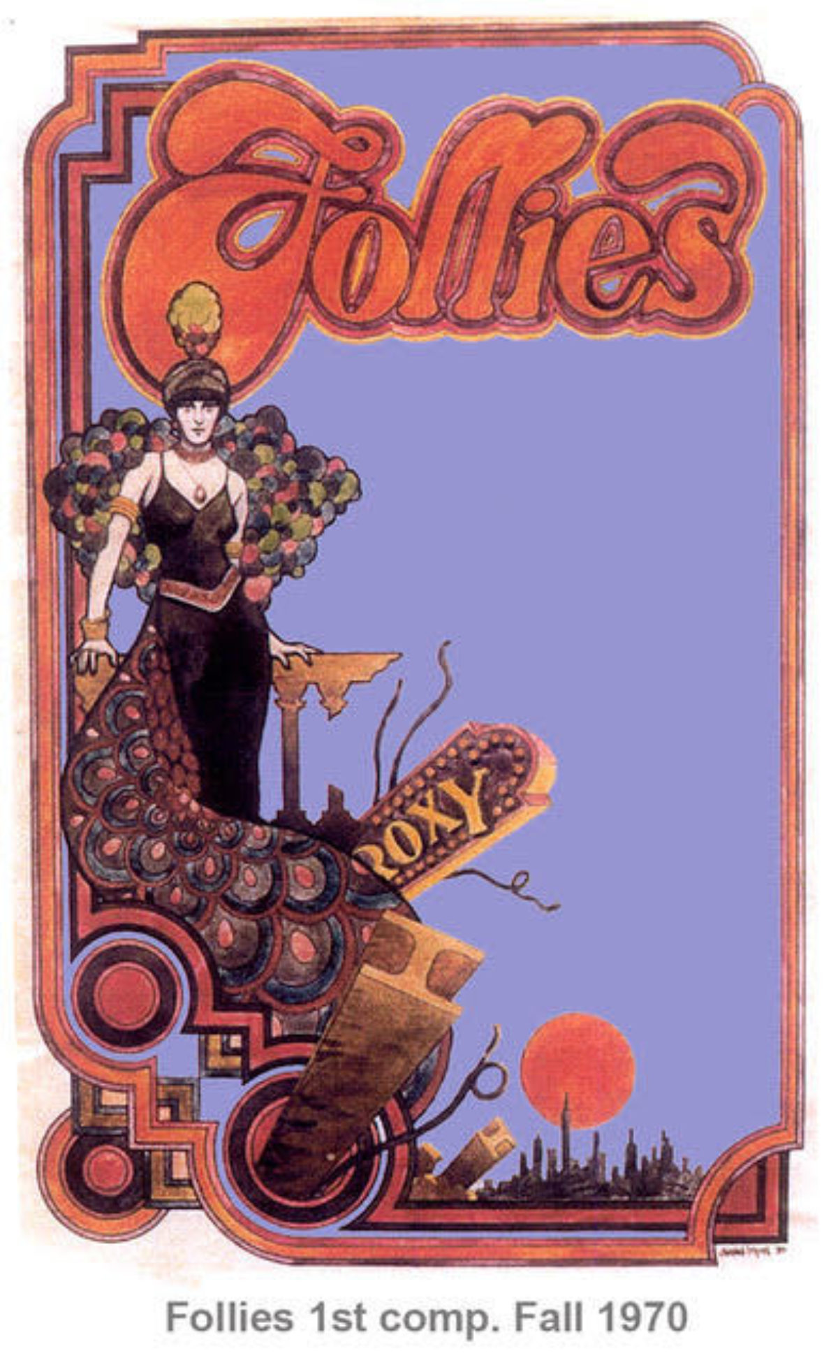
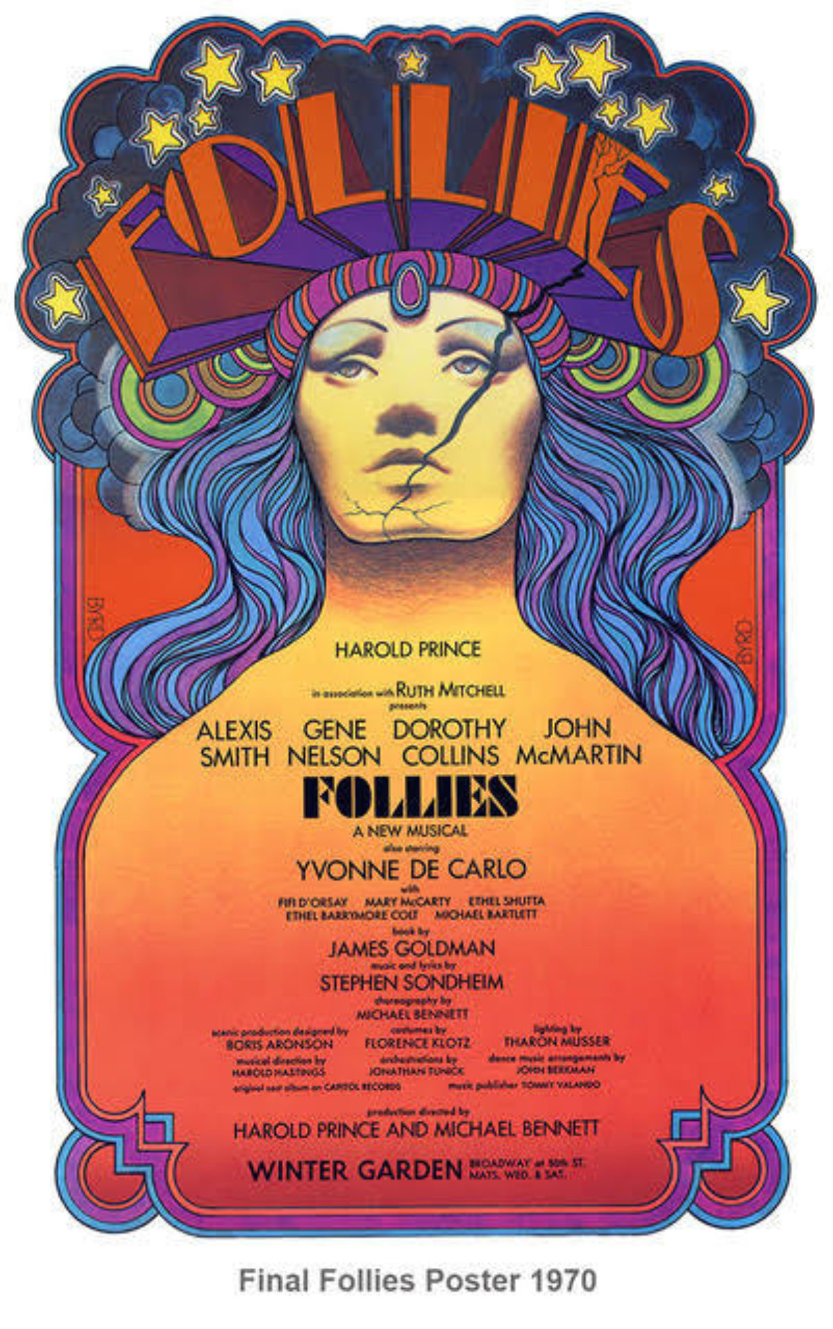
Then, my partner Roger Puckett at the Triton Gallery kept throwing me these off-Broadway theatrical jobs. I kept doing posters for them, and the shows kept closing. I’d get another three more jobs, and they’d close in a week. So I’ve done posters for a lot of shows that didn’t have much money. Then I finally got a call about Follies. Steve Sondheim and Harold Prince were producing a show about the end of the Ziegfeld Follies, and the only reference they had for me was a picture of Gloria Swanson in a black gown and boa, with her arms up, a sunbeam hitting her in the wreckage of the Roxy Theater. It had been demolished not long before because that was the time that if the building was old, you tore it down and put up an anonymous glass building. Since that picture was the only reference I had, I did a sketch of it. We asked if I could present, but they said they already had 17 artist and couldn’t afford another one. So Roger asked if I could do it for free. They love free. So I did this small sketch, maybe 8 inches high, and it was in this room with 17 other sketches. And believe it or not they chose mine. I was literally shocked. I had totally forgotten about it at that point.
So they said they loved it, but they wanted to make some changes. Number one: the figure on the stairs is too dykey – we can’t have that. Of course, I made her very period in a cloche hat – but they figured that was a symbol of dykdom. She had to have voluminous blonde curls rolling down her back and a red dress, huge tits and tons of cleavage. They told me a good example of what they wanted was Dolly Parton. I got those instructions over the phone. So I hung up and, oh God, I was just floored. I mean, really?! This is so not Ziegfeld Follies! So I smoked a joint and had a couple of scotches, and I did what I call the “Dolly” version. I hated it so much. It was ghastly. I thought I’d be laughed off the Rialto, as they say. So that was done and it was time for dinner, but I skipped dinner because I had to do something to replace this piece of shit. So I took three hours and did what is now the very famous poster for Follies. And you know they never mentioned Dolly Parton again.
PH: Do you still think posters are a viable and effective medium today even when everything is promoted and sold online?
DB: Well, um, that’s iffy. I know there are a lot of new poster artists who are doing posters for new groups, some of whom go nowhere and some of whom move up the ladder. Emek is an example – it’s not my style of poster, you know the “flaming eyeball school of art” as I call it. Some of the Fillmore posters were like that – Rick Griffen’s especially. But that’s going on now, and I like some of these guys’ posters. I dislike some of them, too, but that’s how life is. So I don’t know how to answer that question. Certainly there’s not the fervor and fever there was during that era from 1967 or even late 1966 to, say, 1975. The last poster I did for Bill was for the Grateful Dead at the Nassau Coliseum, where I utilized a 1950s theme.
I would also state that some of my posters that I have found quite cringe-worthy are now beloved and famous. So, you know, people are still interested in that era and time, and I think there are collectors of the new artists – but there’s not that fever that went on during what I call the Peter Max period. Peter Max was just huge at that time, like, 1970, HUGE. And I lived a block from Warhol’s Factory in Union Square, so I saw all these people at Max’s Kansas City, where all the hipsters went from both the fine art and the music arts. They hung out at Max’s and they would have tables. Guys like Dan Flavin and Warhol and people like that would go there because it was THE night spot.
I did have a two man show with Arnold Skolnick at the Bethel Woods museum, which is at the top of the meadow where Woodstock happened. We had a show – “A Tale of Two Posters” – and in the show Arnold only had one poster (his Woodstock design) because he was not predominately a poster artist. He had a lot of acrylic paintings of gardens, which was kind of strange with all my commercial work. I had illustrations for magazines and book covers, and all that kind of malarkey. But he had paintings and drawings of flowers and gardens, which made for an odd mix of styles.
Overall, the poster is perhaps the newest form to become part of the pantheon of art styles, but it is here to stay after approximately 170 years. As I recall, Atlantic Magazine recently asked experts from all fields of human endeavor what they thought were the 100 greatest inventions or discoveries in the last 2,000 years – number ONE was lithography, the invention of which (by Alois Senefelder) made possible multiple images in large amounts, thus giving birth to the poster as an art form. I am very humbled and blessed to have been a part of this newly-born tradition in the arts – the marriage of image and the word.
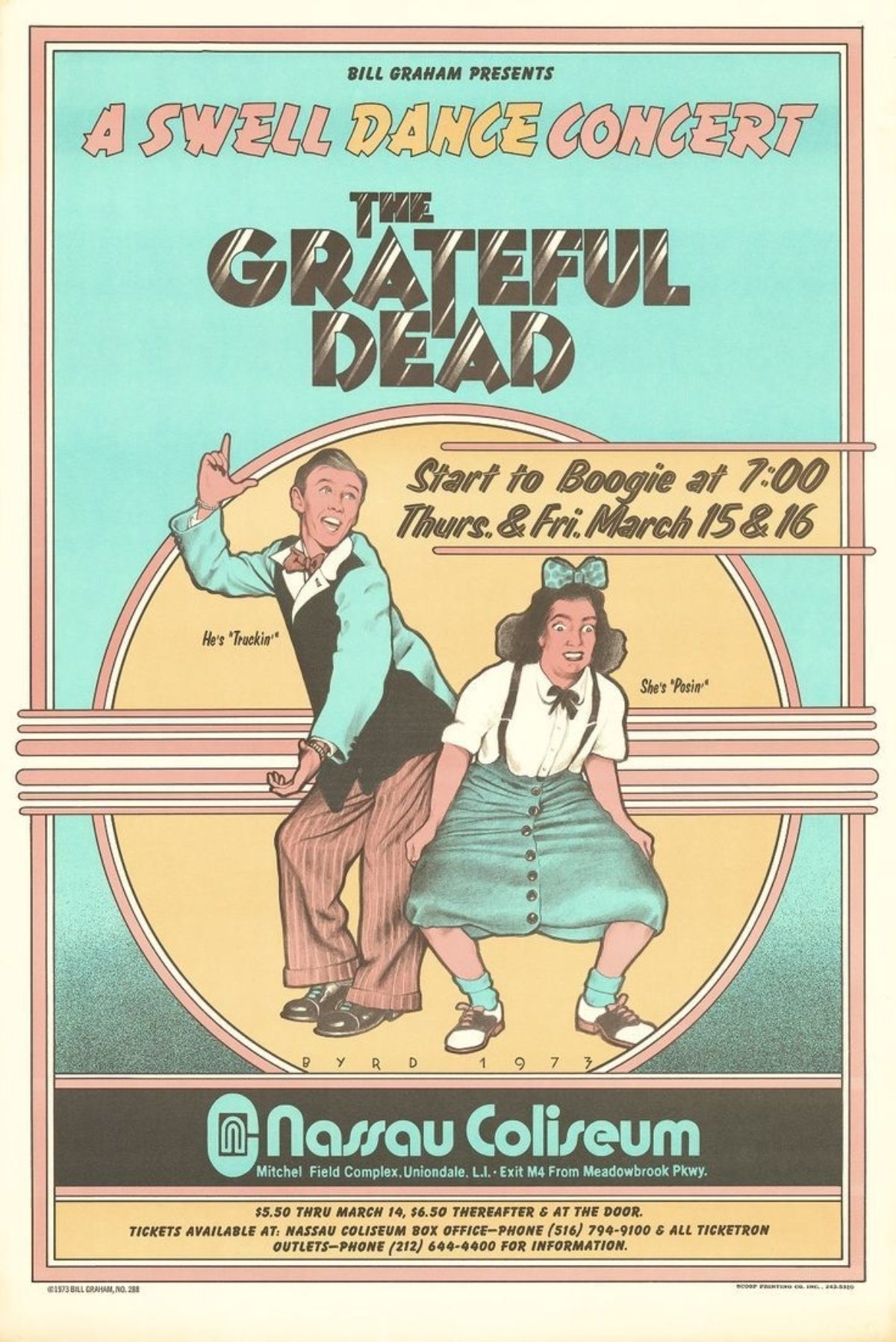
The Grateful Dead, 1973
To see more of David Byrd’s work, please visit his website.
All images provided by David Byrd unless otherwise noted.
