It’s a Poster Eclipse!
.On Monday April 8, at about 2pm in the afternoon, I, like many others, will don strange glasses made of cardboard and plastic, and gaze reverentially at the sky. I will be at home in Vermont, where—with a glass of wine in hand, with two of my sons—I will watch one of nature’s greatest events: a total eclipse of the sun. The fact that it is so well foretold will not diminish its majesty. The writer Annie Dillard, writing about a previous eclipse, said, “it was odd that such a well advertised public event should have no starting gun, no overture, no introductory speaker. I should have known right then that I was out of my depth.”
The event—the eclipse—is indeed well advertised, but that foreknowledge is not a new phenomenon. In 647 B.C., Archilocus, a Greek poet, wrote: “there is nothing beyond hope, nothing wonderful, since Zeus, father of the Olympians, made night from midday, hiding the light of the sun, and sore fear came upon men.” Yet, in 585 B.C., just over sixty years later, came the event that famed science fiction writer Issac Asimov later described as the earliest historical event that is known with precision to this day and, thus, the “birth of science.” What became known as the Eclipse of Thales was predicted, according to the historian Heroditus, by the philosopher Thales of Miletus; but, predicted or not, it had the benign effect of interrupting a long-standing war.
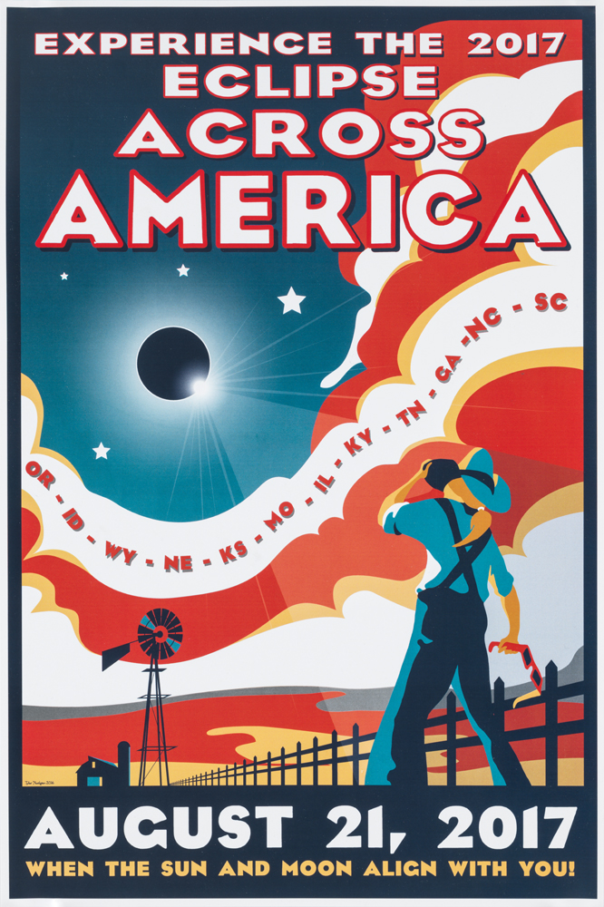
In Poster House’s collection, we have posters designed by Dr. Tyler Nordgren, an astronomer, artist, and author who describes himself as a “night sky ambassador.” Working with the National Park Service, it is no surprise that some of his work is evocative of the classic 1930s WPA posters advertising those parks. The posters in our collection are his work commemorating the eclipse on August 21, 2017. Of the 32 posters he produced for that event (dubbed the “All American Total Solar Eclipse”), I have chosen four disparate examples that represent a cross-section of what many design historians would consider American graphic styles.
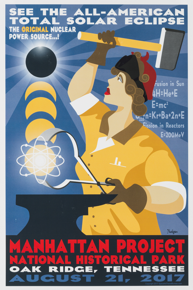

Left: Manhattan Project National Historical Park (2017), Dr. Tyler Nordgren, Poster House Permanent Collection
Right: We Can Do It (1943), J. Howard Miller, Encyclopedia Britannica
The first design has echoes of the famous World War II propaganda poster by J. Howard Miller for Westinghouse, popularly known as “Rosie the Riveter.” Like that composition, this one by Nordgren highlights the contributions that women made to the field—although while the earlier poster focuses on the war effort, this one promotes viewing the event in Manhattan Project National Park in Tennessee, noting the eclipse as the “original nuclear power source.”
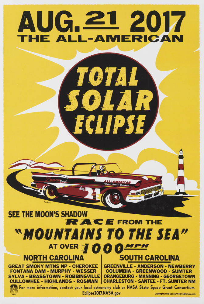
Left: Total Solar Eclipse (2017), Dr. Tyler Nordgren, Poster House Permanent Collection
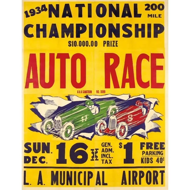
Right: Auto Race (1934), Designer Unknown, Walmart
The second poster by Nordgren features that most American of vehicles: a ‘57 Chevy Bel Air convertible, tail fins and all. With a powerful small block V8 engine, traveling at 1,000 miles per hour and thereby mirroring the speed of the eclipse, this design encourages the viewer to take part in a “Mountains to the Sea” race in order to catch the event in all points through North and South Carolina. The composition is a nod to the stock posters produced by the likes of Globe and Hatch promoting various road races around the country from the 1930s up through the 1950s.
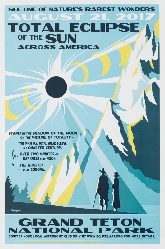
Left: Total Eclipse of the Sun (2017), Dr. Tyler Nordgren, Poster House Permanent Collection
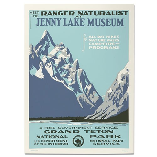
Right: Grand Teton National Park/Jenny Lake (1938), Designer Unknown, America’s National Parks
The third poster is one of many designs by Nordgren that most closely reflects his relationship with the National Park System. The composition firmly resembles that of WPA National Park posters of the 1930s, most of which were produced through silkscreen and used to promote domestic travel to the country’s great wilds. Cleverly, it advertises viewing the eclipse from Grand Teton National Park—the same location promoted in the very first design produced by the WPA for the park system. Norgdren’s image is almost a literal reflection of the 1938 original, with the mountain range decorating contrasting sides of each composition. He also attempts to recreate the four-color printing scheme of the vintage design, mimicking the effect of broad swaths of silkscreen color despite being a digital rendering.
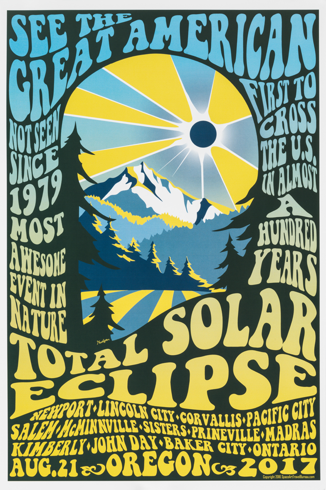
Left: See the Great American Total Solar Eclipse (2017), Dr. Tyler Nordgren, Poster House Permanent Collection
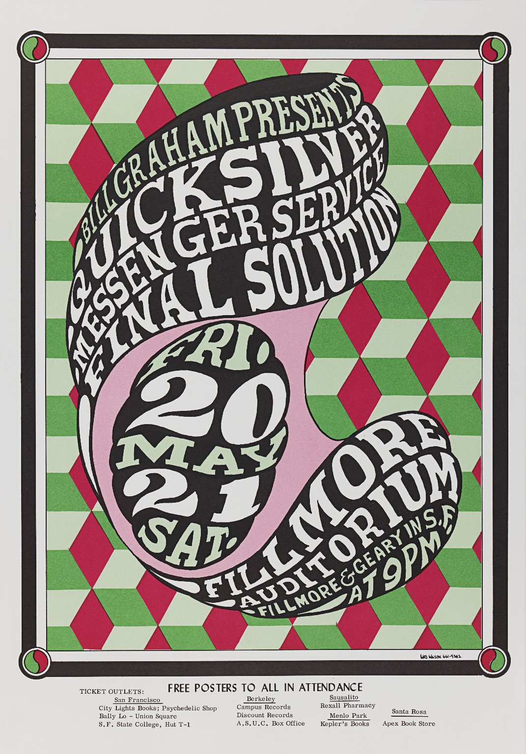
Right: Quicksilver Messenger Service (1966), Wes Wilson, Brooklyn Museum
The final poster in the series that best reflects a particularly American flavor of design is Nordgren’s homage to the psychedelic style. Promoting viewing the eclipse in Oregon, the image echoes many psychedelic rock concert posters that were a feature of the mid-to-late 1960s in the United States. Robert Wesley “Wes” Wilson ignored the common wisdom within poster design that they should be clear and highly readable, instead developing a thick, flowing, sculptural typographic style that required the reader to work to decipher its meaning. This poster, with its bombastic messaging and multiple destinations reads like an itinerary for a traveling rock band as it wends its way to concert venues across the country—or, in this case, Oregon.
Today, Norgdren has continued to make posters reflecting various vintage styles from the poster canon—he even made a downloadable image in promotion of Monday’s big event in New York State. If you are in the path of the eclipse, I hope you will share in the wonder of a natural phenomenon, and in the fact that science allows us to predict how nature and its effects will unfold. If the wonder of it all inspires you to create or embrace a marvelous poster design, so much the better!

