Our Children’s Exhibition Area
.Our Children’s Exhibition Area is inspired by 1960s New York City during the Mad Men era of American advertising. Posters from this time overflow with vibrant color, reflecting a love for new technology and a fascination with unbridled youth culture. Consumerism is at a newfound high, and advertising is beginning to discover a fresh, cheeky voice.
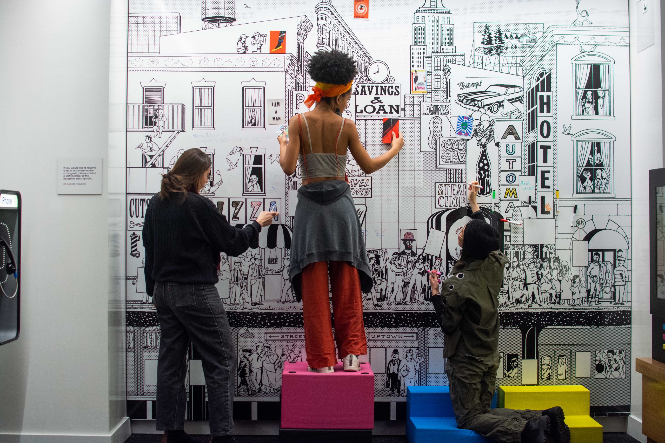
We commissioned a wall mural by Trenton Duerksen that features a bustling Manhattan scene. It is printed on magnetic whiteboard panels, so you can get creative by coloring in areas of the cityscape with erasable markers and adding magnets of famous posters.
Scroll through to see the posters we chose to represent the diversity of design during that time period!
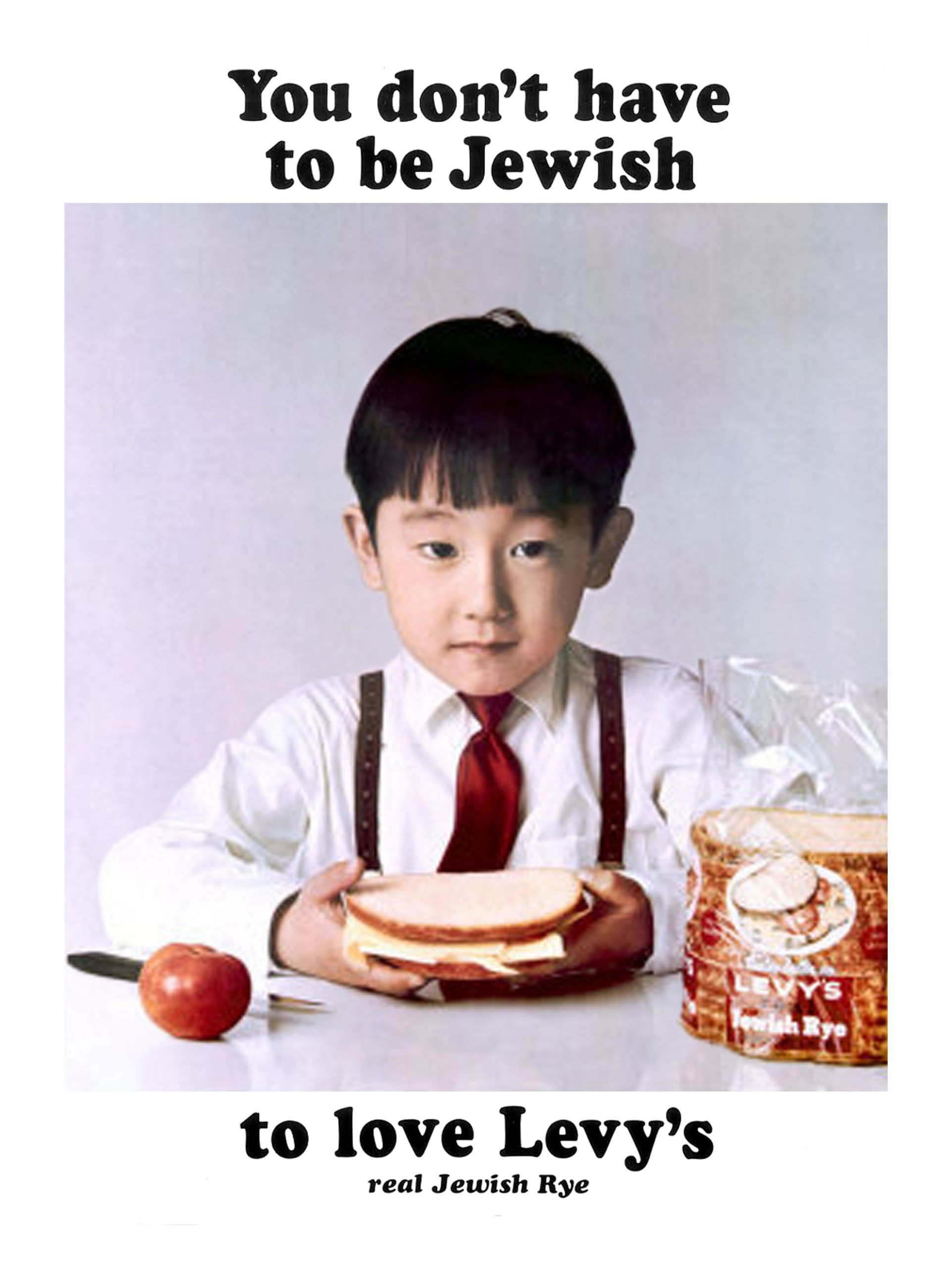
Levy’s, 1967, Howard Zieff (1927–2009) & William Taubin (1916–98)
This poster for Jewish rye bread represents a landmark moment for inclusiveness in advertising in 1967. Created by the agency DDB, the diverse series made Levy’s the best-selling rye bread in the city.
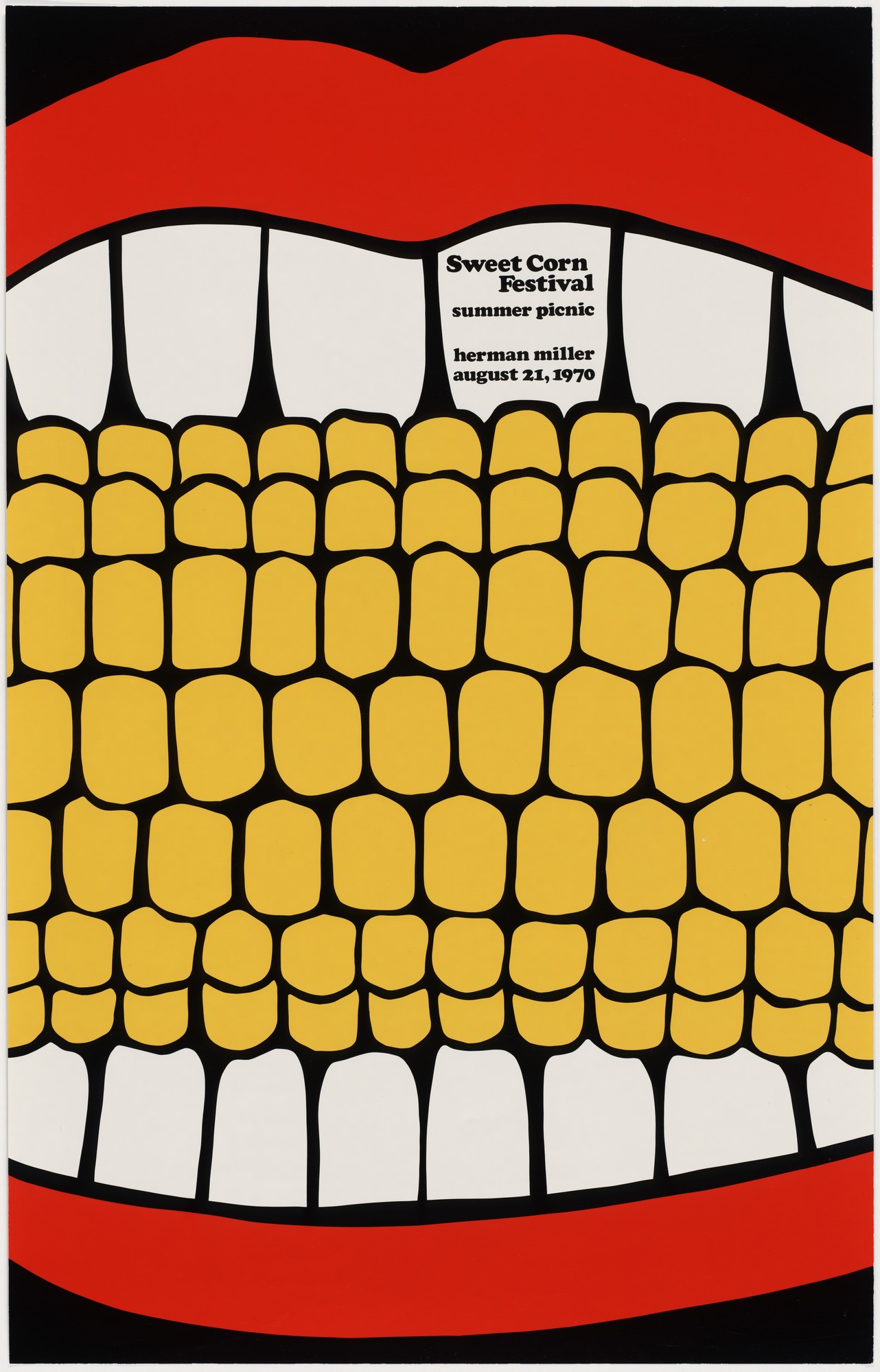
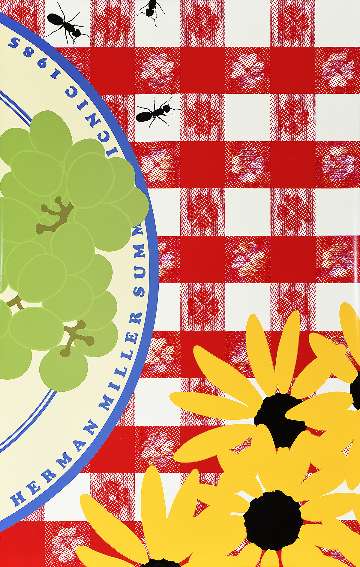
Herman Miller Summer Picnic, 1970, Steven Frykholm (b. 1942)
In 1970, Steve Frykholm created the first in an iconic series of silkscreen posters advertising the annual picnic at the Herman Miller furniture company. Each image, printed in bright colors and in a loose, illustrational style, presents an element of an outdoor picnic in extreme closeup.
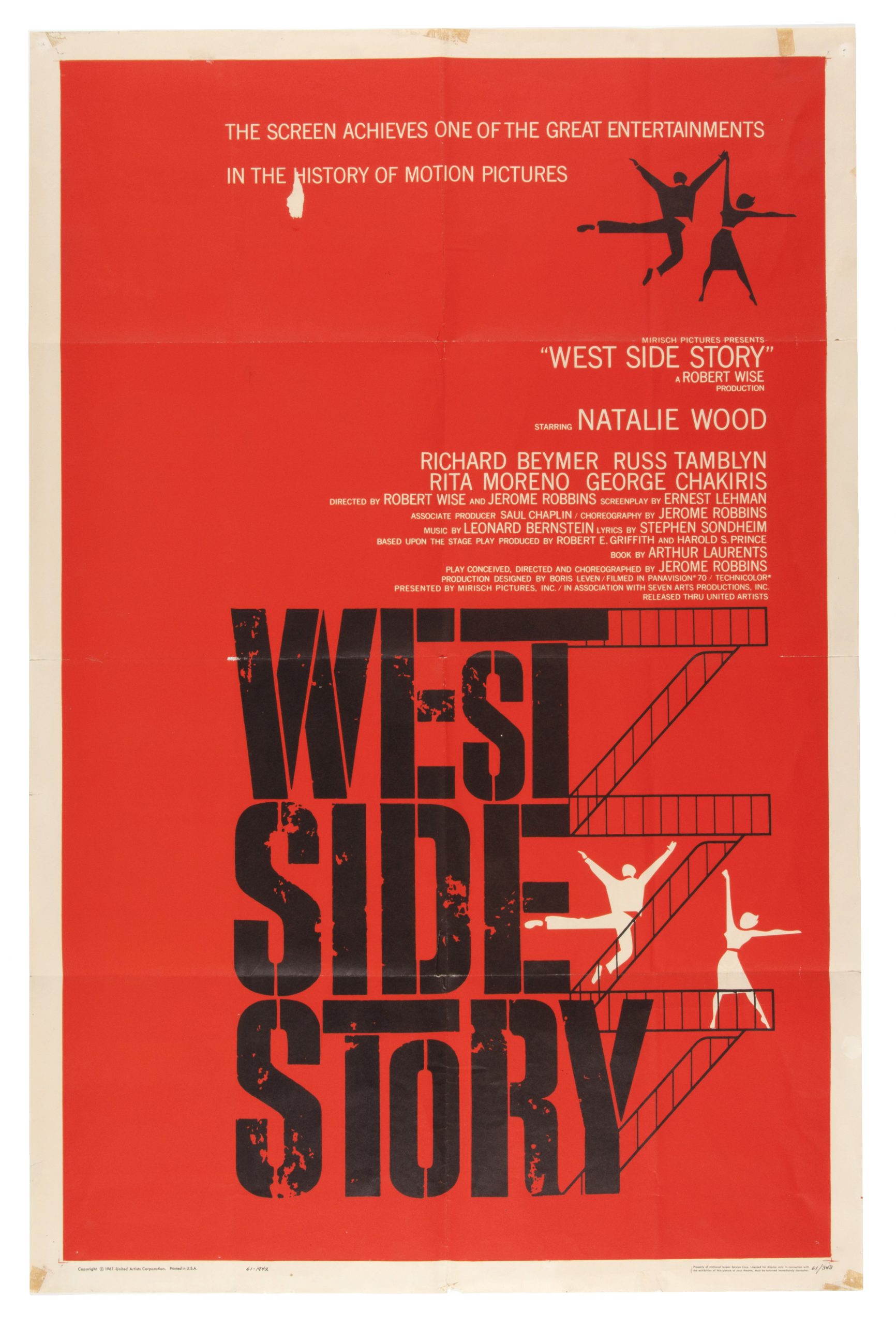
West Side Story, 1961, Joseph Caroff (b. 1921)
Frequently misattributed to Saul Bass, this poster was actually created by Joseph Caroff. It announces the theatrical release of the beloved Stephen Sondheim musical based on Romeo and Juliet that tackles prejudice and young love on the Upper West Side.
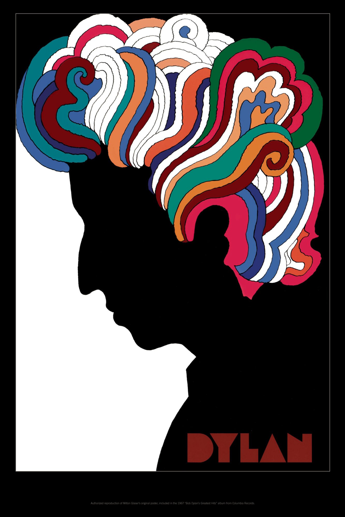
Dylan, 1966, Milton Glaser (b. 1929)
This poster was originally included with the vinyl release of Bob Dylan’s Greatest Hits Volume 1, and remains one of Glaser’s most recognizable works.
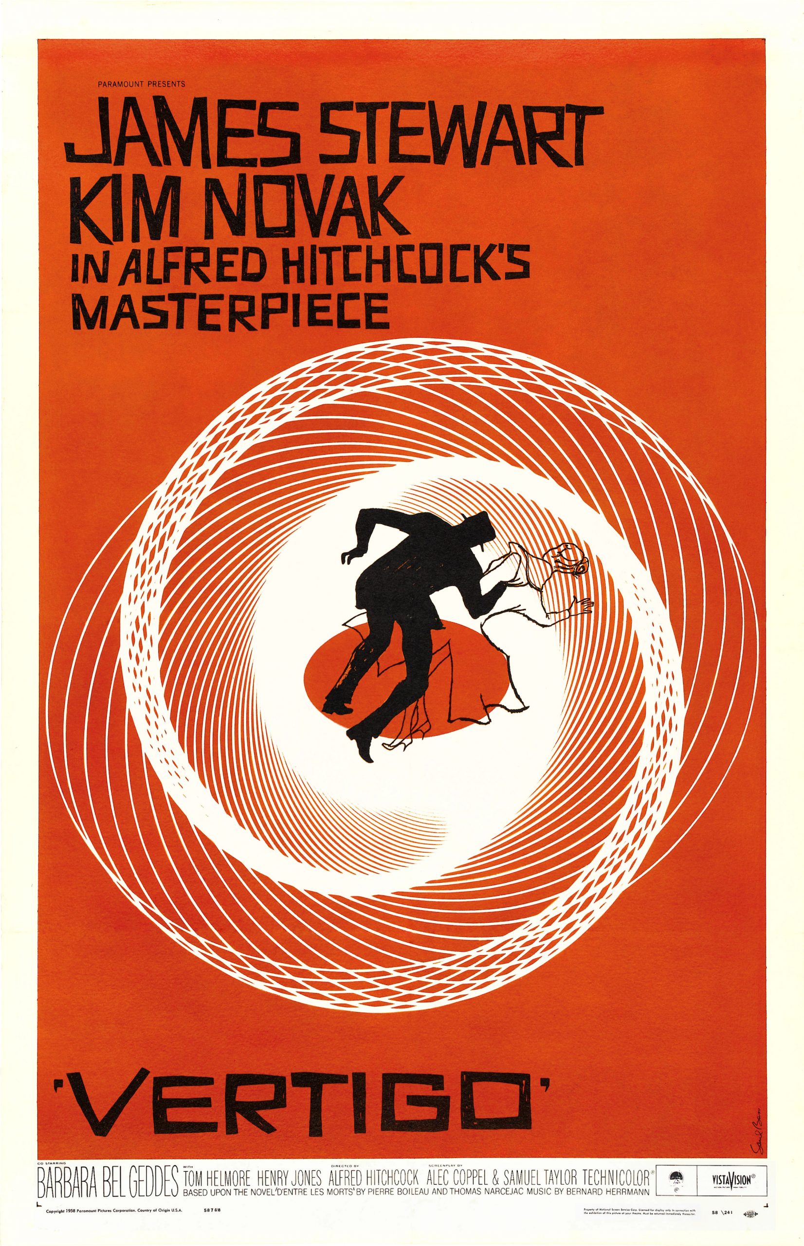
Vertigo, 1958, Saul Bass (1921–96)
Bass is one of the most recognizable American poster artists. Here, Kim Novak and James Stewart’s silhouettes are perched on the edge of a precarious spiral while jagged, hand-cut lettering underscores the visual tension.
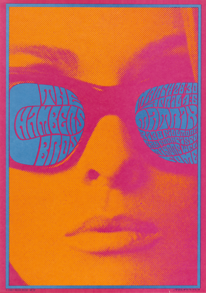
The Chambers Brothers, 1967, Victor Moscoso (b. 1936)
One of the psychedelic rock scene’s “Big Five,” Moscoso helped to visually define the era with his undulating letterforms and vibrating color palette.
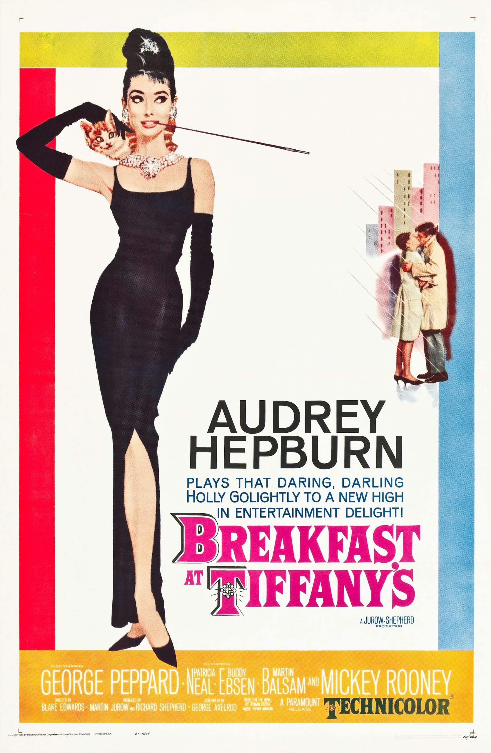
Breakfast at Tiffany’s, 1961, Robert McGinnis (b. 1926)
McGinnis created dozens of movie posters in his prolific career, none of which is more instantly recognizable than this beautiful illustration of Audrey Hepburn as Holly Golightly.
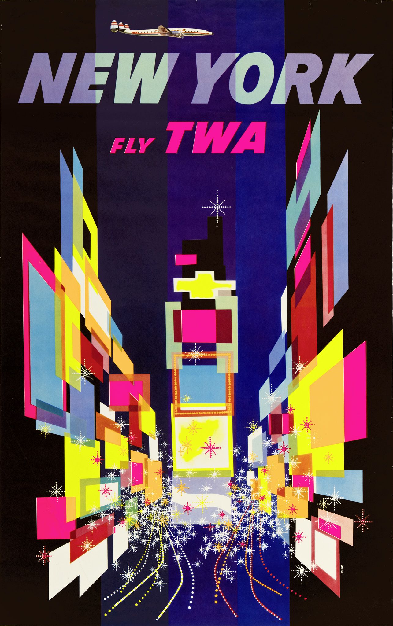
TWA/New York, 1956, David Klein (1918–2005)
Klein’s many upbeat, whimsical posters for TWA came to define the American Jet Age. This is his most iconic image for the company, incorporating the bright lights and billboards of Times Square.
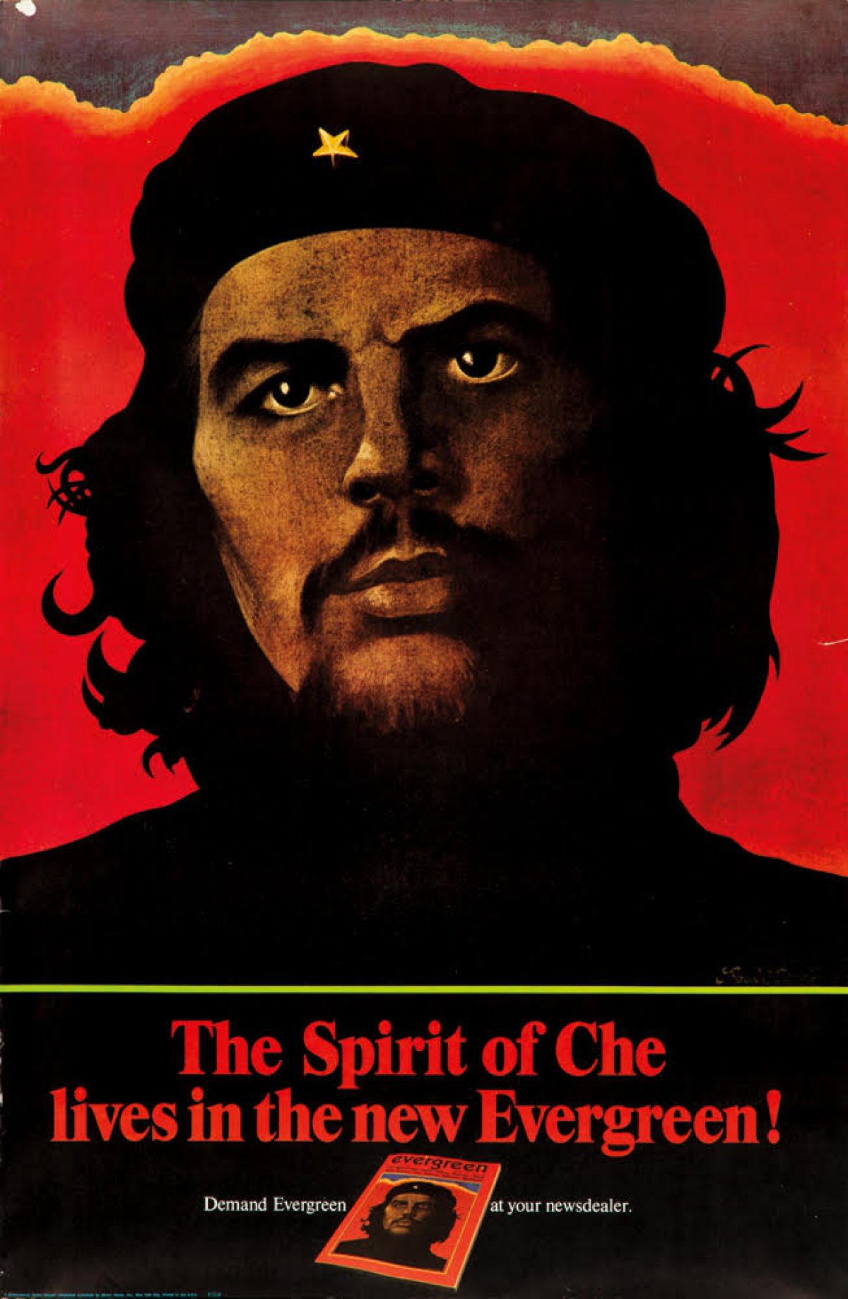
Evergreen/The Spirit of Che, 1968, Paul Davis (b. 1938)
While inspired by the famous Alberto Korda photograph of Che Guevara, this poster was one of the first renderings of the Marxist revolutionary seen by the American public. It proved so sensational that the offices of the magazine’s publisher were bombed in retaliation by anti-Castro Cubans.
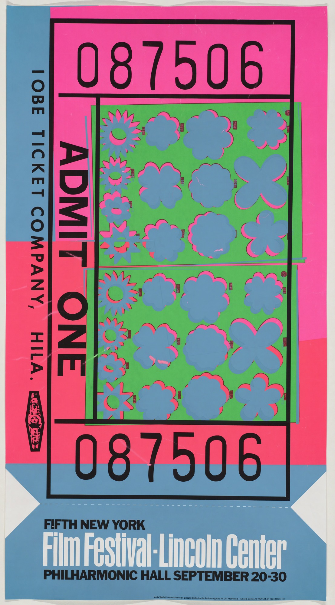
Film Festival/Lincoln Center, 1967, Andy Warhol (1930–87)
When Lincoln Center opened, one of its most important patrons, Vera List, insisted on commissioning the biggest names in the art world to create posters for the venue. This design by Warhol turns the humble ticket stub into a fluorescent Pop Art masterpiece.
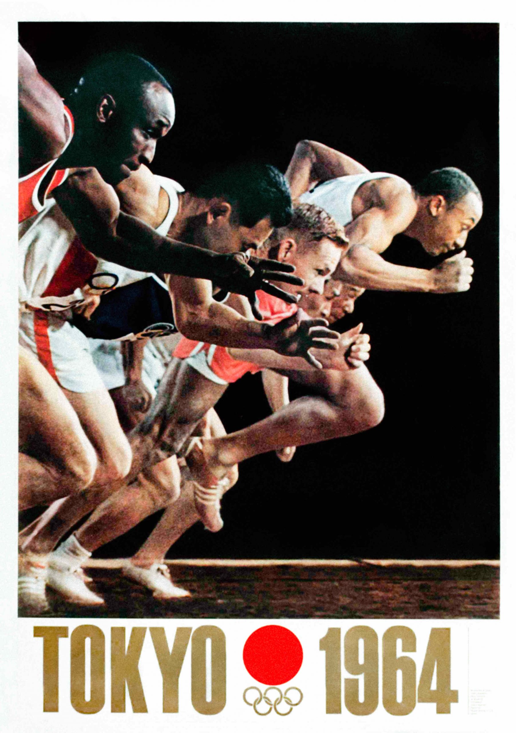
Tokyo 1964, Yusaku Kamekura (1915–77)
The series of posters designed by Kamekura for the 1964 Tokyo Olympics helped to establish the international reputation of Japanese graphic design.
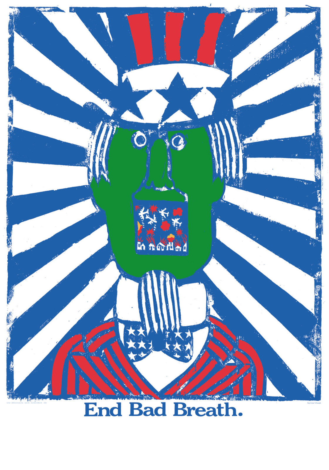
End Bad Breath, 1968, Seymour Chwast (b. 1931)
A founder of Push Pin Studios, Chwast is known for his anti-war imagery. This silkscreen poster was created out of his frustration over the Vietnam War, and shows Uncle Sam opening his mouth to reveal airplanes bombing a Vietnamese village.
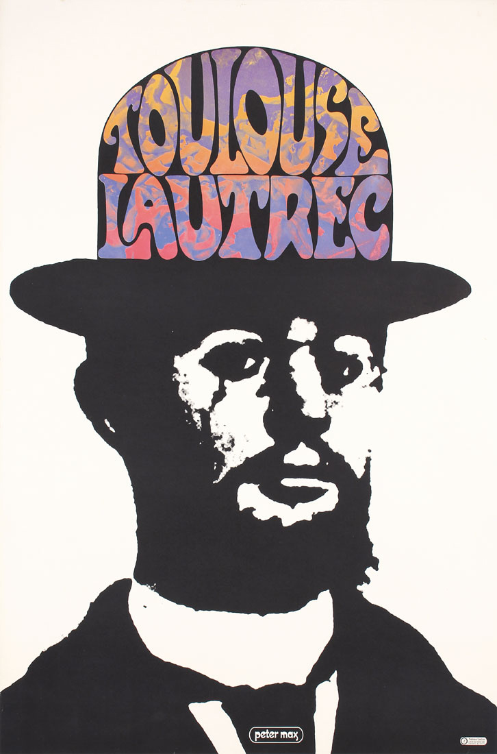
Toulouse Lautrec, 1966, Peter Max (b. 1937)
Peter Max was the most commercial artist to emerge from the psychedelic scene. His work has been used to promote everything from 7-Up to Newark Airport. Here, he updates a photograph of one of the most famous poster designers of all time—Toulouse-Lautrec—and decorates his bowler hat with a fleet of nude ladies.
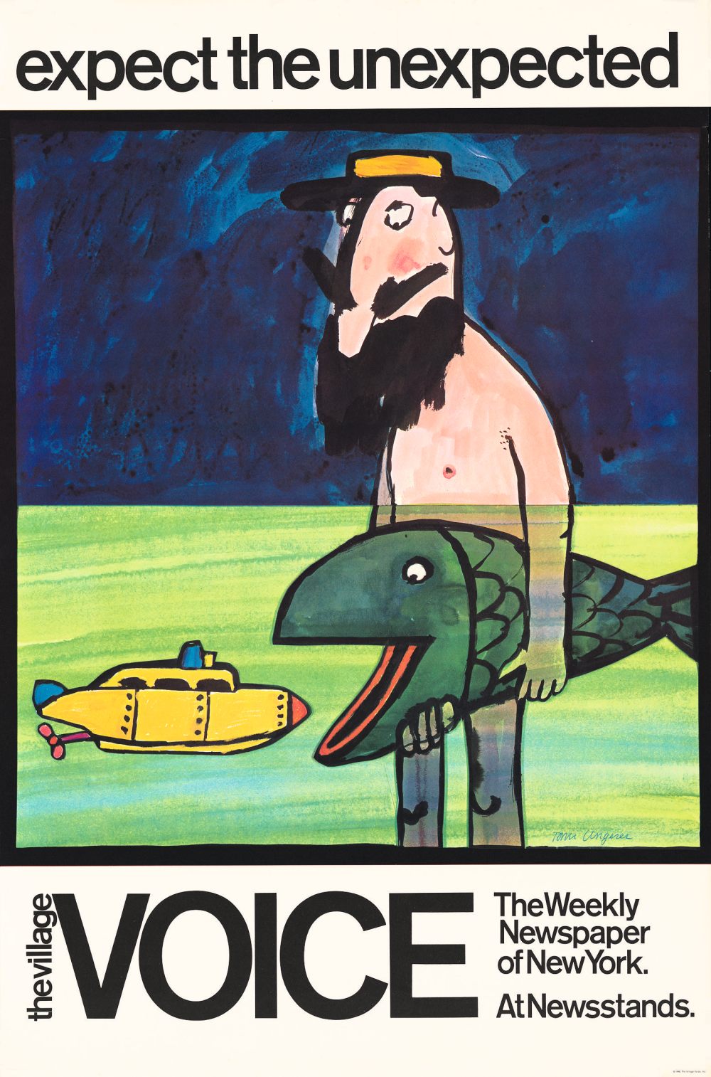
The Village Voice, 1968, Tomi Ungerer (1931–2019)
Rejected by the New York State Lottery, the tagline “expect the unexpected” seemed like a natural fit for The Village Voice, the first alternative newsweekly in the United States. Ungerer brought a uniquely sardonic sense of strange to the many posters he created in New York City during the late 1960s.
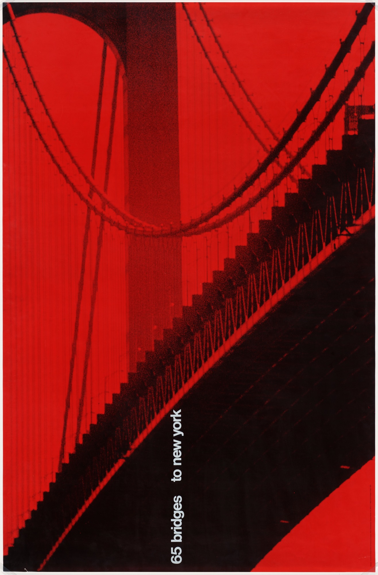
65 Bridges to New York, 1968, Tomoko Miho (1931–2012)
This poster was commissioned by the Container Corporation of America as part of a series intended to beautify and celebrate the city. The posters would have been put up in public spaces, from churches to town halls, as part of the company’s public relations campaign.
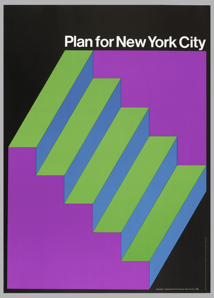
Plan for New York City, 1969, Robert P. Gersin Associates
Faced with stagnant population growth, issues of “white flight,” and increased violence, the city of New York released a six-volume study in 1969 filled with charts, maps, and analysis so that the public could join the conversation on urban decline and how to fix it.
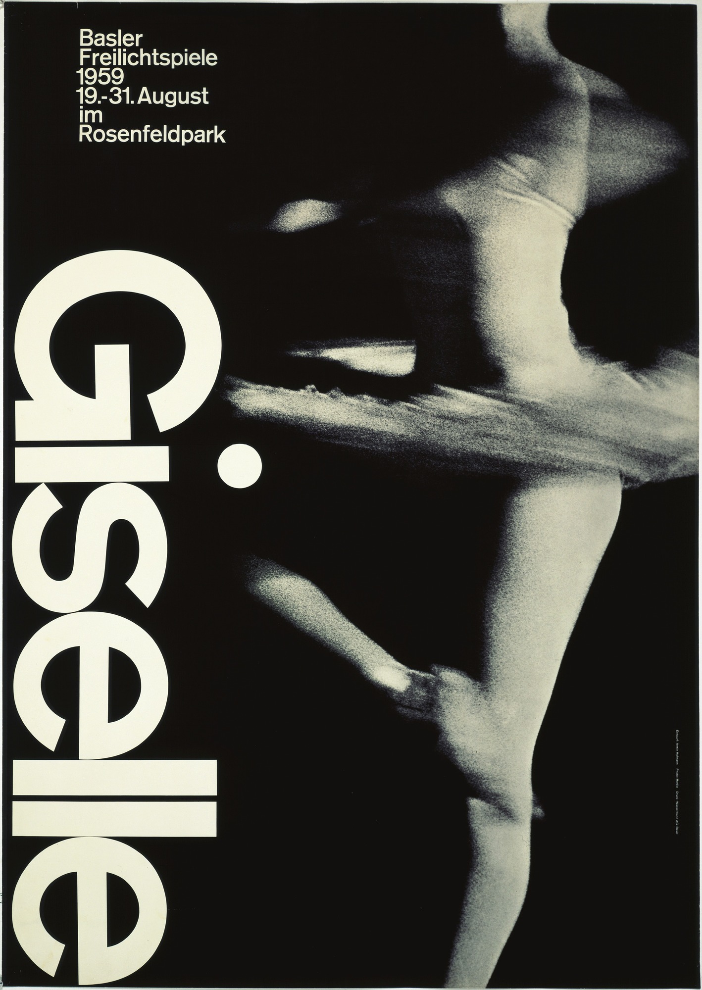
Giselle, 1959, Armin Hofmann (b. 1920)
A famous example of the Swiss International Style, this poster promotes an outdoor performance of the ballet Giselle. Hofmann playfully placed the dot above the “i” where the dancer’s knee would be.
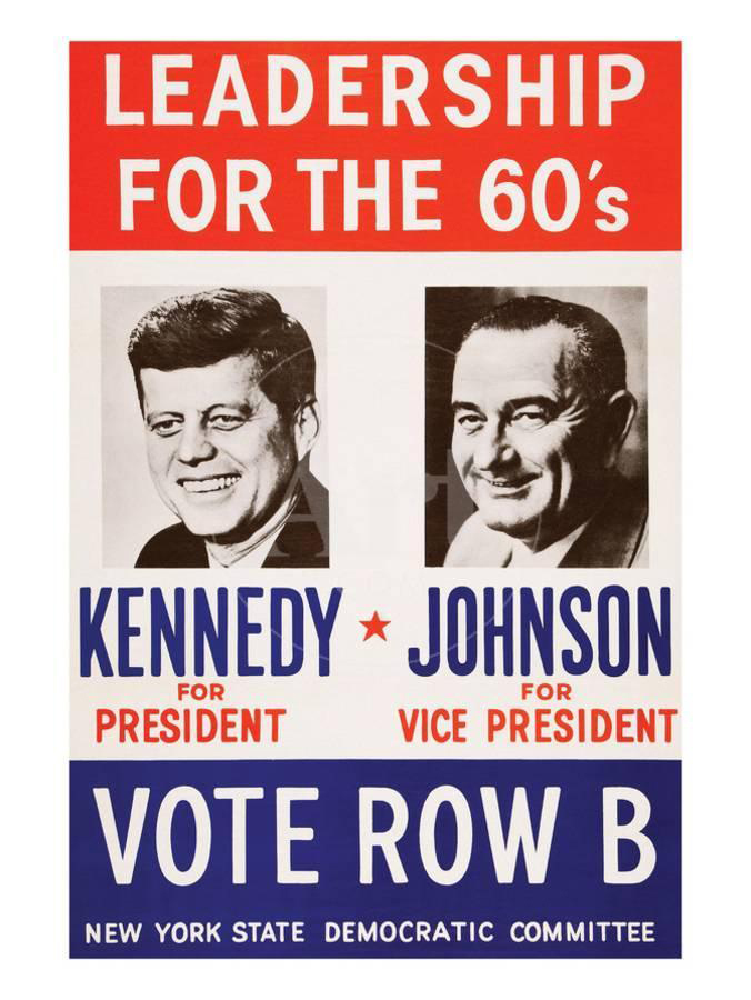
Kennedy for President, 1960, Designer Unknown
Modern campaign posters typically combine a photograph of the proposed candidate with a patriotic color palette—a simple but effective strategy that helped make Kennedy the youngest person ever elected president.
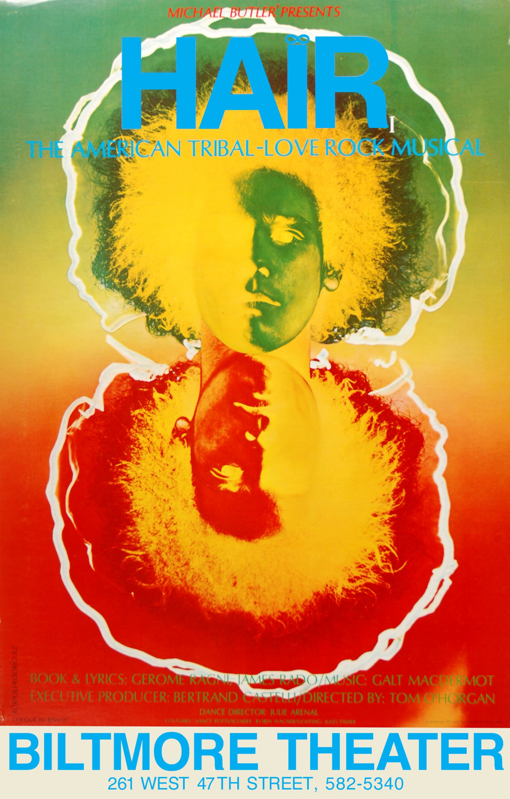
Hair, 1968, Alexius Ruspoli-Rodriguez
Created for the Broadway debut of the musical Hair, this poster would inspire an entire generation of flower children ready to embrace the “Age of Aquarius.” The image itself features a solarized photograph of a member of the cast, a process that causes the dark areas to appear light and vice versa.
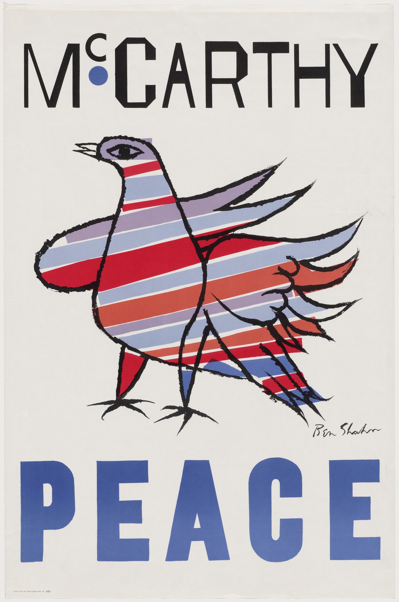
McCarthy/Peace, 1968, Ben Shahn (1898–1969)
Eugene McCarthy’s presidential campaign focused primarily on getting the United States out of Vietnam. He enlisted the designer Ben Shan, a well-known pacifist, to create this poster featuring a patriotic dove of peace.
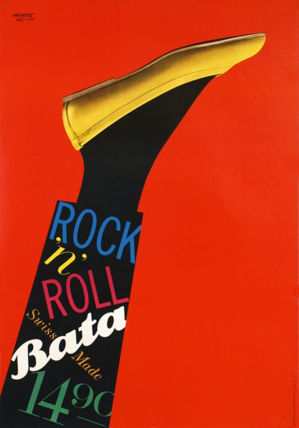
Bata, 1961, Herbert Leupin (1916–99)
Between 1943 and 1963, Leupin created numerous posters for this Swiss shoe company. Here, the artist has spelled out the intended function of Bata’s latest design—sleek flats meant for rock n’ roll dancing.
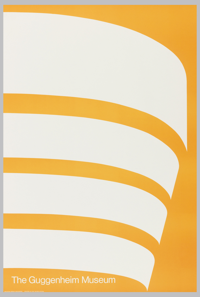
The Guggenheim Museum, 1969, James Malcolm Grear (1931–2016)
In 1969, Malcolm Grear Designers was hired to rebrand the Guggenheim Museum with a new, streamlined logo. This poster was the first step in that process, distilling the distinctive outline of the Frank Lloyd Wright building down to a set of four undulating stripes that would shift and reform in all public-facing museum material over the next two decades.
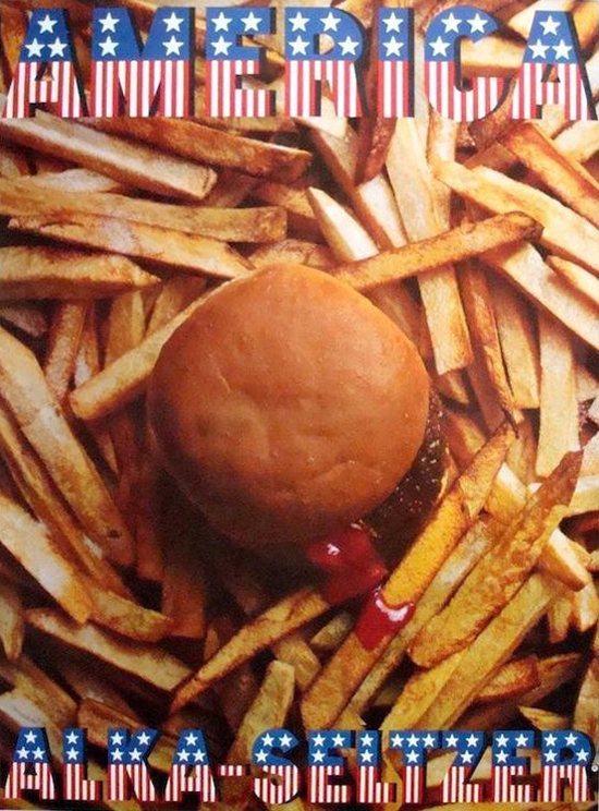
Alka Seltzer, 1968, Designer Unknown
This design is one in a series of four posters. Each image highlights a culinary indulgence from a specific country that might result in a person needing an Alka Seltzer tablet.
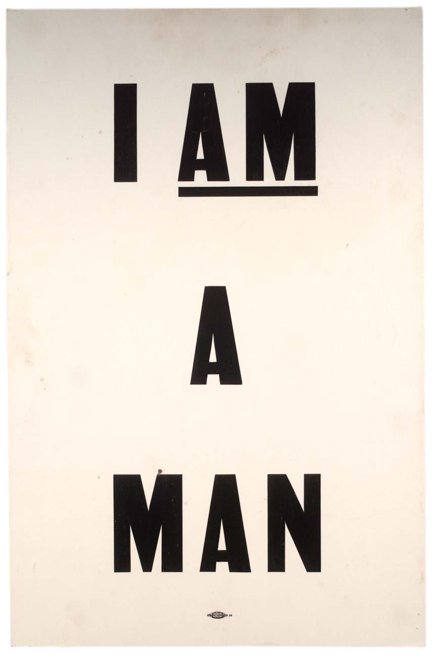
I Am A Man, 1968, Designer Unknown
Carried during the Memphis Sanitation Workers’ Strike as well as during protests soon after Dr. Martin Luther King, Jr.’s assassination, posters featuring this phrase reference the second paragraph in the Declaration of Independence: “that all men are created equal.” It remains one of the most iconic Civil Rights posters.
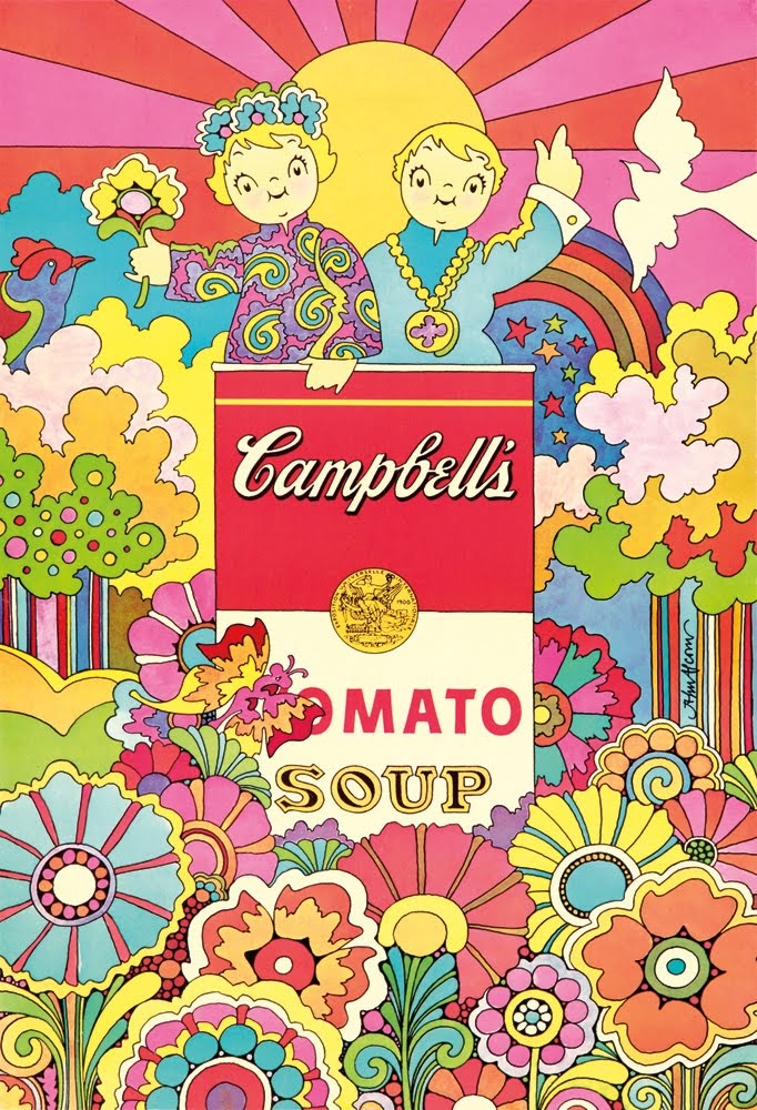
Campbell’s Tomato Soup, 1968, John Alcorn (1935–1992)
Bursting with swingin’ ‘60s style, this poster was part of a mail-in offer from Campbell’s Soup—just send in three Campbell’s-brand labels and this groovy wall art could be yours!
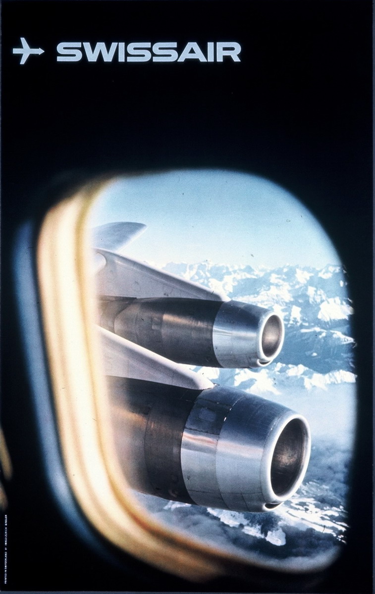
Swissair, 1961, Manfred Bingler (1928–1987)
Winner of the Swiss Poster Award in 1961, this design features the Convair 990 Coronado flying high over the Alps—a dynamic symbol of Jet Age travel.

