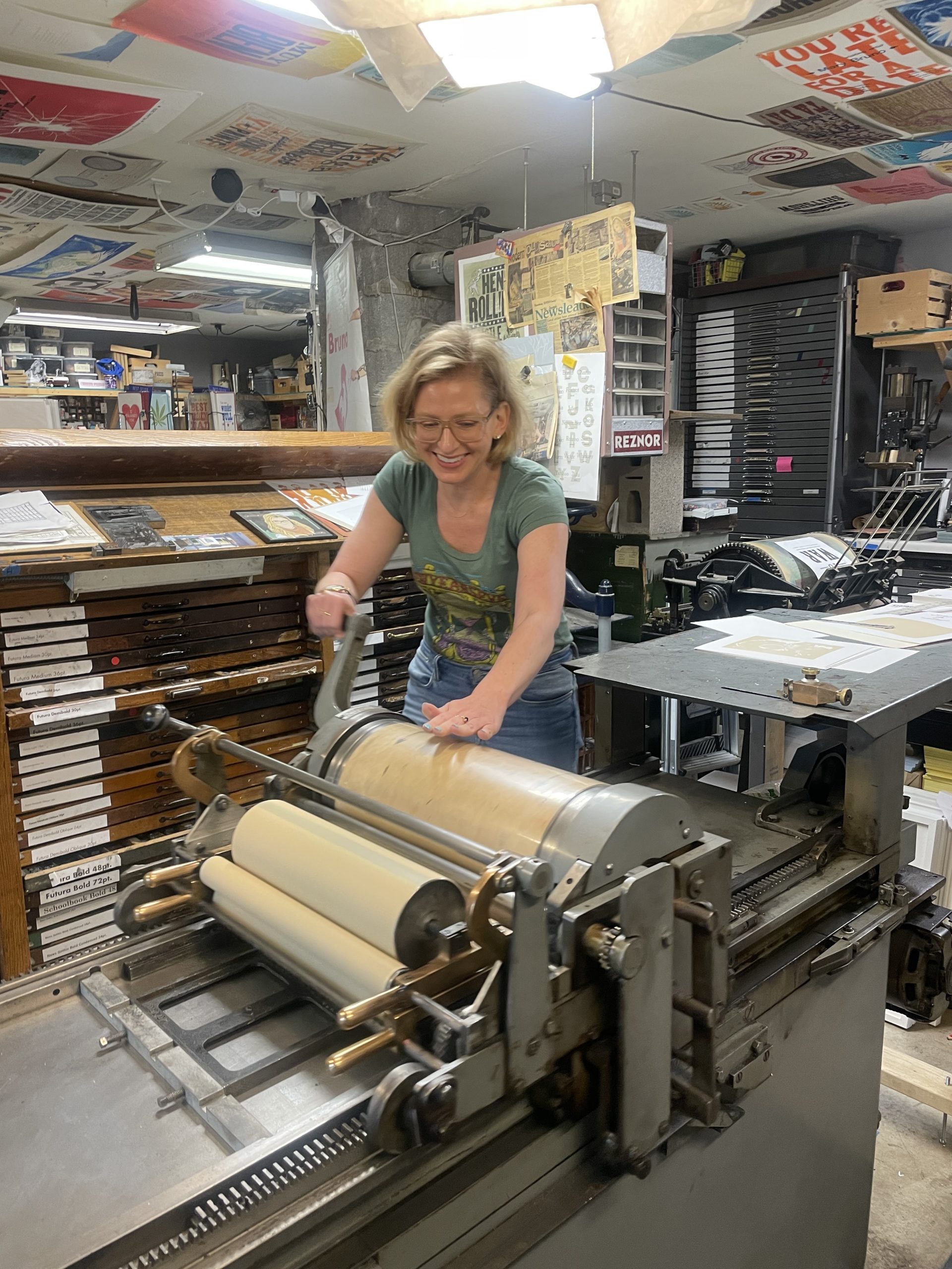

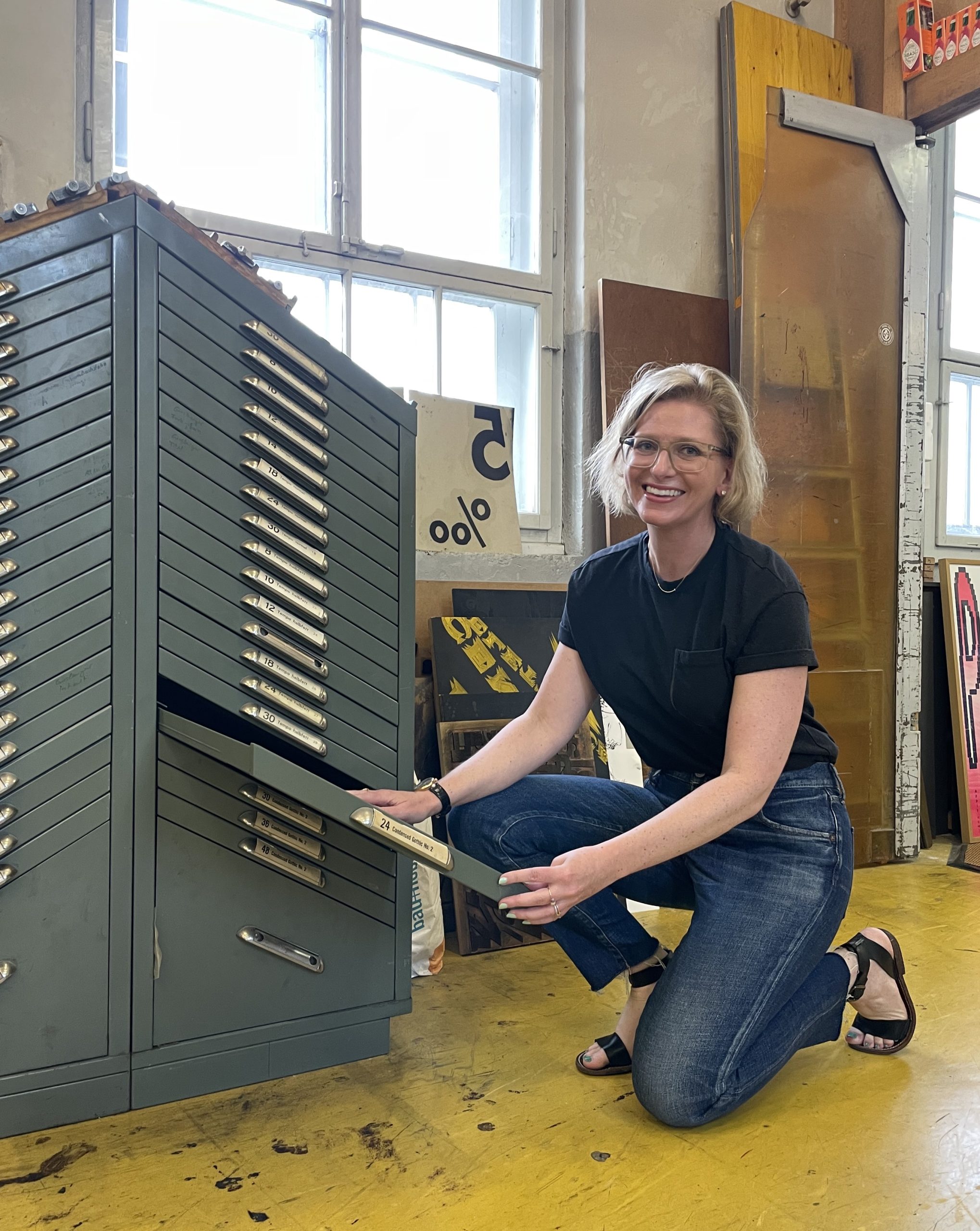
As part of my final professional development trip of the year, I spent a week with Mary Bruno, owner of Bruno Press, a second-generation print shop based in St. Joseph, Minnesota.
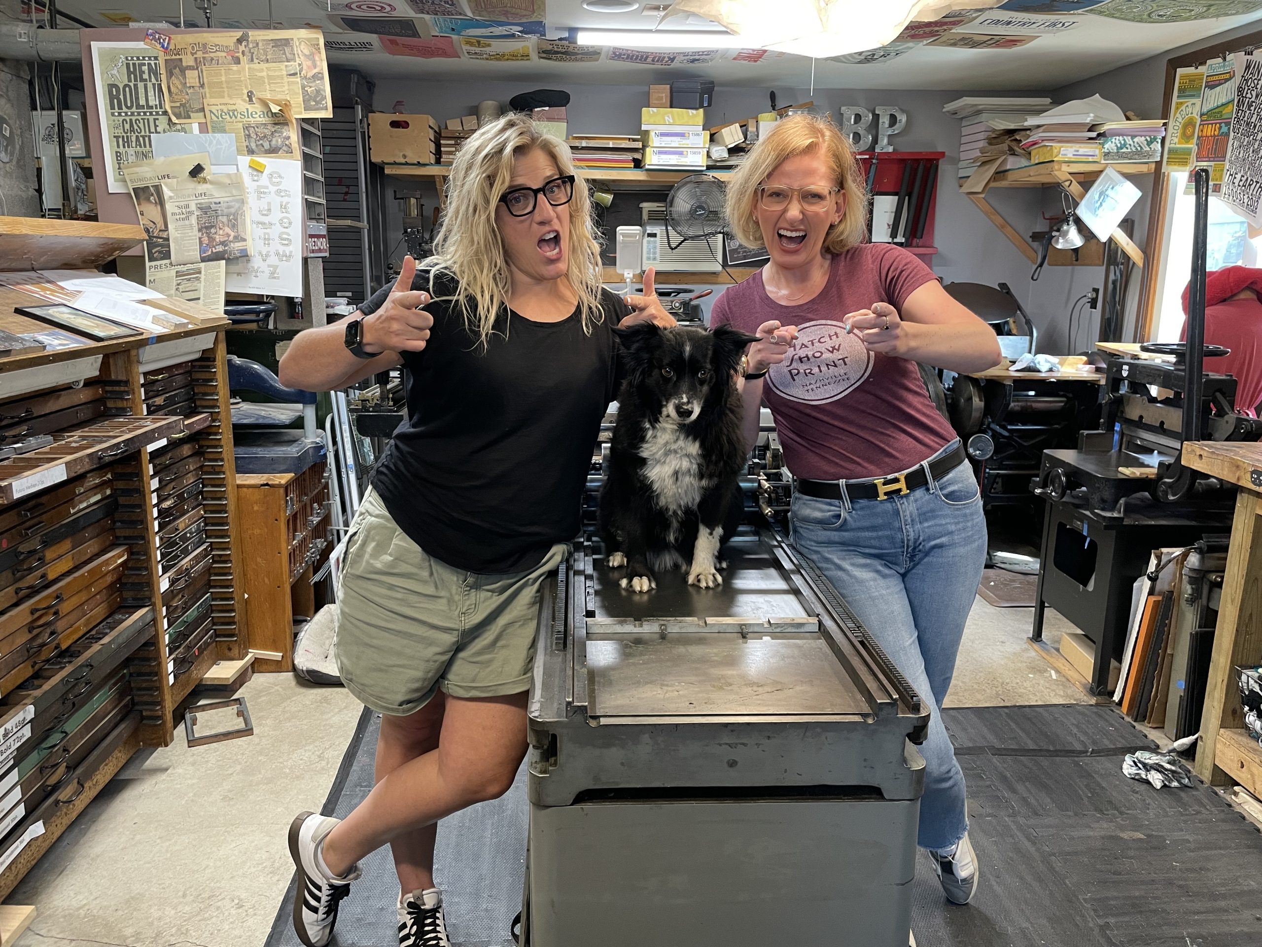
I’d met Mary two years ago at my first Hamilton Wayzgoose. A mutual friend had told us to look out for each other, and thus a beautiful, blonde, bespectacled friendship was born. Had I not been instructed to seek her out, however, I can’t imagine letting the opportunity pass me by—affectionately known as “Sweary Mary,” she’s a social force, the type of person everyone gravitates toward because we can all secretly tell we’re going to have the best time.
My mission in Minnesota was twofold:
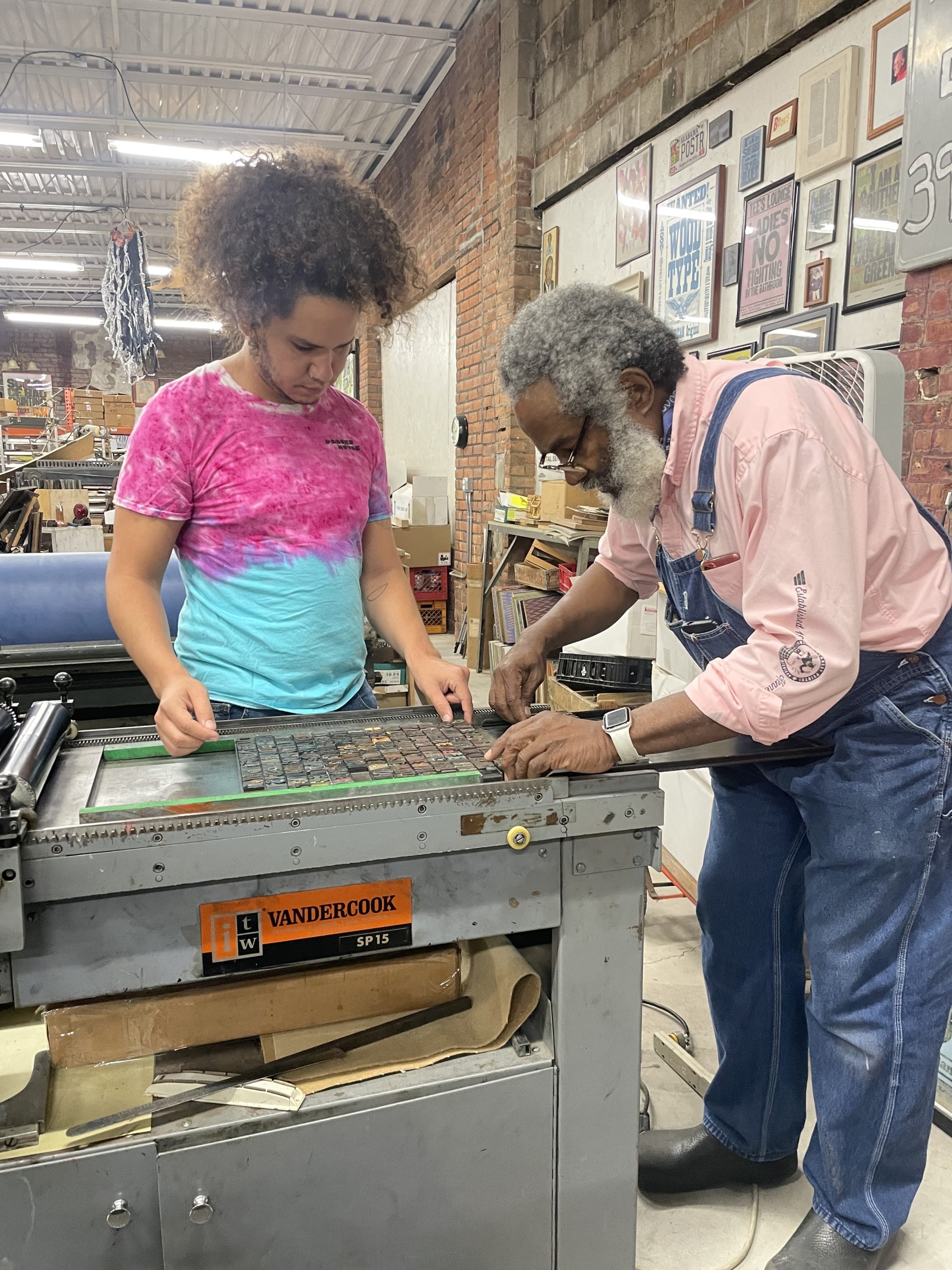
We started with skills. Having worked with Amos Kennedy, Dafi Kühne, and Rick Griffith over the past few years, I figured I knew most of the ins and outs of basic letterpress; however, as each of those designers have shown me before, there’s always more to learn.
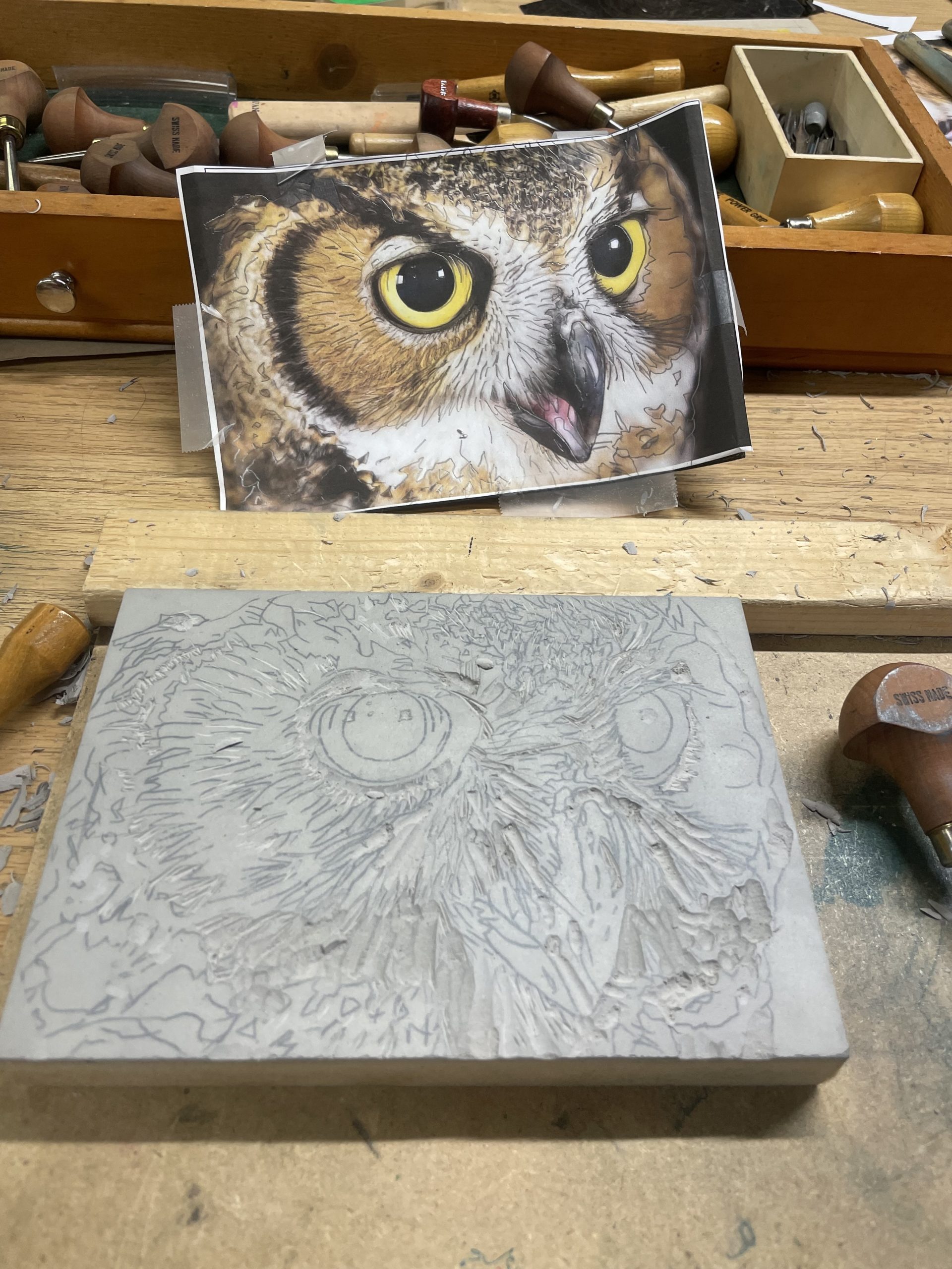
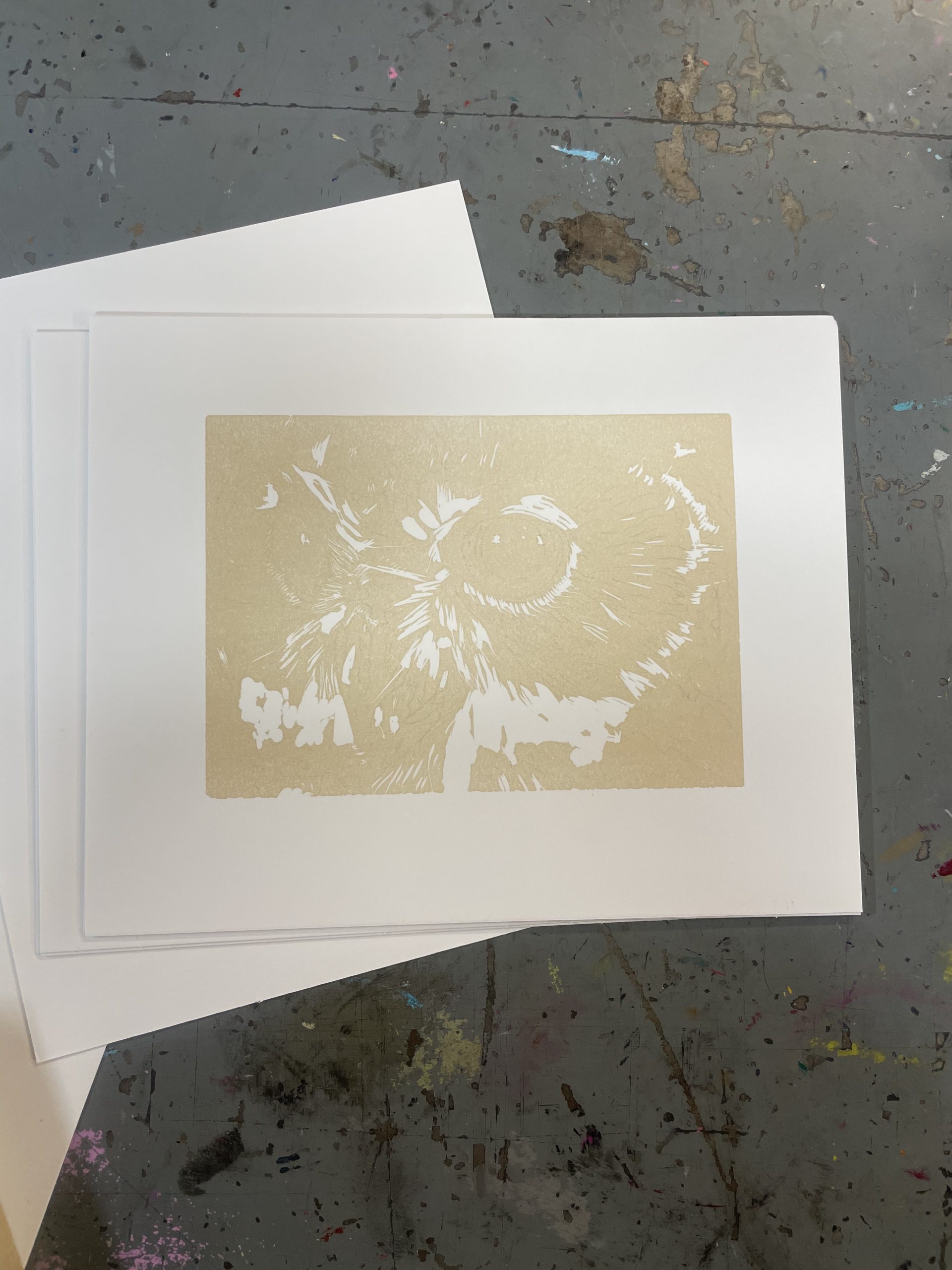
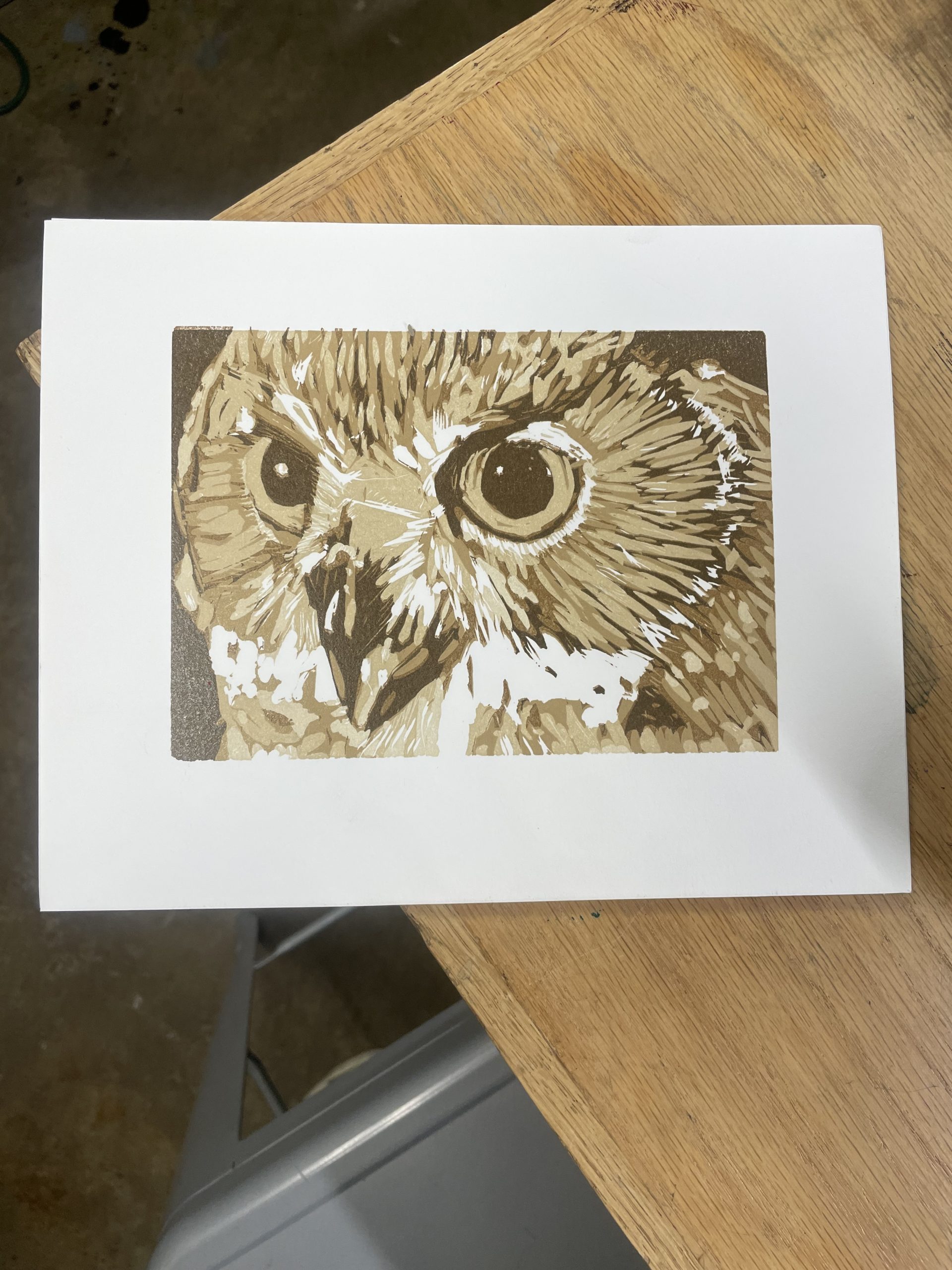
Mary decided to teach me the art of reductive printing—a type of print where the artist progressively carves away more and more of a given design to allow for buildable color and detail. It has the added benefit of easily maintaining perfect registration since you don’t need to re-measure the position of the block every time. In that sense, it’s sort of like how the classic poster lithographers “built” posters on a stone, but involving much less math.
I chose an owl as my design and, after tracing him onto a linoleum block, was instructed to carve away anything that I wanted to remain white in the print. This went on for five different layers, each time the bits I removed correlating to a darker and darker shade of owl that Mary and I would print on her Vandercook Press. The end result was far better than anything I thought I could make.
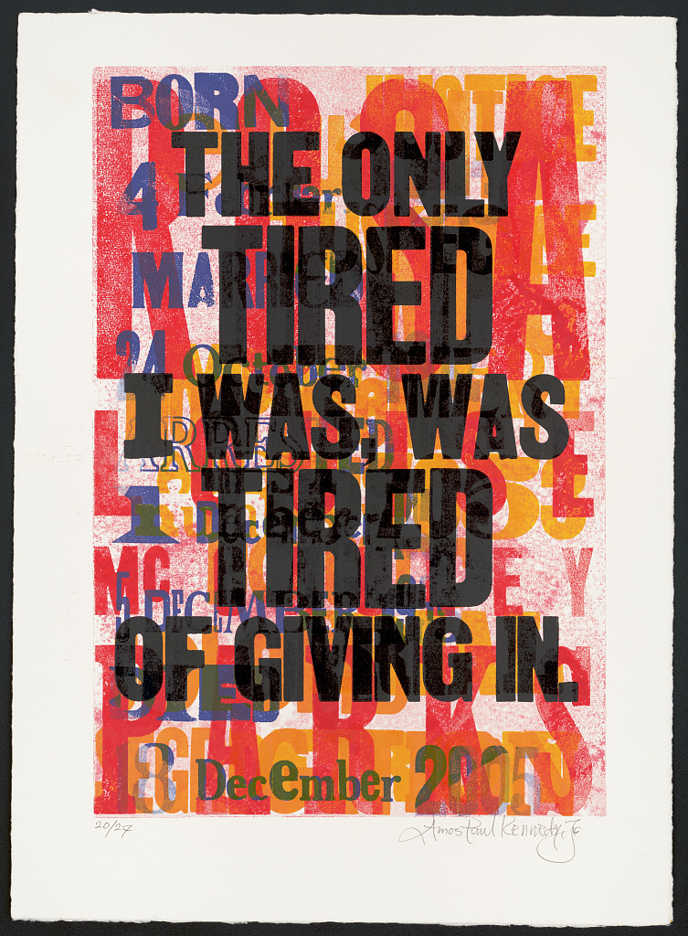
Passes one and five of my five-layered owl print.
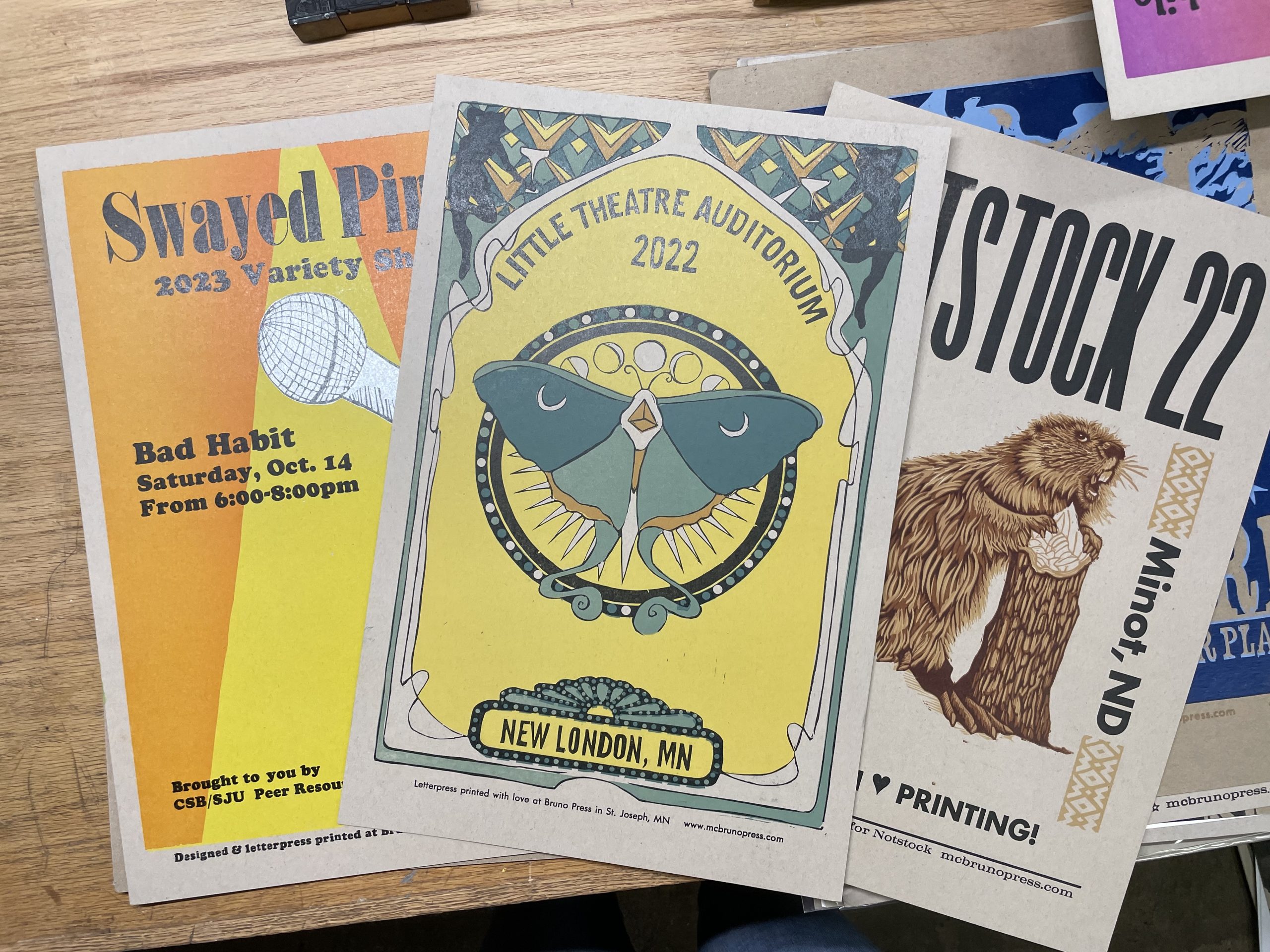
The best part, though, was subsequently going through Mary’s archive of posters and prints she’s made throughout her career to see which ones were made through this reductive method. Suddenly, posters I’d seen done by other artists were clearly made this way—I just had no idea before doing it myself how it worked. Talk about a lightbulb moment!
Some of Mary’s posters.
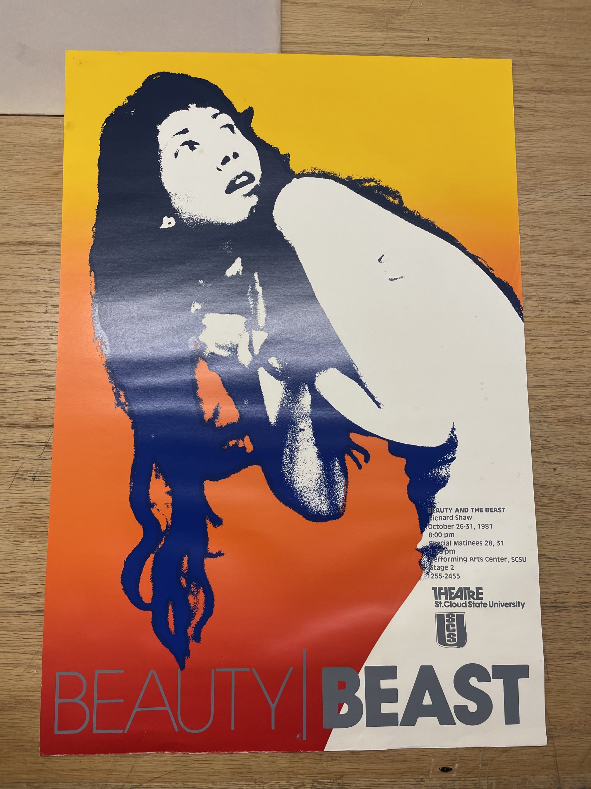
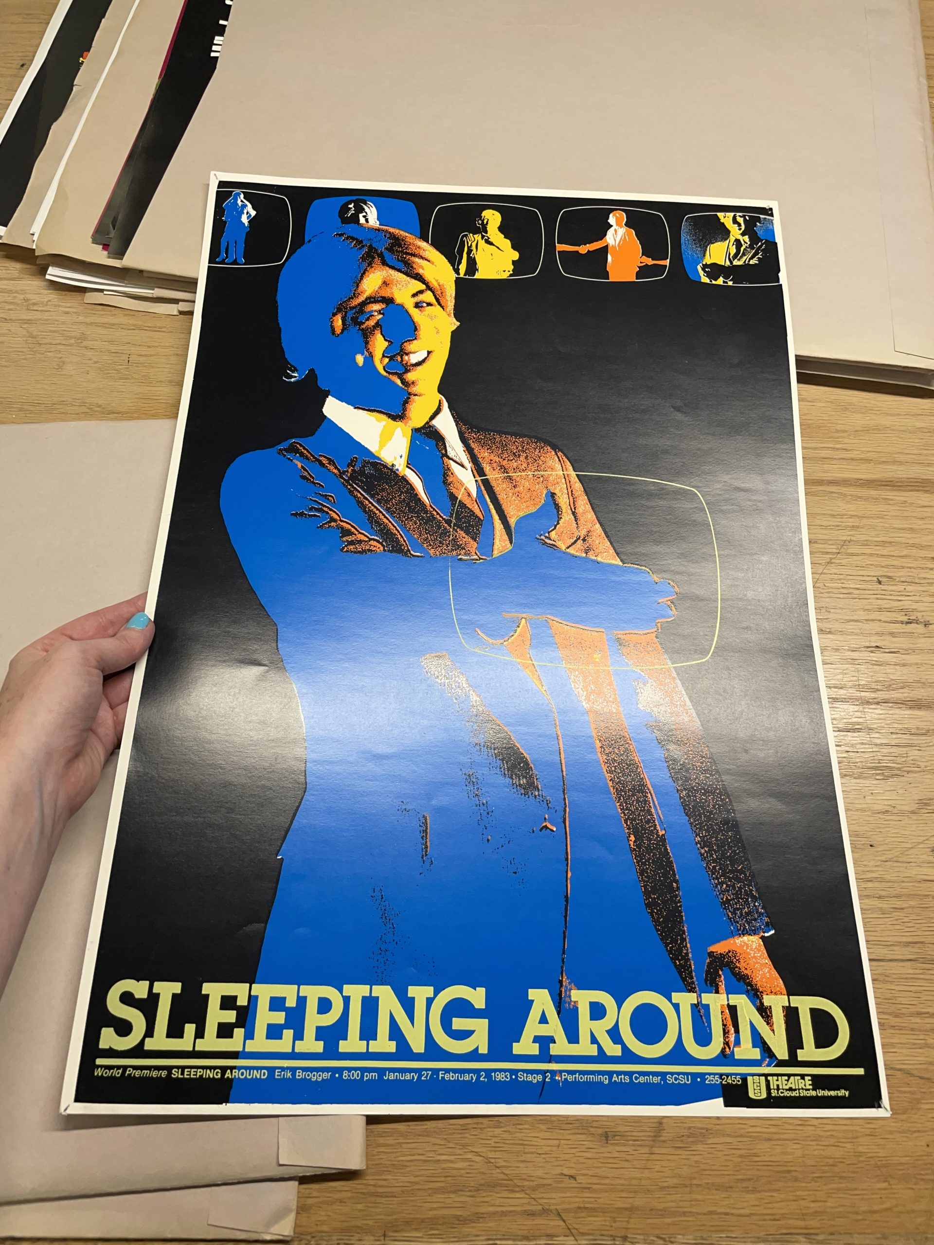
We spent a lot of time over the next few days uncovering pieces the museum could acquire that fit our definition of a poster (a public-facing notice meant to persuade that marries word and image), but, as with everything with Mary Bruno, there was another surprise on the table: we found her father’s posters.
Two examples of Don Bruno’s work.
The late Don Bruno was a master printer who created posters for St. Cloud State University in the 1980s and ‘90s. While I’ve asked our archivists to prepare a blog post specifically on the historic value of these piece, let it suffice to say for now that they fit within the pantheon of exception graphic design work coming out of university campuses, typically made by top-notch designers and rarely getting noticed for their exceptional contributions to the field. I obviously ate these up and insisted that the museum acquire a selection as well, which will hopefully make its way to the museum sometime this fall.
Overall, I can’t get enough of these types of immersive work trips. I never cease to be amazed by the talent of the international printing community and how eager they are to welcome me into their fold—but, most importantly, I’ve yet to stop getting excited that a museum like Poster House exists where their work can find a permanent home to be shared with the world.