
Erin McCarty is a member of Poster House’s design team. In this post, she is sharing a selection of her favorite posters that she’s created for the museum’s First Fridays program along with her inspirations and creative processes.
I first visited Poster House as a grad student in 2022, lured in by my fixation on Soviet film posters. After spending hours writing essays and digitally curating moodboards, I was amazed to be surrounded by the same work that fueled my own personal design projects. Two years later, I joined the design team at Poster House, and I had to shift my perspective from a student to a contributor of the same space.
As part of my now-typical Poster House workload, I create the monthly First Friday posters. With their incredibly open-ended briefs, the project is assigned to me as practically a blank slate. The greatest challenge comes from having to scavenge my brain for design inspiration. The varied event lineup each month serves as the first visual idea to explore. Woodblock printing event? Now’s the chance to break out my woodblock printing materials. New exhibitions can also affect the poster direction, as I’m surrounded by their material for months on end and their influence can subconsciously bleed into other work. Current events and holidays (e.g., Valentine’s Day, Disability Pride Month) can weave their way into the designs; or sometimes the poster is simply a new style or creation method I’ve wanted to experiment with.
With twelve First Friday posters on my roster, now seems like a timely moment to revisit the posters that generated the most intriguing behind-the-scenes processes. Each month brings a tangled web of ideas and rough drafts that eventually spawn the posted-up versions you might see around the Poster House perimeter.
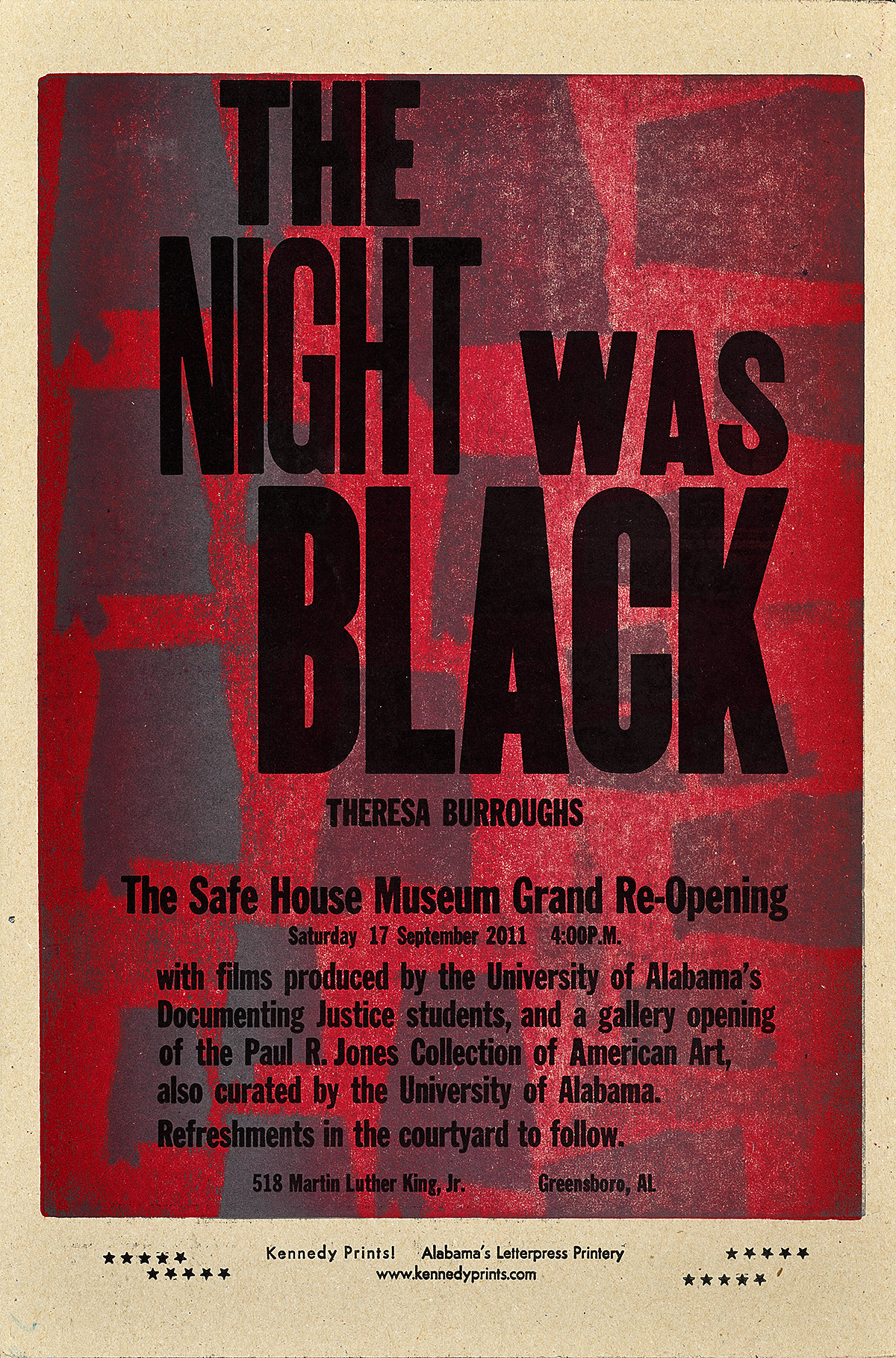
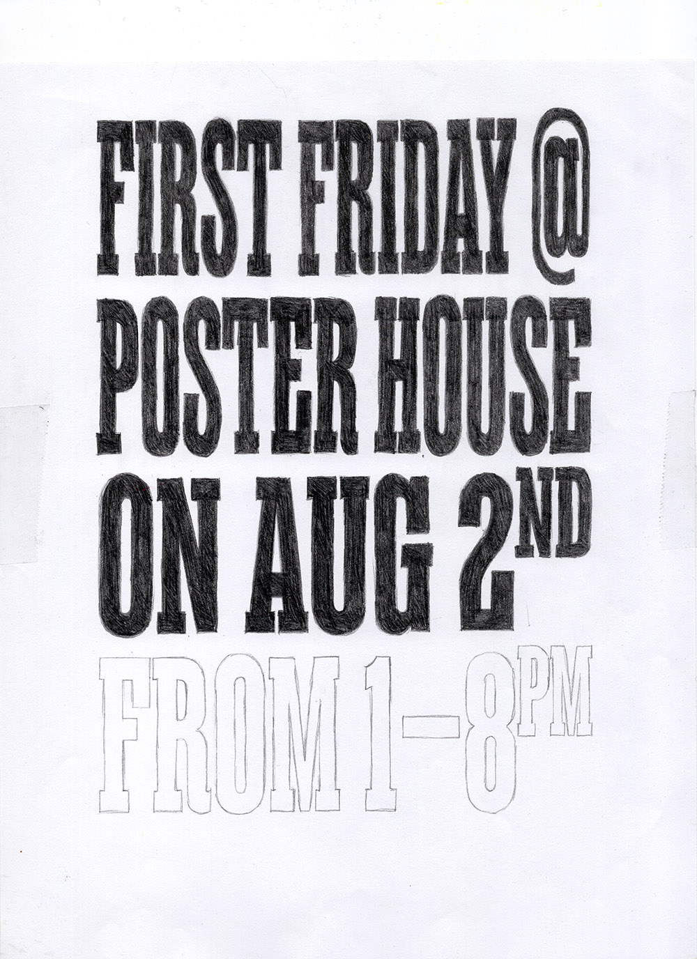
Poster for the August 2024 First Friday
Created during the peak of my summertime misery, August 2024’s poster served as a manifesto for my anti-summer propaganda. The frying concrete and lack of a coastal breeze during New York City’s summer has a way of making me yearn for the black ice sludge puddles of Capricorn season. Motivated by my grudge, I wanted to craft a poster that replicated the feeling of the sun simmering down on you; the moment you look up to the sky and are blinded while the heat slowly cooks away. With a large, type-focused poster, I turned to letterpress posters (à la friends of Poster House: the Arm, Amos Kennedy) as main sources of inspiration.
Left: The Arm at the 2024 Poster House Block Party
Right: The Night Was Black (2011) by Amos Paul Kennedy, Jr.
A major obstacle for this poster was my lack of instant access to the aforementioned letterpress printing materials, so, as always, I went with a DIY approach. With the composition looking too pixel-perfect after digitally laying it out, I printed the text layer and started scribbling around. I pulled the lamp off my nightstand and traced over the printed sheet to create a more rough-textured, hand-drawn lettering style. After scanning my drawing and touching it up, I used a blend mode in PhotoShop to let the bottom layers peek through, digitally recreating a more analog, layered printing effect.
Digital scan of hand-drawn text
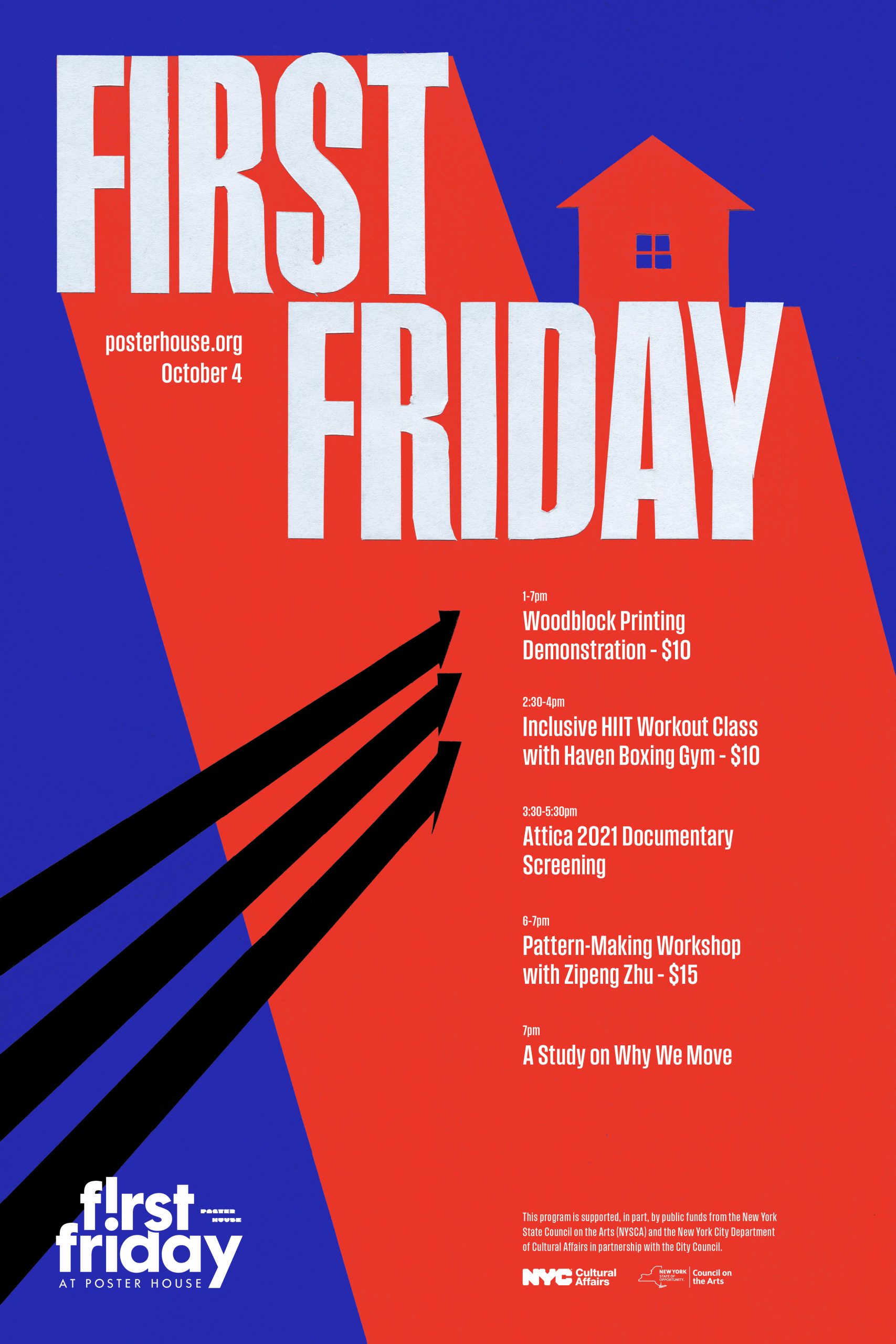
Poster for the October 2024 First Friday
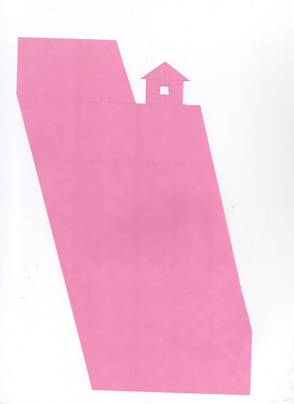
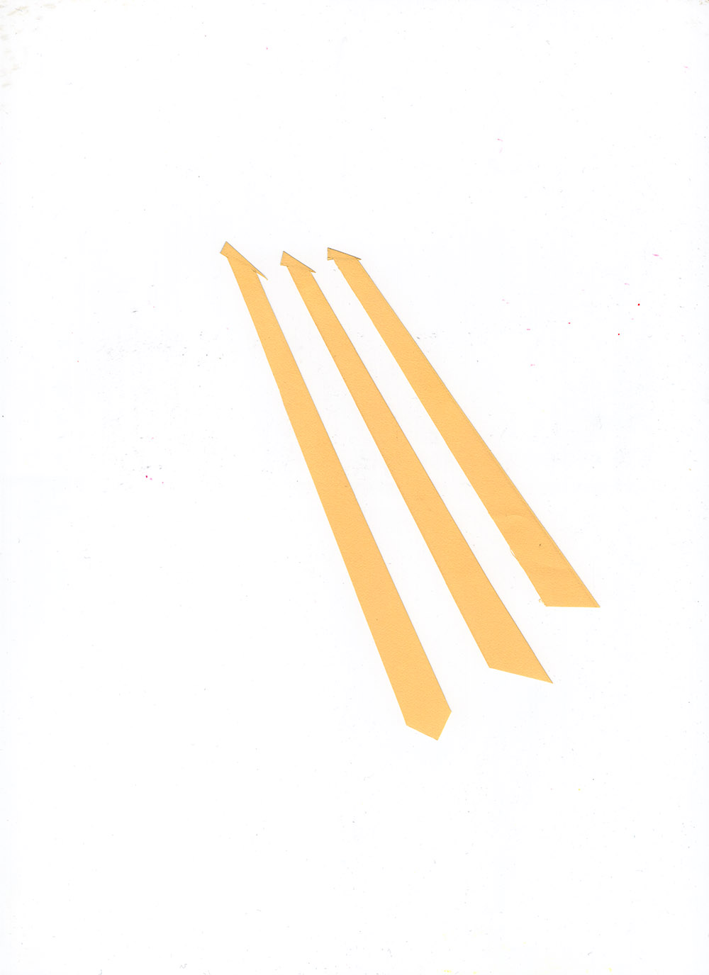
Following the kick off of fall’s Lester Beall exhibition, October 2024’s poster was an homage to Beall’s modernist approach to design. When attempting to replicate another designer’s style, I have to exercise my pattern-recognition skills and take note of the recurring visual motifs that appear in their works. After walking through the exhibition space once the show was up, I was struck by Beall’s use of incredibly bright, patriotic colors. They fill large swaths of negative space within his compositions, often accompanied by angular interjections—arrows being the most common. His use of image masking or silhouetting (removing background elements to isolate the shape of a subject) might imply the use of hand-cut collage during his creation process. By producing a sort of step-by-step formula for his compositions, I was able to attempt to make a “Beall” poster of my own.
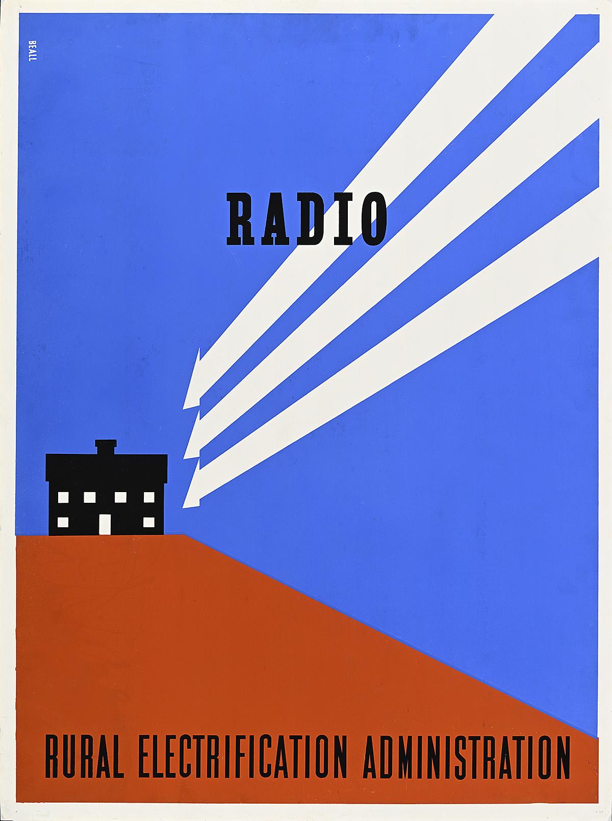
Radio/Rural Electrification Administration (1937) by Lester Beall
Before diving into the inevitable hand-cut collage direction I knew my poster was going to take, I digitally mapped out everything. Beall’s Radio/Rural Electrification Administration poster served as my main template–primarily because my mind connected the house to a poster…house. I took a crack at font-matching the Rural Electrification Administration text in the original image by searching for a condensed sans serif typeface. With a handful of fonts grabbed, I narrowed down my selection by looking at the individual letters. The bottom of an A needs to be the right height; the center of an R aligned just so. Field Gothic Narrow No.23 was the typeface winner, and with that, it was collage assembly time. I printed out each individual layer from the digital artboard, then traced and cut out the shapes with a scalpel. Each element was then scanned, digitally retouched, then assembled as separate layers back into the digital collage.
Digital scans of the first two cut and collaged layers
Digital scan of the final cut and collaged layer
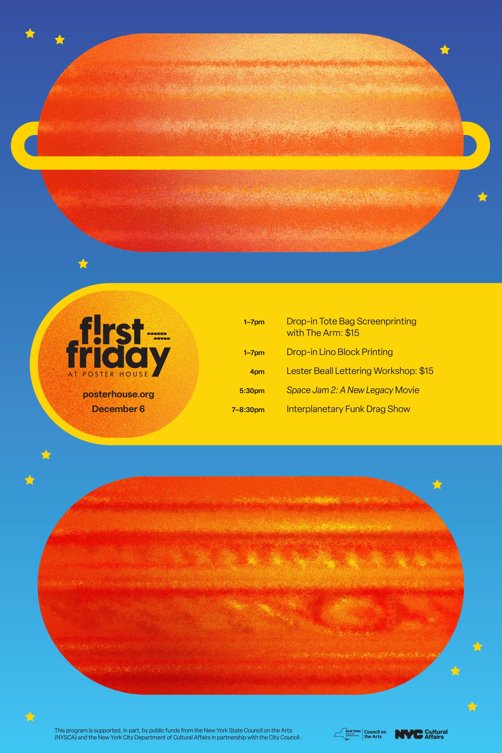
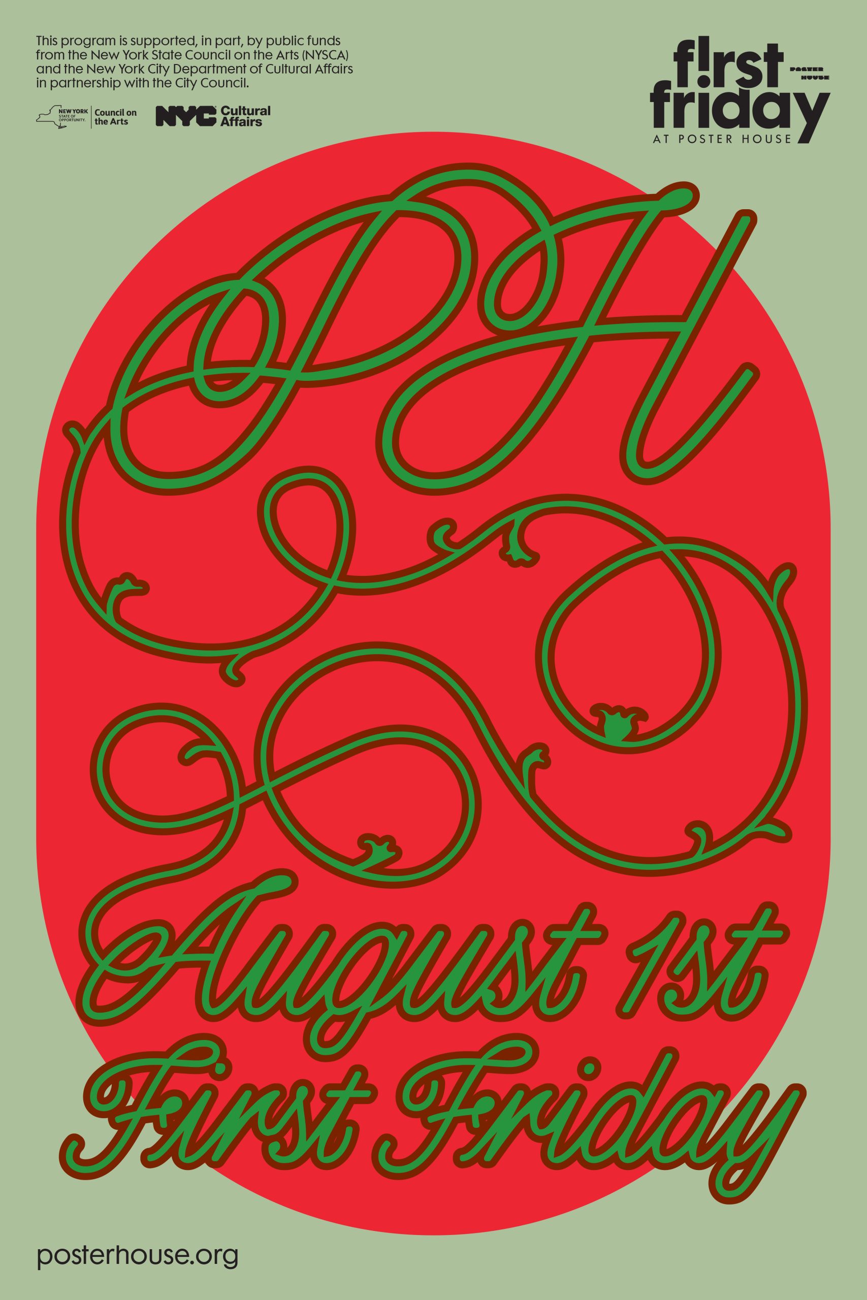
Poster for the December 2024 First Friday
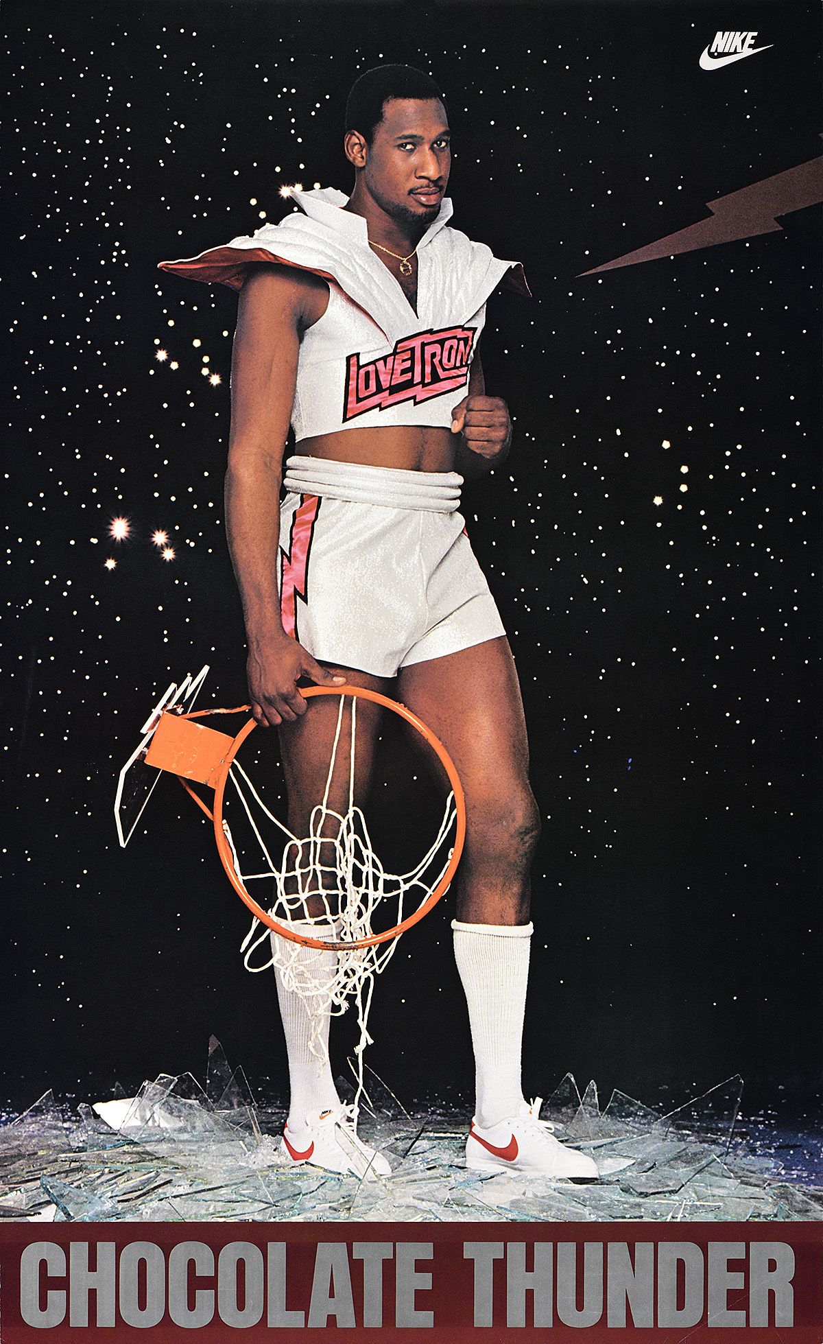
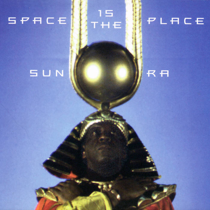
December 2024’s poster was based on the many intergalactic-themed events for the month, alongside the recognized favorite from the Nike exhibition: Chocolate Thunder/Darryl Dawkins. The first step for channeling a similar intergalactic campy visual required blasting the entire Parliament-Funkadelic discography (probably Funkentelechy) on loop. Following the p-funk high, I dipped into some Sun Ra while looking at Space Age furniture moodboards. After spending hours immersed in the bright sounds and colors of the late 1960s and ’70s, my brain began rapidly firing visuals of bouncing planets and skating asteroids.
Chocolate Thunder/Darryl Dawkins (1982) by photographer: Chuck Kuhn
Collection of Bruce “ImaPaqRat” Fisher
Left: Space is the Place by Sun Ra
(Image source: Bandcamp, Blue Thumb Records)
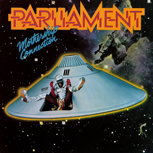
Right: Mothership Connection by Parliament
(Image source: Casablanca Records)
I wanted to create a subtly psychedelic poster, and the bright blue gradients paired with yellows and near-neon reds that I decided to incorporate made my eyes race around the composition. The detailed planet illustrations I used were meant to give an implication of depth, which is sharply countered by the flat background. This is definitely a poster I’d want to animate, as I intended for there to be an imagined movement within each element. In my mind, the surfaces of planets angrily stew as their shapes bounce along to the rhythm of bass; the sharp stars twisting around and piercing your vision with their lights; the asteroid steadily brewing as it aligns itself to the center of the composition.
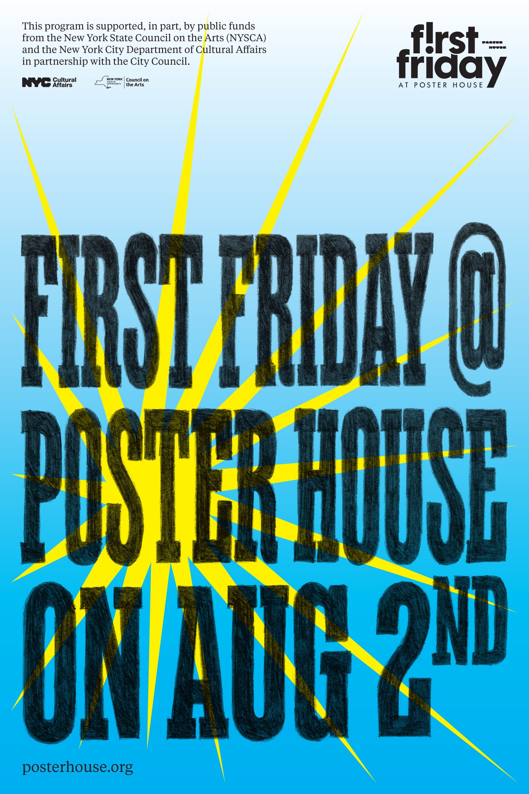
Poster for the August 2025 First Friday
For August 2025’s First Friday poster, what started as an exploration of Art Deco typography transformed into a medieval-infused composition. While struggling to brainstorm visual ideas, I turned to the upcoming exhibition on Italian Fascism, considering I was deep into related projects and regularly perusing through its checklist. Something that regularly draws my attention in work from the Art Deco period is the bold, geometric type, which often serves as a beautiful artistic flourish that can feel like the centerpiece of the design. The color combinations typically astound me, as I tend to fall into palette habits as a designer and rarely consider pairing the colors often embraced during the 1920s and ’30s. In the midst of exploring Art Deco typefaces and color combos, I kept feeling that something was missing from my composition—but couldn’t piece together what it was.
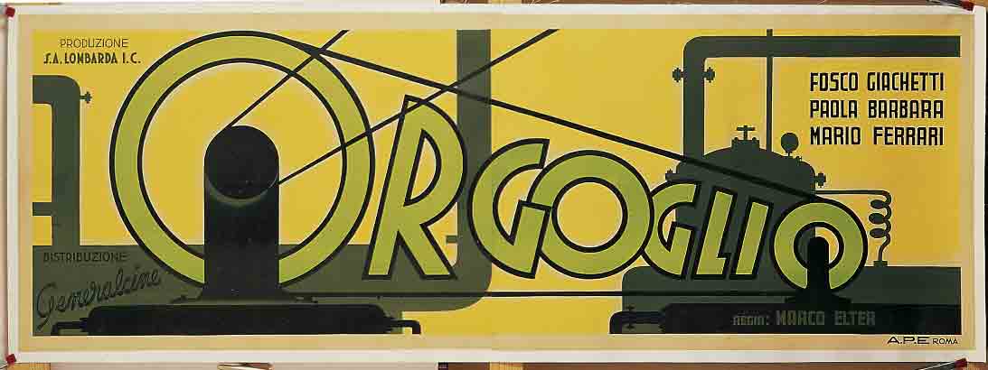
Orgoglio (Pride) (1938) by Carlo Bompiani
Fondazione Massimo e Sonia Cirulli Collection, Bologna
As a tangent during my explorations, I discovered the Pencerio typeface and downloaded it with the intention of saving it for the following month’s poster. I spent way too long looking at ideas to bookmark, and at some unrecallable moment the side-by-side August and September artboards began to merge. With the Art Deco-inspired colors and the new curly typeface, I was reminded of my obsession with medieval illuminated manuscripts. I began interweaving letters and sprawling vines across the empty space. Once finished, I realized I had no idea where I had mentally gone during the creation process, or even what I created, but I knew I was a fan of the end result.
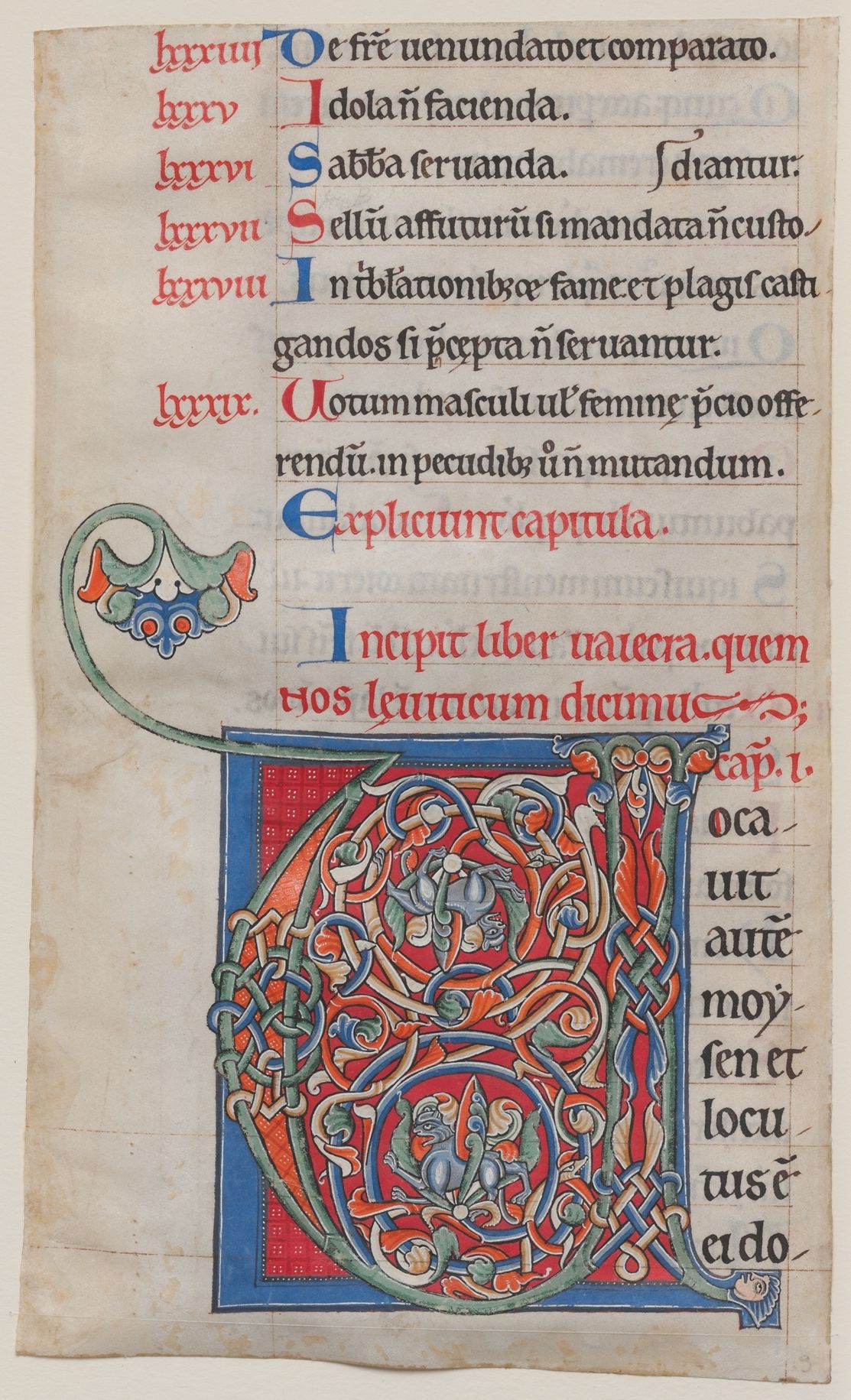
Manuscript Illumination with Initial V (c. 1175-95) from a Bible
The Cloisters Collection
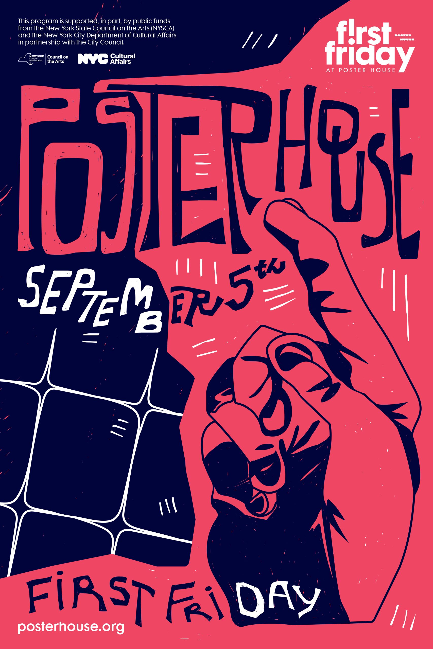
Poster for the September 2025 First Friday
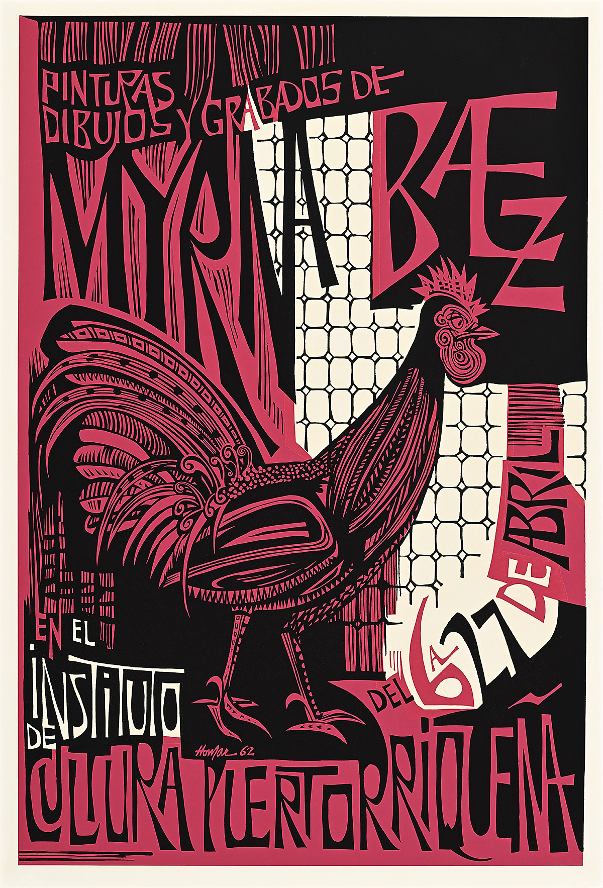
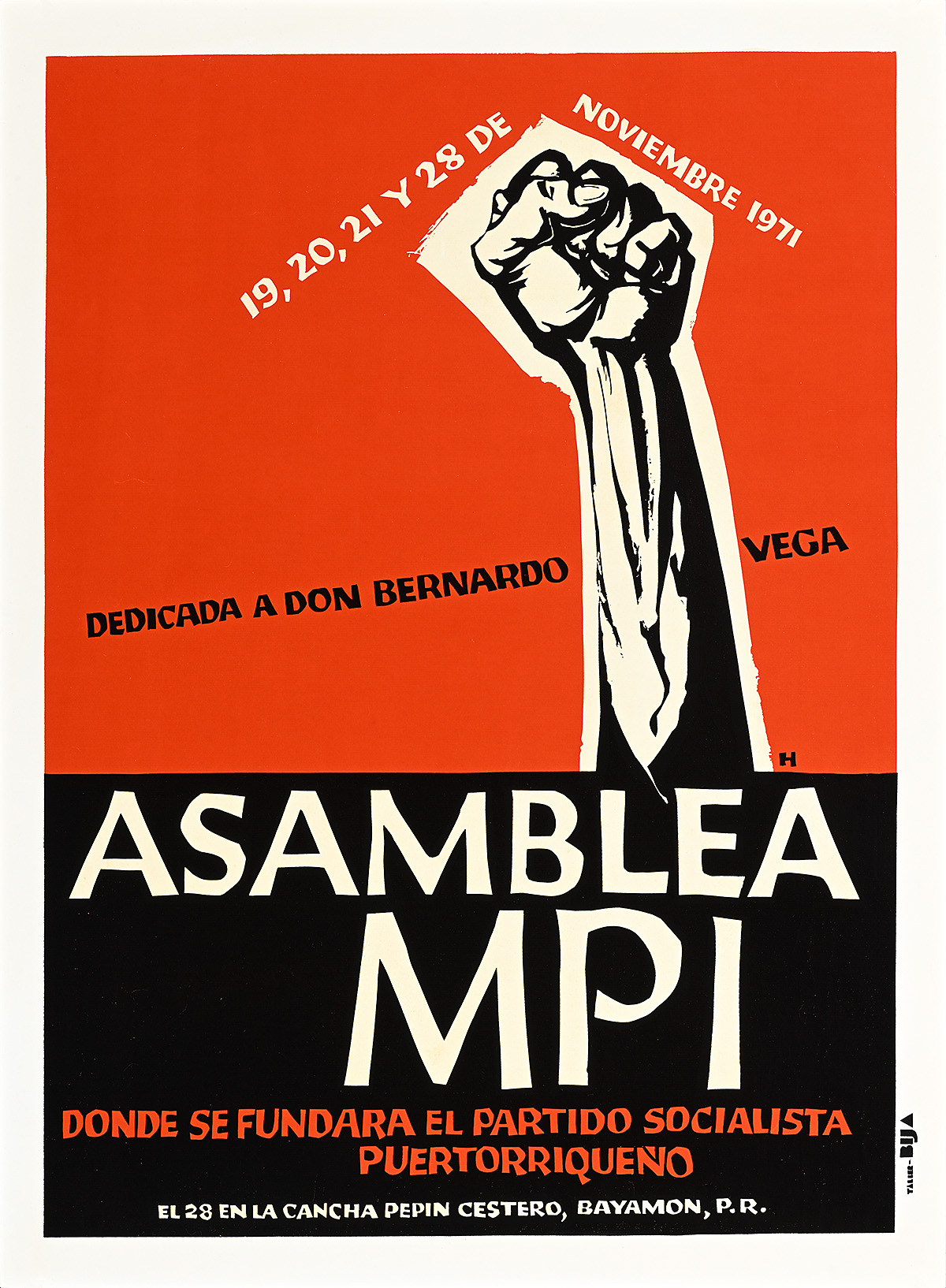
Printed during the final weeks of the exhibition dedicated to Lorenzo Homar, my September 2025 First Friday poster attempts to replicate the feeling of the artist’s myriad designs. While analyzing his work to pinpoint his most recognizable motifs, I noted that my composition would need to include handwritten lettering, a vivid background color, and some sort of block-printed illustration. In all of his posters, Homar’s lettering was very expressive, appearing often as a rough-brushed cursive or angular and interlocking type. His color choices also stood out to me during my first walk-through of the show, specifically how incredibly bright the reds seemed to glow in person. The focal point of his compositions are often rough-edged illustrations that cut through the design.
Left: Pinturas Dibujos y Grabados de Myrna Báez (Paintings, Drawings, & Engravings by Myrna Báez) (1962) by Lorenzo Homar
Poster House Permanent Collection
Right: Asamblea MPI (MPI Assembly) (1971) by Lorenzo Homar
Poster House Permanent Collection
When you put my poster side-by-side with Homar’s Pinturas Dibujos y Grabados de Myrna Báez (Paintings, Drawings, & Engravings by Myrna Báez), you will see some similarities, as his image served as my main reference point. I also pulled the idea of using a hand as the central illustration point from Homar’s Asamblea MPI (MPI Assembly). Created while I was away from my usual workspace, I couldn’t rely on my typical method of translating analog block prints into digital scans. As such, the digital nature of the poster is evident in the fact that each block of color is actually composed of individual vector paths. I’m not exactly sure why I made the process harder for myself by using vectors instead of a simple brush tool, but the precise nature of the vectors created really sharp, jagged intersections that added to the hand-carved look I was mimicking.
The next time you spot a First Friday poster in the wild, it might be worth taking a closer look at some of the details. Beginning as a blank-slate design brief means I frequently turn to my surroundings for visual inspiration. Whether subconsciously or not, that means the posters may include easter eggs of my other ongoing projects at Poster House, reference current or upcoming exhibitions, or unearth some deepcut discoveries after falling down a research rabbit hole. I hope others can find inspiration in my posters, as I definitely view them as a platform to share the most interesting ideas I stumble upon each month.