Posters of the Green New Deal
.This article by our Chief Curator is reproduced in its entirety from the Muse by Clio, where it first appeared on September 5, 2019.

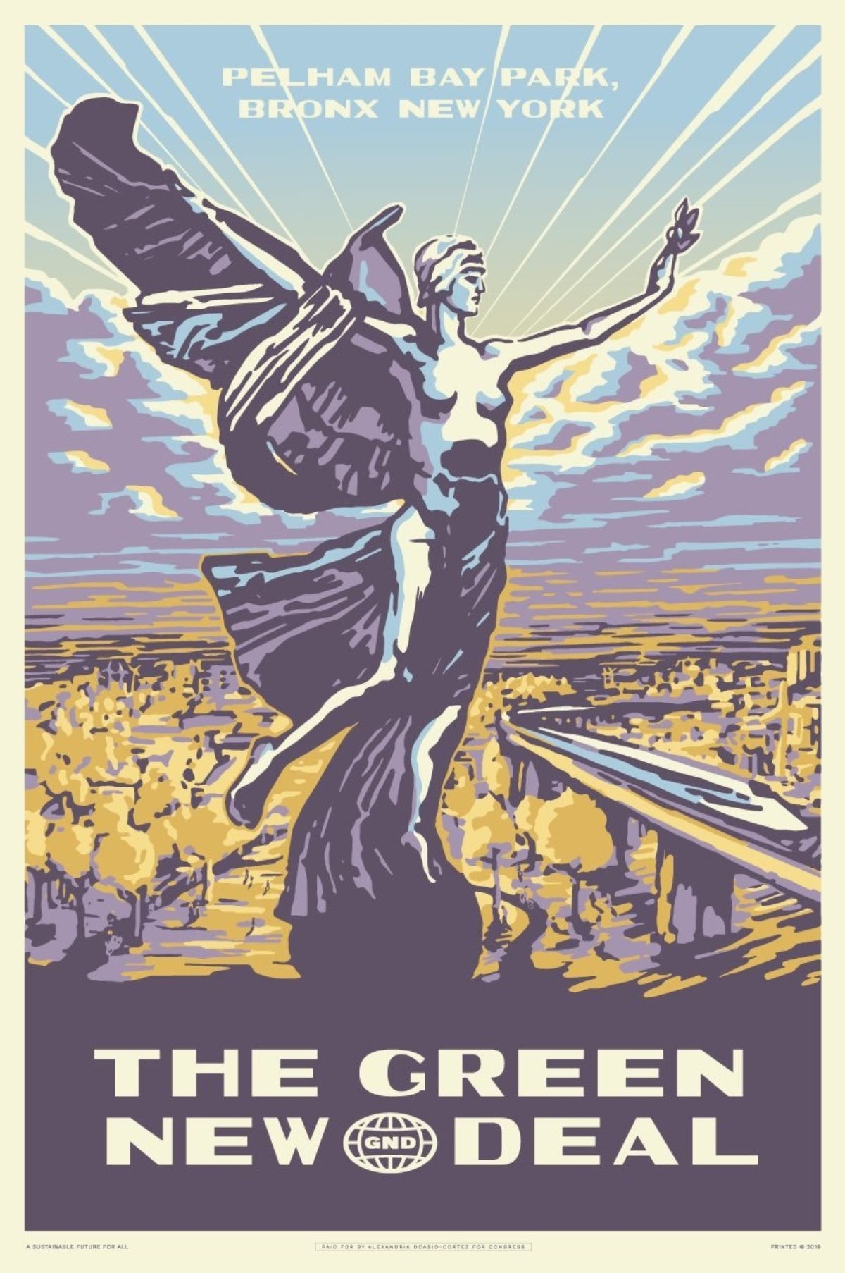
The Green New Deal / Pelham Bay Park, Tandem (2019)
On Aug. 30, Alexandria Ocasio-Cortez tweeted images of the first two posters in a series promoting the Green New Deal. Like the title of her ambitious proposed legislation, these posters reference FDR’s New Deal, specifically the Works Progress Administration, created to combat the Great Depression.
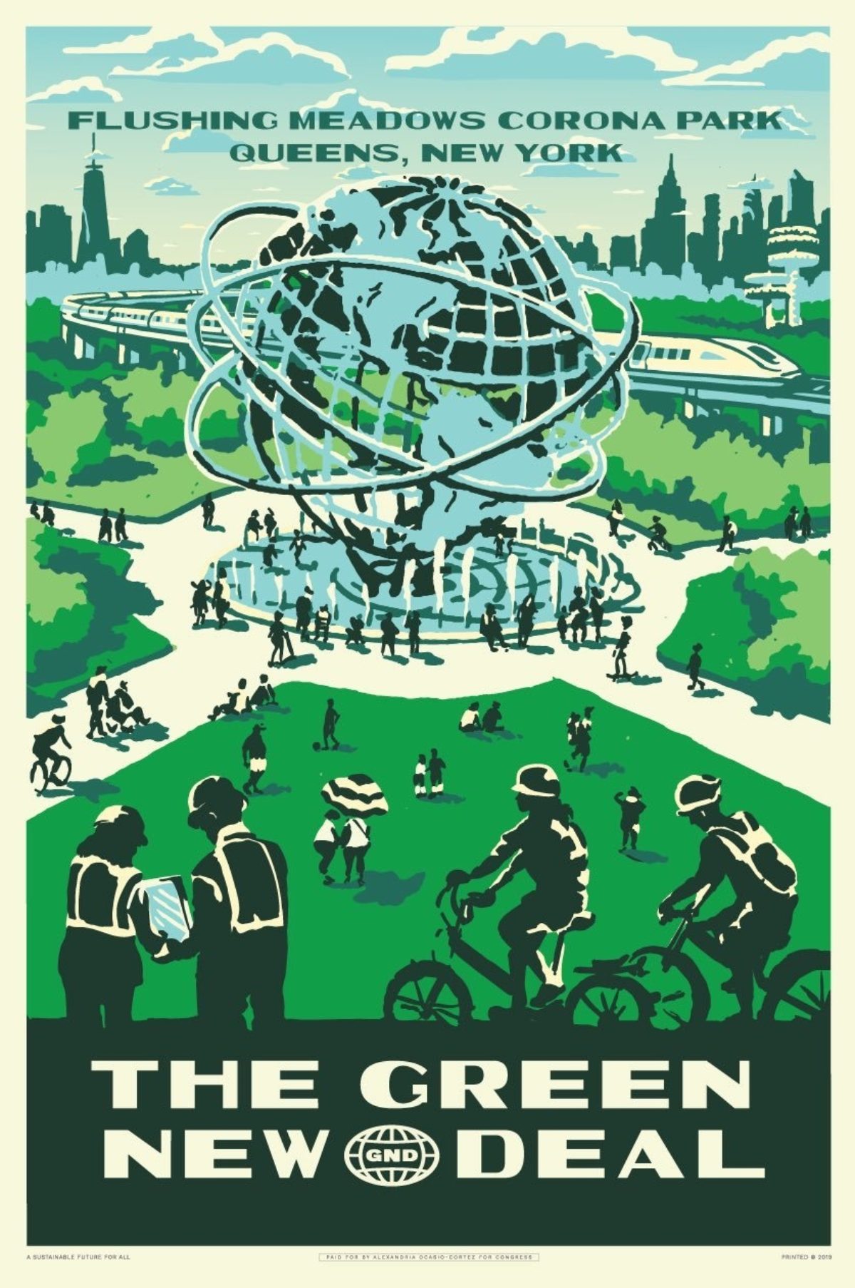
The Green New Deal / Corona Park, Tandem (2019)
Between 1936 and 1943, over 2,000 unique posters were designed and printed by the Federal Art Project within the WPA. They announced events and exhibitions, informed viewers about the value of public health and education, and, most memorably, celebrated the country’s National Park System.
Tandem, the NYC firm behind the new posters (which also branded AOC’s successful 2018 congressional primary campaign), did well to choose these images as inspiration, as they are considered by most poster historians to be a highpoint in American poster output, and are some of the most rare and beloved by collectors. More importantly, they represent one of the first moments when the U.S. government supported the arts on a national scale, and actively pushed citizens overwhelmed by the Depression into a brighter economic future.
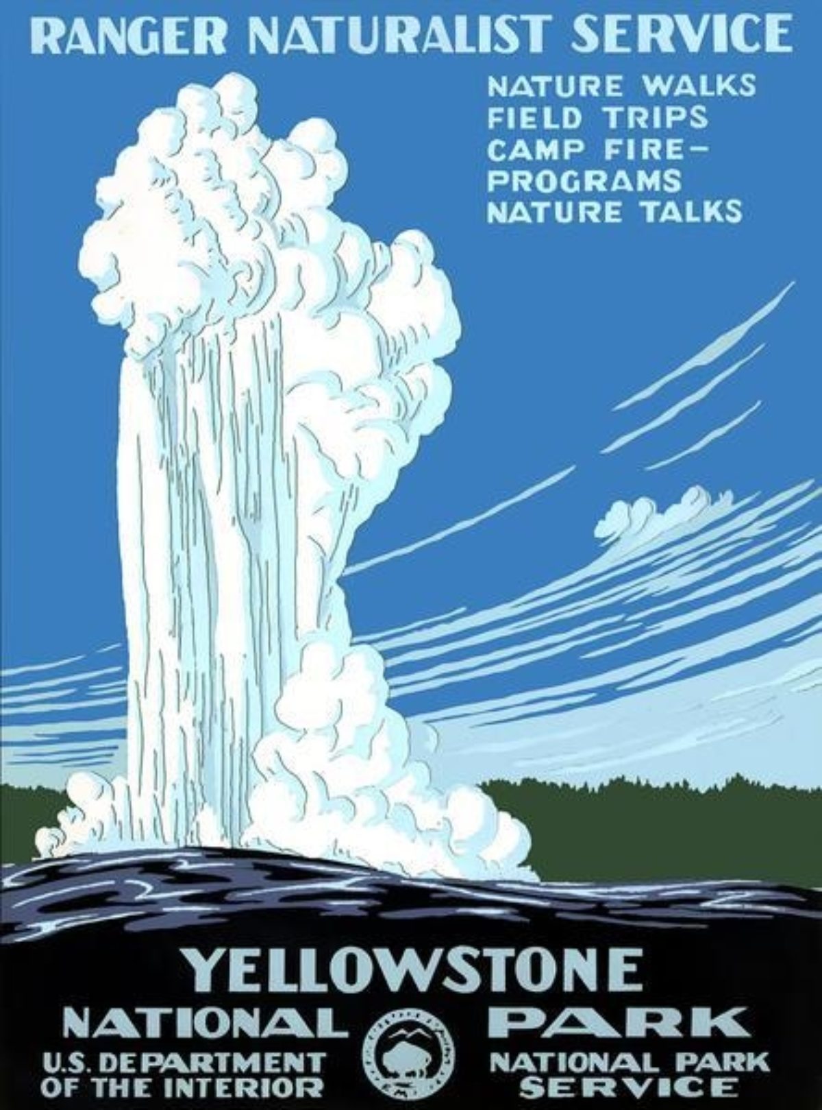

Left: Yellowstone National Park, Chester Don Powell (ca. 1938)
Right: Grand Canyon National Park, Chester Don Powell (ca. 1938
Fittingly, the first poster department within the WPA began in New York City, home to both AOC and the two parks highlighted in this initial GND poster collection. Mayor Fiorello LaGuardia embraced the power of posters early on, and had already established the Mayor’s Poster Project within the national Civil Works Administration (a temporary predecessor to the WPA). When the Federal Arts Project was born, it absorbed this poster-making division, using it as a template to create similar outposts across the United States.
While the posters handed out last weekend are digitally printed, it’s been mentioned that larger silkscreen versions will soon be available. This choice further parallels the Green New Deal posters and their inspiration, as FAP posters were mostly created via screen printing—a highly tactile and inexpensive way to create a limited run of images. Silkscreening posters within the FAP was also a highly collaborative effort, with artists working alongside technicians to realize finished designs. The results in both instances create depth and form through flat planes of color layered on top of one another, typically accompanied by clear, sans-serif text. They are not photorealistic, and yet they are highly evocative, timeless depictions of public space.
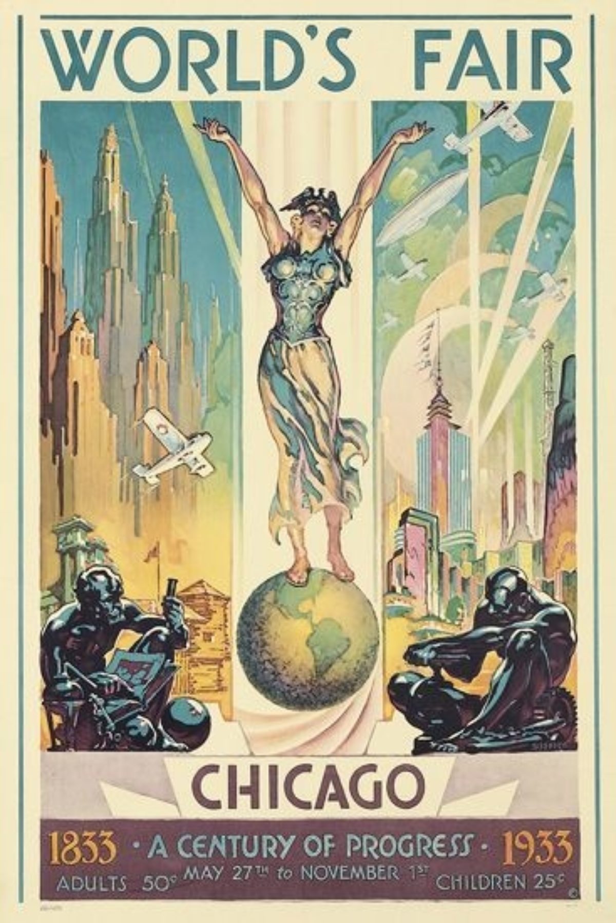
World’s Fair Chicago, Glen C. Sheffer (1933)
Although the style is heavily linked to that of the WPA, the compositions of both GND posters also tap into other moments in poster history. The image for Pelham Bay Park prominently features the Bronx Victory Memorial, but the positioning of the statue is a spot-on nod to Glen C. Sheffer’s 1933 Chicago World’s Fair design (another fitting choice given the event’s subtitle, “a century of progress”).
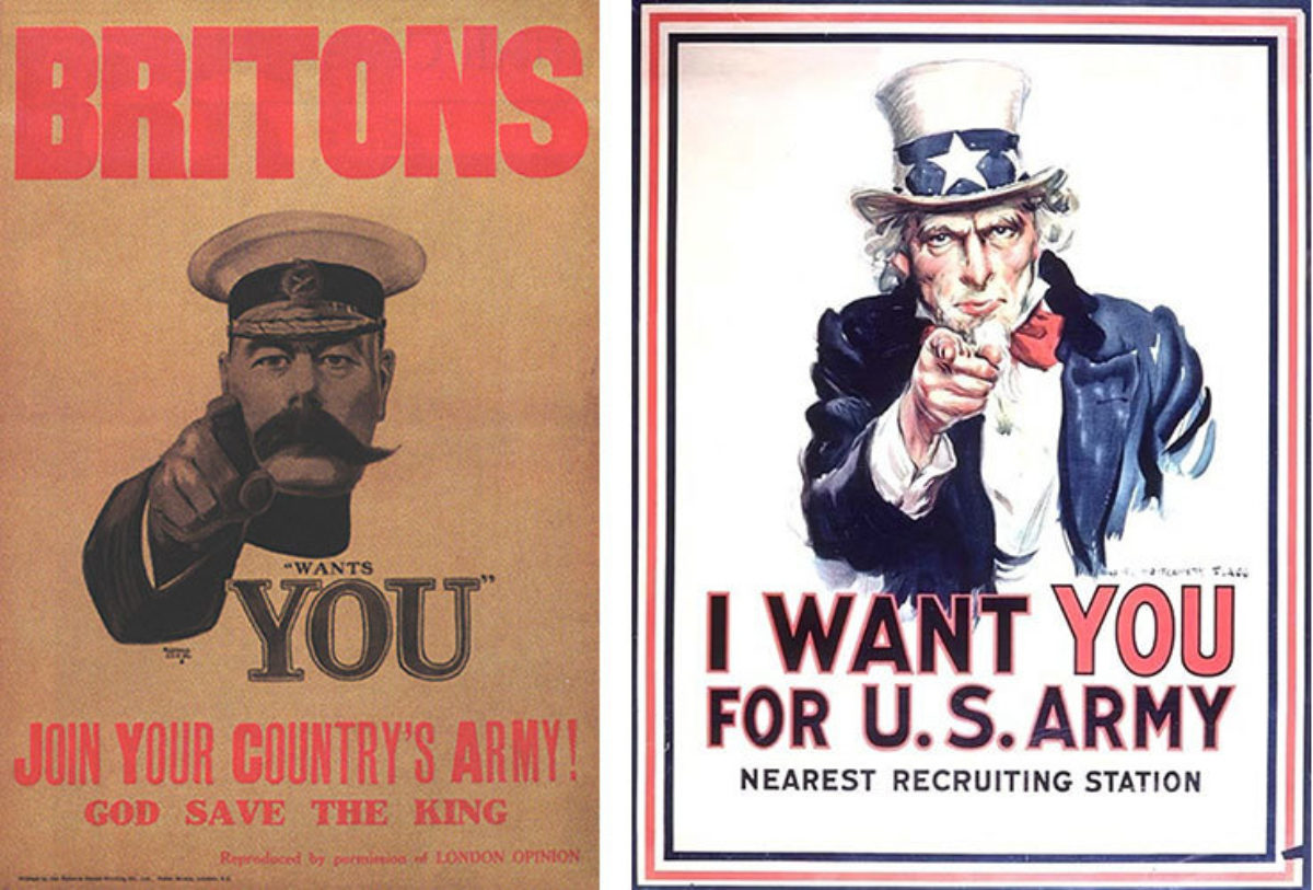
Left: Lord Kitchener Wants You, Alfred Leete (1914)
Right: I Want You, James Montgomery Flagg (1917)
Critics have been hot to point out Soviet-esque design choices in the compositions; however, all countries borrowed from the same styles when creating good posters. It would serve them well to remember that James Montgomery Flagg’s iconic “I Want You” poster—arguably the most celebrated American image from World War I—was a rip-off of Alfred Leete’s British recruitment poster, which was further copied by the Soviets, Germans, Italians and Japanese.

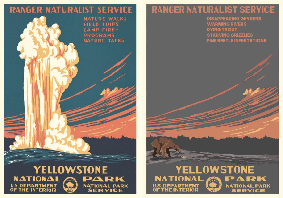
Left: Death Valley National Park, Cristian Eres (2018)
Right: Side-by-side views of the original poster for Yellowstone National Park and one by Hannah Rothstein indicating what climate change will do to it by 2050
This is also not the first time WPA posters have gone on to inspire contemporary designs. The Fifty-Nine Parks series is a gorgeous modern remix of National Park posters done in a vintage style, while artist Hannah Rothstein recently created bleak visions of the park system in 2050 as horrific casualties of climate change. These posters for the Green New Deal continue this dialogue between great design of the past and effective storytelling for a present-day audience.
All images c/o the Muse or artists’ websites.

