

The poster should be so fashioned that he who runs may read…
Paul Rennie is a poster enthusiast and collector based in Britain. He is subject leader in contexts in Graphic Communication Design at Central Saint Martins, London. His book about the poster designer Tom Eckersley will be published by Pavilion later in 2020.
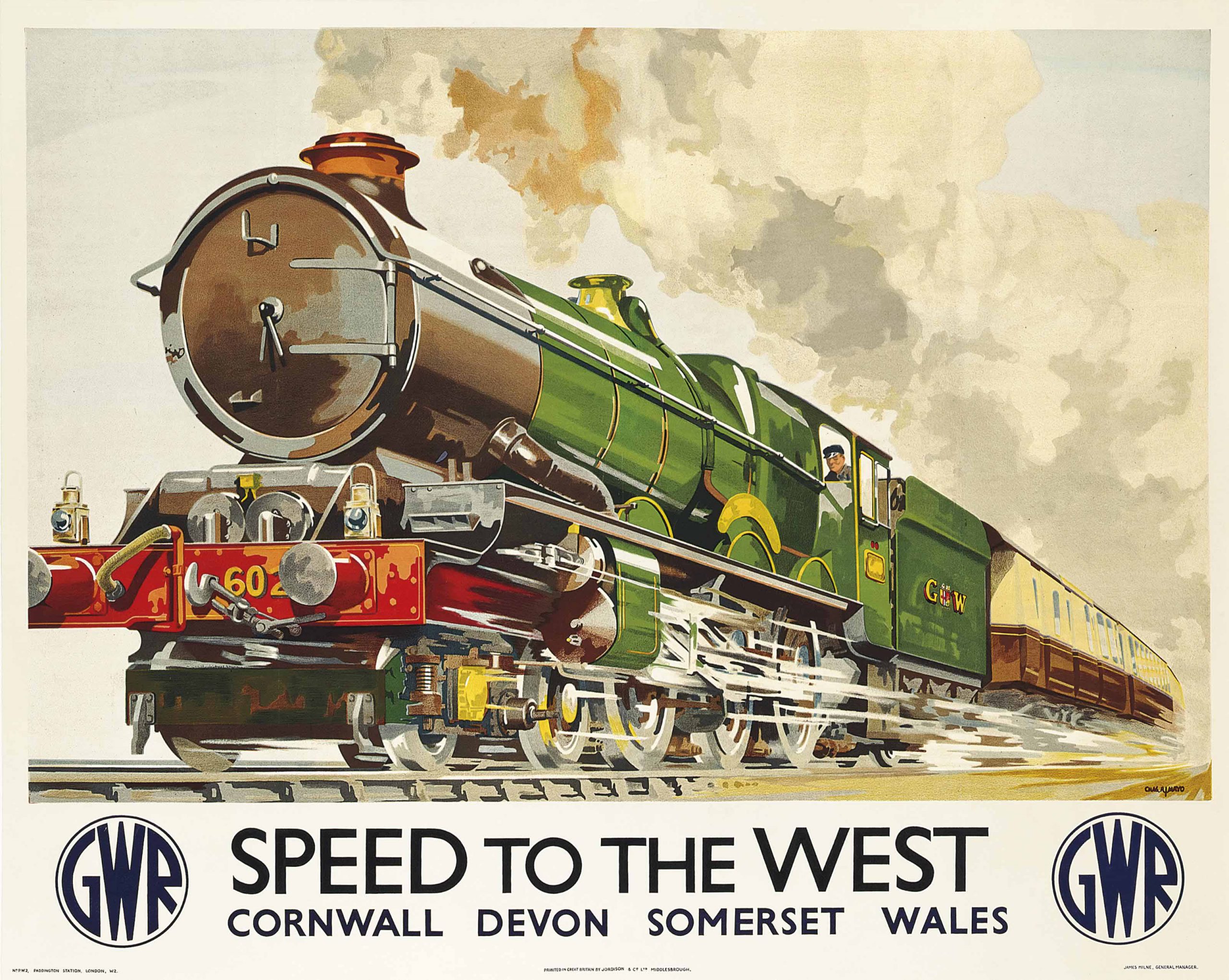
Speed To The West, Charles Mayo, 1939
Image: Christie’s
This is a post about the posters produced by the railway companies in Britain between 1923 and the beginning of World War II. In general, these posters conform to golden-age expectations of collectors and enthusiasts everywhere, combining color, scale, glamour, and sophistication.
The railway network in Britain developed rapidly throughout the 19th century. In its first phase, the expansion of the railway was fueled by the ad-hoc schemes of a railway mania. The period after World War I saw an attempt to rationalize the railway network and its services according to new systems and structures that had devolved from the command and control of the armed forces during the war. The railways were, accordingly, organized into four regional groups comprising east coast, west coast, south-west, and southern sectors. For practical purposes, these sectors were identified by the historic names of their most important railway companies: London and North Eastern; London, Midland and Scottish; Great Western; and the Southern Railway.
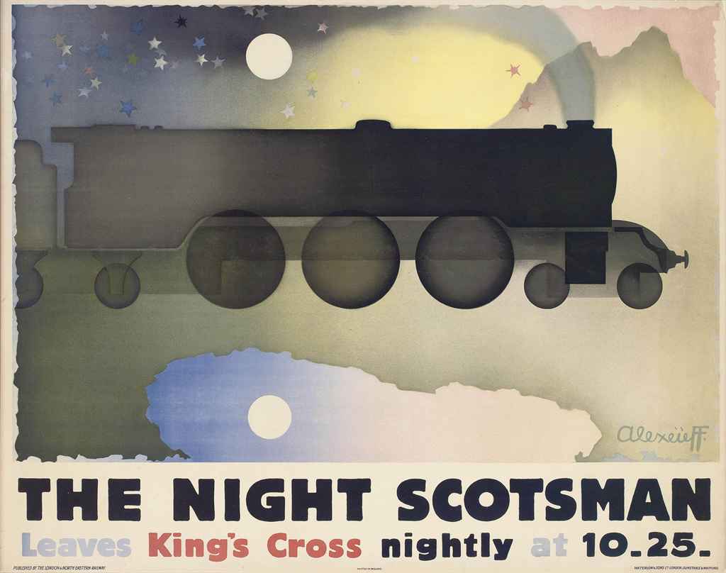
The Night Scotsman, Alexandre Alexeieff, 1931
Image: Christie’s
The origins of the modern poster coincide almost exactly with the great acceleration of mid-19th century society provided by the machine-ensemble of the railway system. The poster was the first image made to be seen from a distance and whist moving by virtue of its color effects and large-scale, made possible by color lithographic printing. It was therefore entirely appropriate that the railways should embrace the poster to promote their activities and services.
As the machine-ensemble of modern society accelerated through its stages of steam railway, bicycle power, internal combustion, and aviation, the poster also gained speed, building upon its founding characteristic of scale with the addition of simplification and sparkle effects, derived from Japanese colored woodcuts. All of this was combined, to spectacular effect, on station platforms and advertising display hoardings around the country, so as to provide an entirely new kind of popular and artistic display.
The idea of speed, implicit in the cultural form of the poster, is made visually explicit through combining elements of scale, simplicity, and sparkle. These traits are especially and appropriately evident in the railway poster.
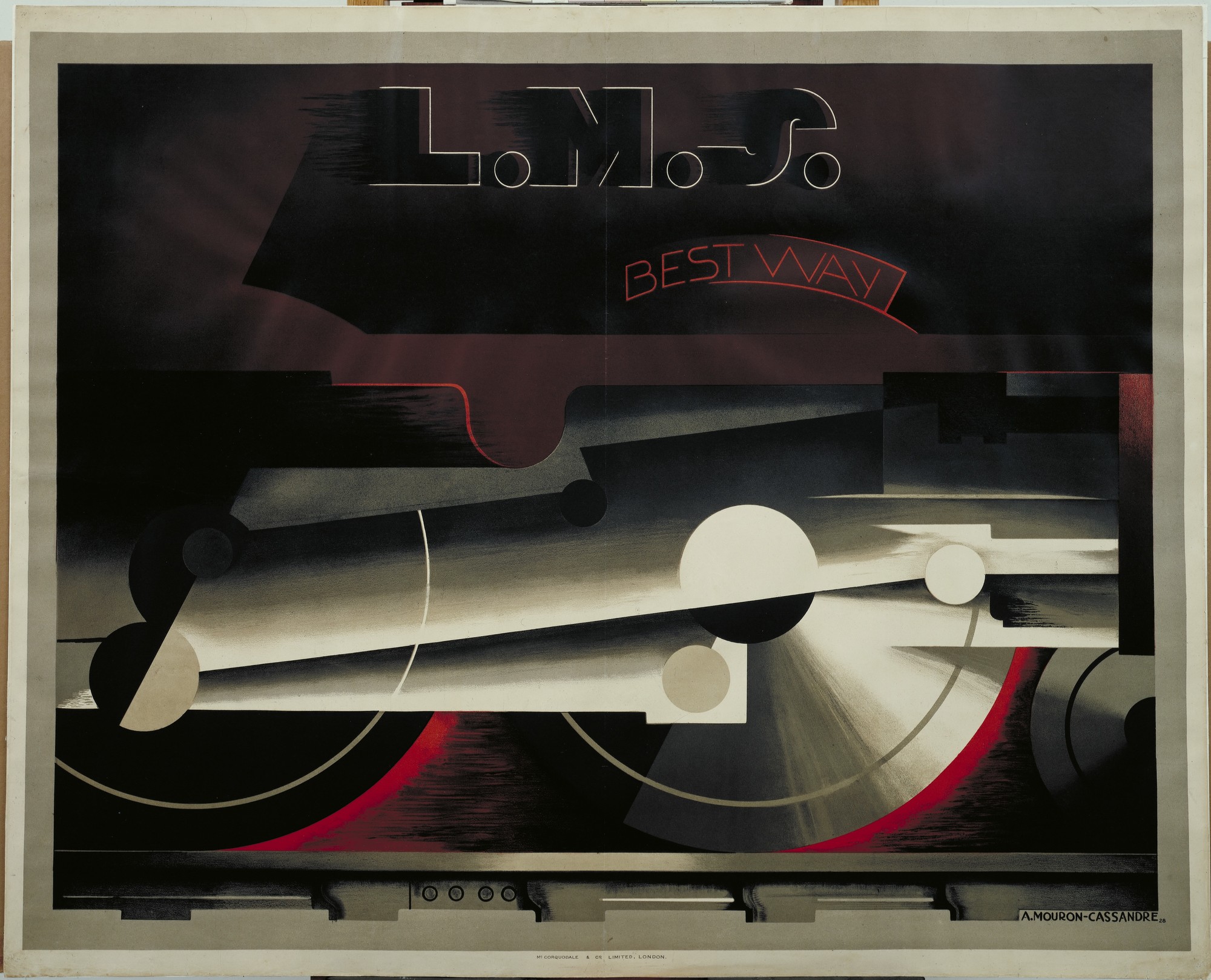
L.M.S. Bestway, A.M. Cassandre, 1928
Image: MoMA
The impressive scale of the classic railway poster derives from the quad royal size of the images—one sheet of paper measuring 50 inches wide by 40 inches high, and in landscape orientation. For practical purposes, these were amongst the largest single-sheet posters, and relatively few printing companies had the plant and associated expertise to realize images at this scale and at the quality required.
By a happy coincidence, the major railway companies had, during the 19th century, been at the forefront of the developing print economy associated with industrial production and logistics. In the first instance, their printing was of the traditional letterpress form. However, from the 1840s onwards, the railway companies were amongst the first to incorporate lithographic printing into the production of integrated railway timetables and display material. Over time, the relationships between regional railway companies, their printers, and the local economy developed into an integrated network of economic exchanges.
In practical terms, the large-scaled lithographic presses used to produce the railway posters were, even in the 1930s, old machines which perished in the use of litho stones and maintained the craft traditions of hand-drawn color separations and carefully judged color effects.
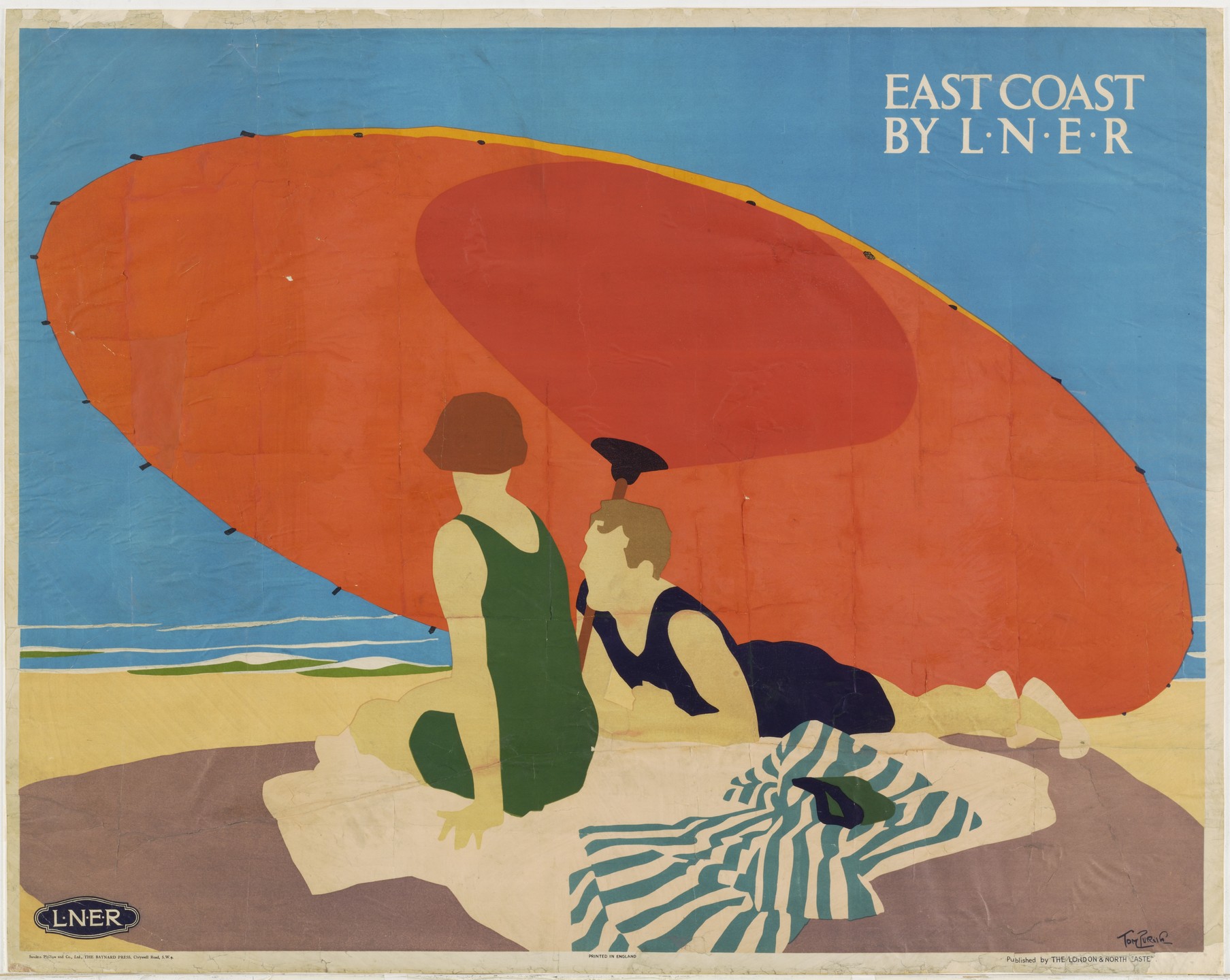
Left: East Coast by L.N.E.R., Tom Purvis, 1925
Image: MoMA
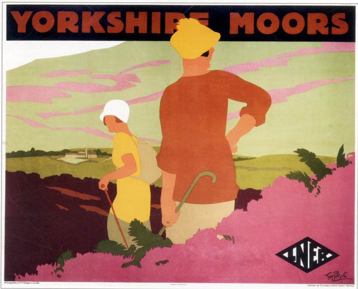
Right: Yorkshire Moors, Tom Purvis, c. 1930
Image: Twitter
The optical simplifications of flat color required the careful consideration of how two-dimensional shapes were understood through the cognitive mechanisms of perception as three-dimensional space. In practice, this depended on the careful consideration of the use of black as a key to both printing and perception.
Anyone who has seen a series of progressive proofs of posters will recognize the magic of how the design becomes unified through the addition of the final black. Somehow, the black printing tricks the eye into understanding the different areas of flat color as distributed in space. This powerful visual trick also had the effect of implying a heightened level of illumination. In its most extreme form, the poster appears as bright as if the scene was illuminated from within. This lighting is perfect for rendering views associated with seaside and open air—the traditional subjects of the railway poster.
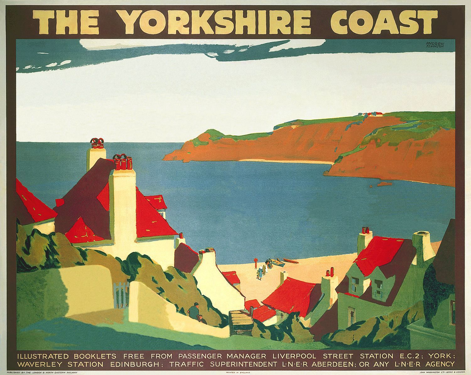
The Yorkshire Coast, Andrew Johnson, c. 1932
Image: Pinterest
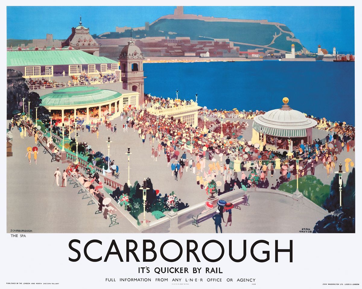
In Fred Taylor’s architectural posters for the LNER, the visual referencing of building detail produces an attractive visual sparkle to grab the eye.
Even in the landscape painting posters of Norman Wilkinson made for the LMS, the rendering of light and shade across the landscape is derived from the optical discombobulations of dazzle camouflage from WWI.
The addition of lettering—in various styles—to the poster design is also an opportunity to add an attractive optical sparkle to the image. Even in the simplified mechanical forms of Gill sans, used by the LNER, the lettering provides an additional and complimentary group of two-dimensional shapes within the design. Obviously, many poster designs include the elaboration of more obviously decorative lettering, perhaps derived from shop-fronts and letterpress playbills, to increase the eye-catching allure of the design.
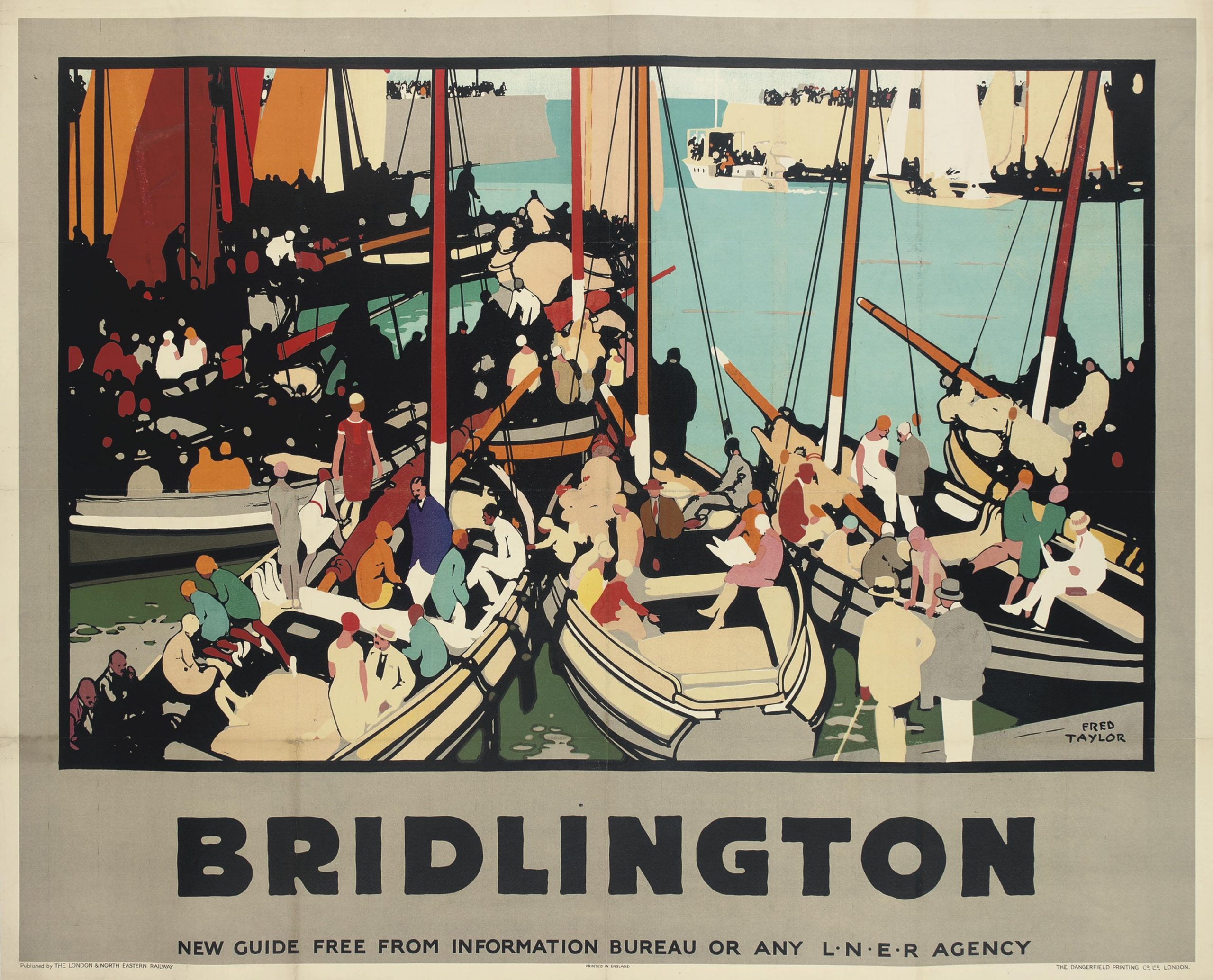
Left: Bridlington, Fred Taylor, 1928
Image: Christie’s
Right: Scarborough, Fred Taylor, c. 1927
Image: Art & Artists
The LNER’s mechanical engineer, Sir Nigel Gresley, produced the fastest steam locomotives in the world (world speed record for steam loco, A4 streamlined, Mallard, established in 1938), so it was entirely appropriate that the London and North Eastern should have the latest posters.
The posters are part of an accelerated image culture associated with the increasing speed of the machine-ensemble, expressed in two distinct, but related, forms of swiftness—the first in the speed (and economy) of their production, the second in the accelerated form of their image deriving from the combination of scale, simplification, and sparkle.
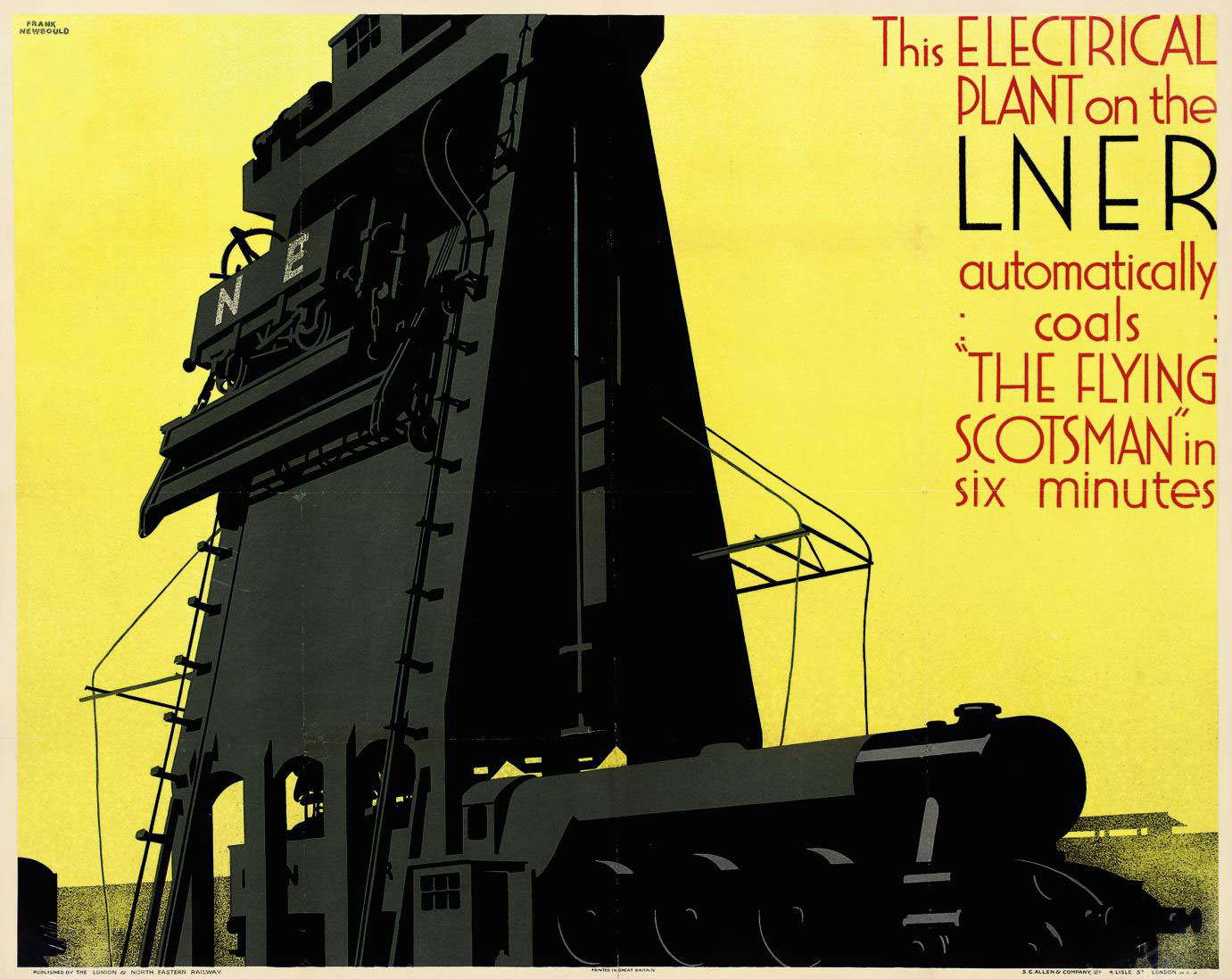
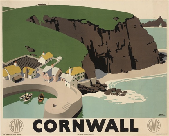
Left: Electrical Plant on the L.N.E.R., Frank Newbould, 1932
Image: Christie’s
Right: Cornwall, Frank Newbould, c. 1931
Image: Artnet
Of course, speed is nothing without sophistication—and the sophistication of high-speed living and railway transportation was described through a combination of locomotive engineering, comfort and luxury, and the feelings of desire attaching to the exotic travel destinations of seaside resorts and their associated attractions.
The railway poster was also international in its scope, through the subject-matter of promoting international services and destinations, and also in the use of the greatest international designers—A.M. Cassandre, Ludwig Hohlwein, Alexandre Alexeieff, and Leo Marfurt, amongst others.
The English author Andrew Martin has described the particular and specific glamour attached to the named express railway services provided during the 1930s by the Brighton Belle and the Golden Arrow (SR), the Riviera Express (GWR), and the Flying Scotsman (LNER). Elsewhere, Martin notes the excitement and luxury associated with travel on the night (sleeper) train services. In cinema history, Alfred Hitchcock was also especially sensitive to the glamour, sophistication, and excitement offered by high speed railway travel, as seen in The 39 Steps (1935), The Lady Vanishes (1938), Strangers on a Train (1951), North by Northwest (1959), and Marnie (1964). Each attest to Hitchcock’s obvious appreciation of the potential provided by railway trains.
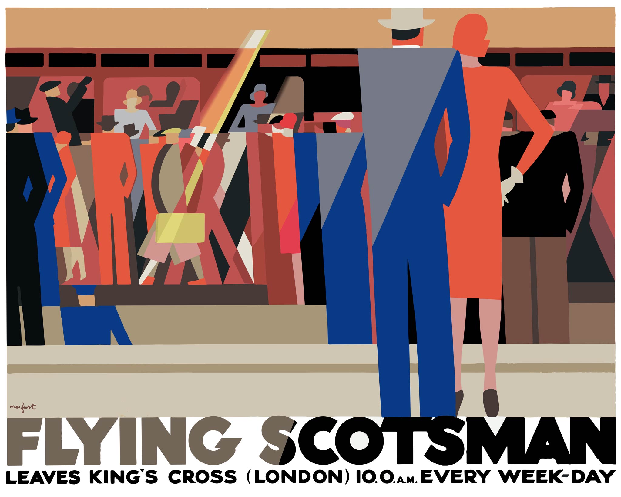
The Flying Scotsman, Leo Martfurt, 1929
Image: Retours
In addition to the evident mechanical spectacular provided by the train sheds, station restaurants, and engineering on display, the railway posters also provided a complementary artistic spectacular of association (with places, feelings, and meanings) along every station platform in Britain.
The arrangement by which posters were displayed was quite specific to the railways and not straightforwardly commercial. In simple terms, the main railway routes served a number of coastal and other routes. So, the destinations of travel were considered the primary beneficiaries of increasing travel. Accordingly, the town clerk’s offices of the resorts and other destinations underwrote the production of the original designs for posters.
The associated costs of make-ready and printing the posters were borne by the printing companies, who were able to spread the costs of this expensive form of printing across the greater part of their work with the railway companies. Finally, the railway companies themselves were able to display the posters on their own property.
The development of this specific and particular economy of poster production made possible the production of a high quality advertising product in edition sizes that were relatively small by commercial standards.
In general, the railway posters were produced to be displayed. They were either pasted onto platform hoardings and are lost, or they were trimmed, framed, and displayed in the waiting rooms and lounges of the stations. Some posters were also sent to schools and to travel agents for display. The physical scale of railway posters, however, puts their display beyond the scope of anything not institutionally exercised.
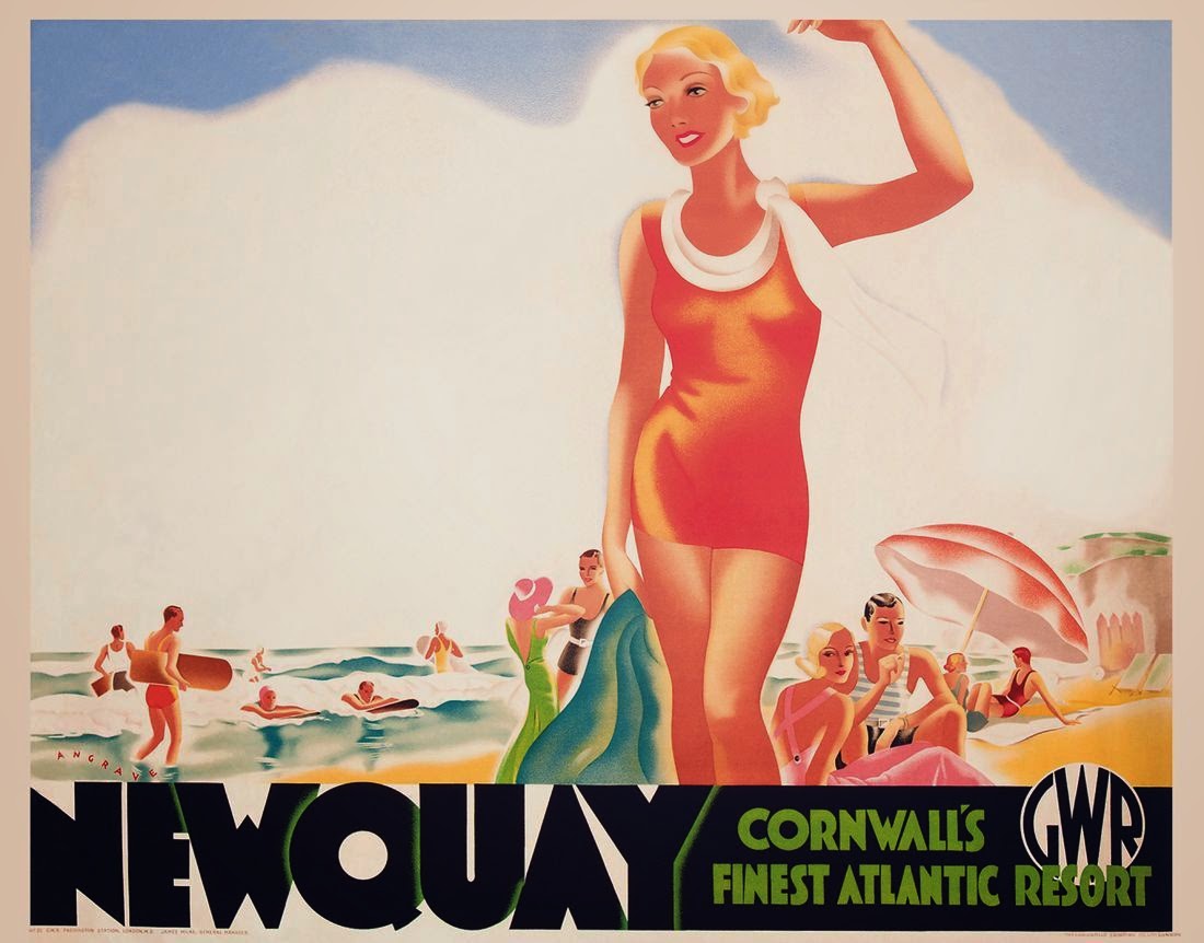
Newquay, Bruce Angrave, c. 1930
Image: Vintage Surfboard Collector
The survival of railway posters from Britain during the golden age before WWII remains something of a mystery. The archives of the National Railway Museum, their publications, and the recent Poster to Poster series of publications each attest to the large number of posters designed and printed to support the railways. In contrast to the number of posters that survive from the 19th century—from Germany and France especially—these golden age posters survive in relatively small numbers.
For the most part, they seem to have survived by having been saved, in one form or another, within in the railway system itself. Usually, the discovery of posters involves the opening of some lost office or store. Occasionally, a box or suitcase at someone’s home has revealed itself to be full of graphic treasure.
Each of the characteristics identified above is individually impressive and necessary to successful poster design; but, they are only really effective in combination together.
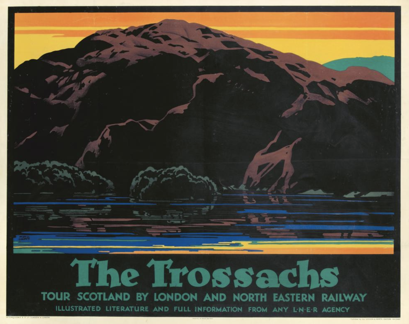
The Trossachs, Austin Cooper, c. 1928
Image: Pinterest