The Revolution Will Be Digitized: Typefaces from Emigre & FUSE

In 1984, the Apple Macintosh computer was introduced, ushering in a new era of digital type design.
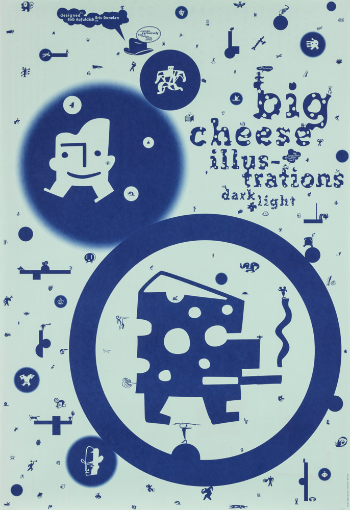
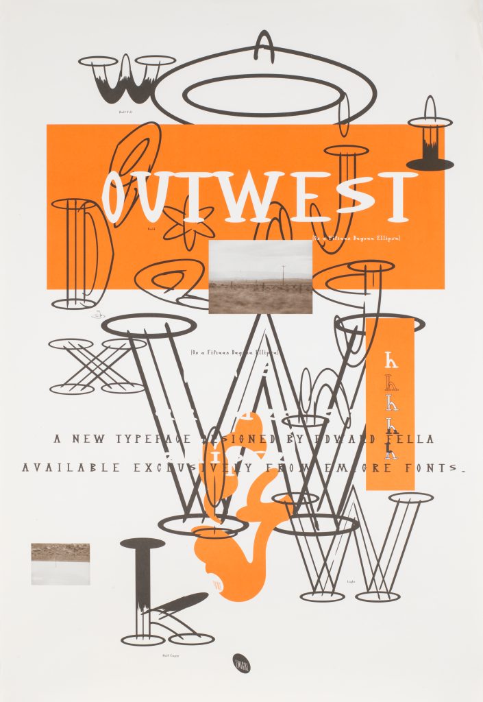
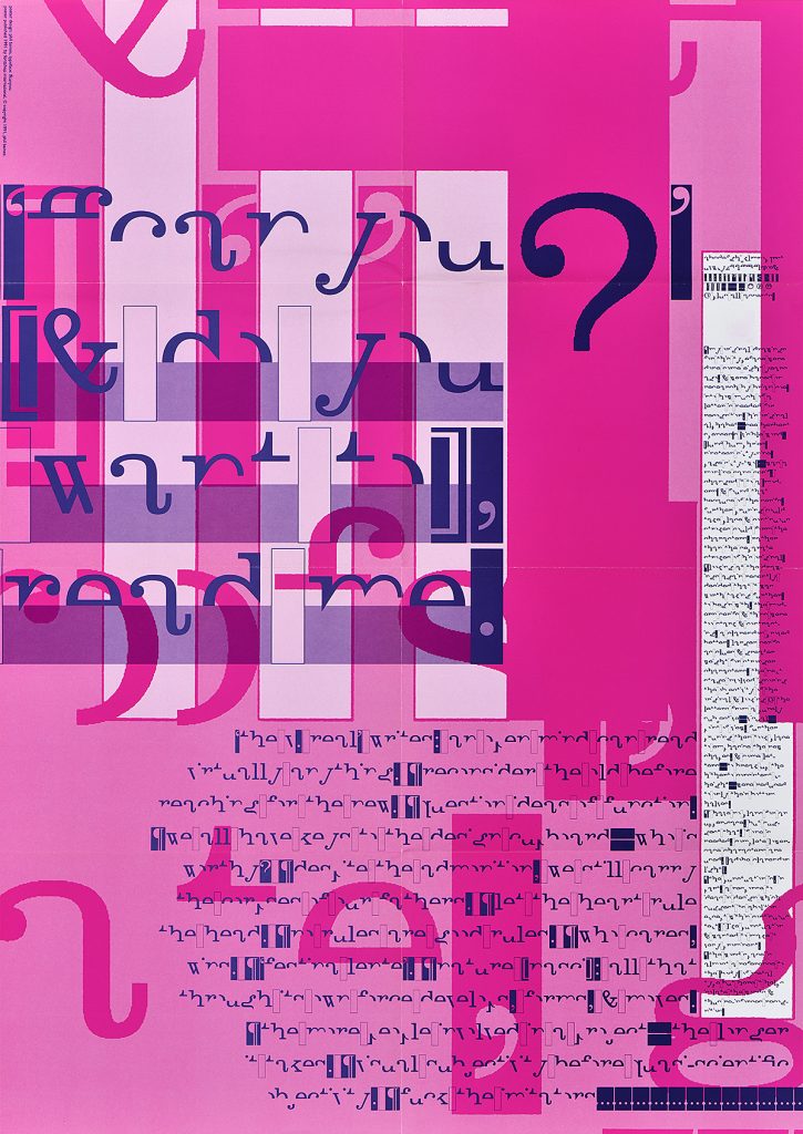
That same year, Rudy VanderLans and Zuzana Licko founded Emigre Graphics in San Francisco. Soon, this typeface foundry and its magazine, Emigre, became the late 20th century’s wellspring of experimental digital typography and graphic design.
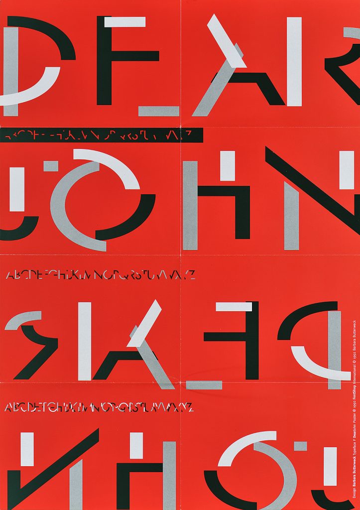
A few years later, in 1991, FUSE was founded by Neville Brody and Jon Wozencroft as both a printed and digital publication, becoming a unique showcase for experimental digital-typeface designers and typographers. Replacing bound pages, the magazine’s content came on a computer diskette and included five folded, printed posters that explained and sampled the featured typeface designs.
This show explores Emigre and FUSE through their posters announcing new, progressive digital typefaces.
Steven Heller is the co-chair of SVA MFA Design ini New York. He is the author and/or editor of over 200 books on graphic design, typography and mass culture. He was the art director of the New York Times Book Review for three decades and also wrote its Visuals Column. He currently is editor-at-large for PRINTmag.com and writes The Daily Heller.