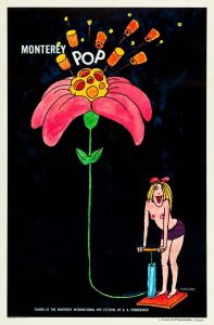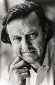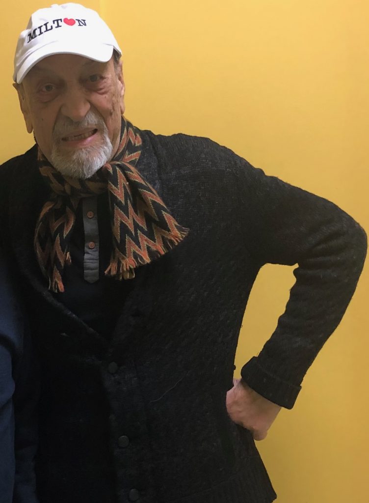
A Tribute to Milton Glaser
.Like most of the design community, when I got the news alert around midnight last night that Milton Glaser had died, I figured there must be some mistake. It was his birthday—91—clearly someone had clicked the wrong button at the Times and accidentally published his obituary.
Sadly, despite texts filled with shock and disbelief from many of my colleagues throughout the night, by morning we all knew that the news was real: Milton Glaser, the godfather of American graphic design, had suffered a stroke and passed away on June 26.
Rather than rehash all the great articles going around right now that celebrate one of the most dynamic lives lived in graphic design, I asked some of my coworkers to choose a poster from Milton’s oeuvre that struck them in some way—our own tribute to a legend in the field.
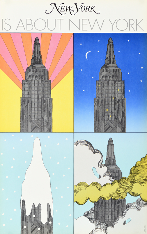
New York, 1967
Poster House Permanent Collection
On April 8, 1968, Milton Glaser and Clay Felker published the first issue of New York magazine, a sassy, rough-and-tumble counterpoint to the more sedate and snooty New Yorker. In the lead-up to the launch, Glaser designed this poster embodying all that the magazine would be in a single seasonal image: New York magazine would be about New York City. Not the tourist-trap of Times Square New York, but the one the people who live here know, the one that remains iconic and beloved in the unbearable summer, the snow-slush winter, the smog-filled hazy days, and the illuminated nights. It didn’t hurt that Glaser’s studio was just a few blocks from the Empire State Building, making this poster his cheeky equivalent of Monet’s Haystacks.
Back in March, we asked Milton if he wanted to be part of our #CombatCovid PSA campaign in Times Square, a partnership with Times Square Arts and PRINT Magazine that was meant as a gift to the city, thanking essential workers and locals for their endurance and selflessness as we all fought the COVID-19 outbreak. Milton suggested that he rework this poster as his contribution to the project. Our design team, who chose this as their favorite image of his, helped Milton animate it, turning it into a shining beacon of one of the great symbols of the city.
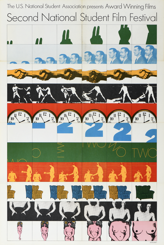
Second National Student Film Festival, 1966
Poster House Permanent Collection
As with most of the incredible designs that came out of Push Pin Studios, so much of Milton’s work references larger moments in art history, riffing on visual tropes of the past with a fresh sense of fun and irony. Our Collections Manager loves this poster for the Second National Student Film Festival because it plays with the ideas of Eadweard Muybridge’s photographic studies of motion (you know those famous images strips from the 1800s of a horse running), inserting humor while also expressing the essence of what film is. While some panels, like the clock, are straightforward and mundane, others, like the nude woman whose breasts just keep getting larger, tell you all you need to know about Milton’s wry sense of humor when approaching a graphic design challenge.
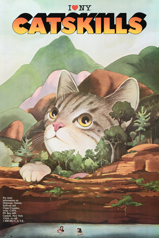
Catskills, 1985
Poster House Permanent Collection
Milton spent a lot of his time with his wife, Shirley, and their friends up in Woodstock, NY. His connection to the community was deep, and he loved the area so much that it will be his final resting place. This is just one of many posters he created for the region, all riffing on the “cat” in Catskills. What struck our Director so much was that anytime you go into a business in upstate New York, you will most likely find a copy of one of these hanging on the wall. Urban legend has it that Milton was notorious for offering copies of this poster in exchange for minor services, so everyone from his mechanic to his local deli has this image hanging proudly in their shops. We first fell in love with this poster as we prepared for the New York Art Book Fair—it was our hottest seller, and remains one of the most popular items in our gift shop.
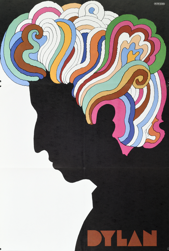
Dylan, 1966
Poster House Permanent Collection
You can’t talk about Milton Glaser’s poster legacy without mentioning this image that he created for the LP Bob Dylan’s Greatest Hits—the favorite poster of our Director of Operations. This simple silhouette in profile with wild, fluorescent hair has since been riffed on by countless designers, turning it into meme-able status in the 21st century. Milton always claimed he was inspired by Marchel Duchamp’s 1957 Self-Portrait, a piece of paper hand-torn by Duchamp to look like himself in profile, the negative space of the missing paper creating his figure. Glaser’s interpretation harnesses the austerity of that piece, but combines it with colorful elements of Islamic painting that he was studying at the time. The result is magical.
Compositionally, the hair is a character unto itself. There’s even a long held myth that you can see the name Elvis spelled out in those psychedelic locks; however, even Milton stated that if you can see that name, it certainly was not intentional. What some may not know is that, as this was the last record Dylan put out with Columbia (after he had already broken his contract), he had absolutely nothing to do with its production or with the poster. So, this is Milton going rogue, interpreting another creative mind as he saw fit. He even added his own Baby Teeth typeface—a new font he’d been working on based around a hand-painted sign he saw in Mexico City—because he liked that it looked “peculiar” next to Dylan’s head.
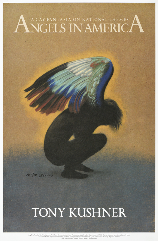
Angels in America, 1993
Poster House Permanent Collection
While so much of Milton’s work is beloved and irrevocably tied to him as an artist, many of his designs are known separate from him. Our Marketing Manager chose this poster for Tony Kushner’s seminal theatrical piece Angels in America because he fell in love with it long before learning that it was created by Milton Glaser. Some of the compositional elements from Milton’s Dylan are present in this poster—the silhouette of the figure contrasting with the colorful wings—but Milton has taken it to an entirely different place. There is added emotion, namely sorrow and resilience, pulsating off the page, the perfect embodiment of Kushner’s epic story around the AIDS crisis.
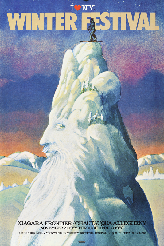
Winter Festival, 1982
Poster House Permanent Collection
After creating the I Love NY logo, Milton frequently designed posters celebrating various parts of New York State’s cultural offerings. Like the image he made for the Catskills, this poster features an anthropomorphized geographical element—a snow-capped mountain come to life to celebrate the Niagara Frontier/Chautauqua-Allegheny region of the State. The Director of Operations for Café des Affiches (our museum café) chose this as her favorite poster by Milton because, as a born and raised New Yorker, she feels a strong connection to any of the work he created for the area, but also for anything associated with skiing, one of her favorite family pastimes.
Milton claimed the inspiration for this poster came from images of Old Man Winter in children’s books from his childhood. The idea of a mountain man come to life with the appearance of the first snow of the season is exactly the type of whimsy that shows up in so many of his posters.
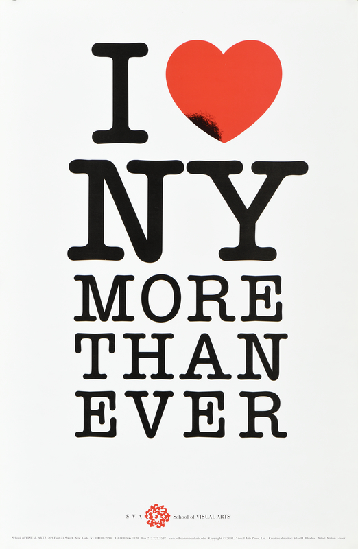
I Love NY More Than Ever, 2001
Poster House Permanent Collection
In 1977, Milton created the I Love NY logo—without a doubt the most recognizable municipal design ever made. Over the past 40 years, it has taken on a life of its own, appearing not just on tourism merchandise, but in various forms celebrating other cities, other businesses, other ideas, and other people. I can’t think of another instance where two glyphs (“I ♥”) express so much in so many different iterations.
My personal pick for a favorite poster by Milton is the one he made in the wake of September 11—a design that reinterpreted his 1977 logo and imbued it with a highly personal, extraordinarily powerful message. Beyond the added text, Milton singed the heart near its southwestern tip, corresponding to the location of the Twin Towers in Manhattan. The poster was handed out by students from SVA (where Milton taught), reminding viewers that we are all New Yorkers, united in our resilience in the face of catastrophe. It was a call to emotional arms, rallying everyone to double down on their love for the city and all who live there.
While there are many fantastic and important graphic designers alive today, no one will ever surpass Milton in his variety or his impact. He is present in so many parts of our day, from beer labels to comic logos, city signage to bakery bags. And posters. So many, many posters.

