

I spent almost the first 10 years of my life in the city where I was born: Havana. The Havana of the 1960s was still very much the city constructed from the 19th century through the 1950s; a fusion of colonial Baroque architecture, some Beaux Arts buildings, bits of Art Nouveau and Art Deco, tropical versions of the Bauhaus, neon signs and advertisements from before the 1959 revolution, and plenty of revolutionary billboards. As I walked with various members of my family (mother, aunts, grandmother) through my own neighborhood of Vedado and into the Habana Vieja part of the city, however, it was the posters that always caught my attention.
Before the triumph of the revolution in 1959, the posters that appeared on the streets throughout the island tended to be advertisements for movies (Latin American, American, and European), U.S. consumer goods (Coca-Cola, etc.), and for candidates during election season. With the revolution, I would argue that posters and films became the most innovative and effective art forms used by the regime. Cuba, with the capital of Havana as its center, had a long history (together with Mexico, Brazil, Argentina, and Uruguay) as a center of avant-garde art as far back as the 1920s. Leading magazines such as Social (1916–1938), revista de avance (1927–1930), and Bohemia (1908–1960) had introduced the latest trends in graphic design on their covers and advertisements since the early 20th century. The aesthetic and revolutionary use of posters after 1959 therefore reflected a long lineage. Eladio Rivadulla Martínez (1923–2011) imparted his knowledge of silkscreen at the ICAIC (Cuban Institute of Cinematographic Art and Industry) from 1959 to 1964. Another significant influence in the development of the poster in post-1959 Cuba, were the carteles created by Lorenzo Homar and his team of graphic designers working at the Office of Community Education and the Institute of Puerto Rican Culture from the early 1950s onward. Unlike the Puerto Rican designers, who both experimented with and perfected the silkscreen technique, the poster makers in Cuba favored offset lithography based on original designs made in gouache, casein, ink, or photomontage—though in the early years of the revolution outside of Havana, they favored silkscreen.
Against Racism and Apartheid (1961), by Raúl Piña
Poster House Permanent Collection
The power of these posters lies in the designer’s ability to communicate radical political ideas through visual means, specifically composition, typography, and color.
Raúl Piña’s 1961 Contra el Racismo y el Apartheid (Against Racism and Apartheid) is an example of the Cuban Revolution’s commitment to the freedom and equality of Black South Africans since its earliest days. The image fuses the profile of a beautiful young Black woman with the map of the African continent, which serves as her hair. In this austere black-on-white design, the only touches of color are found around her neck, where green, yellow, and black play off each other with a sliver of orange-red. The title reappears in English in the lower part of the poster. The work was created for OSPAAAL, Organización de Solidaridad con los Pueblos de Asia, África y Latino América (Organization of Solidarity with the People of Asia, Africa, and Latin America), a propaganda arm of the Cuban Foreign Ministry intended to express solidarity with the people of the developing world.
Black Power (1968), by Alfredo Rostgaard
Poster House Permanent Collection
One of the most prolific Cuban poster designers was Alfredo Rostgaard (1943–2004). Born in Guantánamo, he studied art at the José Joaquín Tejada School of Art in Santiago de Cuba. Between 1960 through 1975, he was the art director at OSPAAAL and from 1963 he was both the art director and political cartoonist of the magazine of the Juventud Comunista (Communist Youth). He created many iconic posters throughout his career, one of which is Black Power of 1968, shown above. The design is dominated by the open mouth of a panther with sharp fangs; inside the mouth, the words “Black Power” stand out against a black background. The panther’s nostrils and red eyes appear in the upper part of the poster. The lettering at the lower left reads: “Retaliation to Crime: Revolutionary Violence” in English, French, Spanish, and Arabic.
Day of Solidarity with the People of Palestine (1968), by Faustino Pérez
Poster House Permanent Collection
From the very beginning, the revolutionary Cuban regime expressed solidarity with communities in the developing or Third World, among them the Palestinians and their right to a homeland. In his 1968 poster Day of Solidarity with the People of Palestine, Faustino Pérez expresses this with an elegant and simple design that simultaneously represents the profile of an Arab man and the rifle that stands in for his eye; the ocher, white, and black colors evoke the desert environment of the Palestinians. The dissonant red at the muzzle of the gun suggests the bloody violence of rebellion.
Day of Continental Support for Vietnam, Cambodia, and Laos (1969), by José Lamas
Poster House Permanent Collection
The Latin American and Caribbean Students’ Association (OCLAE) produced posters focused on transcontinental solidarity; one of the most unsettling of these images is José Lamas’s Day of Continental Support for Vietnam, Cambodia and Laos 15 to 21 of October from 1969. Against a stark yellow background, a blue-faced President Richard Nixon with red eyes flashes a sinister smile. His hair is composed of a black-and-white photograph of corpses on a battlefield.
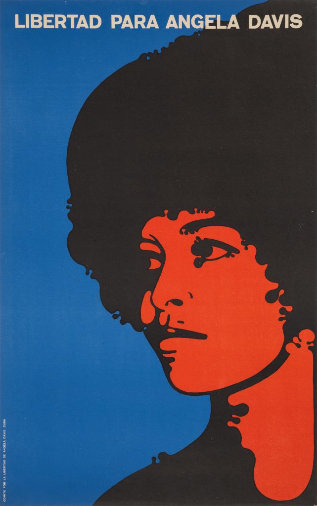
Freedom for Angela Davis (1971) by Félix Beltrán
Poster House Permanent Collection
Next to Rostgaard, the other internationally known Cuban poster designer is Félix Beltrán (1938–2022). Born in Havana to a middle-class family, he came to New York and studied graphic design at the School of Visual Arts before returning to Cuba immediately after the revolution to contribute to the island’s culture. The themes of his posters varied from calls to save electricity and water to more explicitly political images such as his 1971 image of activist Angela Davis. A close-up of Davis’s face, with her recognizable Afro, occupies most of the space. Her hair, features, and shoulder are black, while her skin is red and the background is a bright cerulean blue. White lettering at the top of the poster demands: “Freedom for Angela Davis.” Blunt and immediate, the message is clear.
The power of these posters resides in the designer’s ability to avoid the tired imagery of Socialist Realism in favor of a dynamic, Pop art-like language of graphic design with stylized shapes and bright, bold colors, one that effectively communicates radical ideas without terrifying the viewer.
Alejandro Anreus was the curator of Puerto Rico in Print: The Posters of Lorenzo Homar. He is Emeritus Professor of Art History and Latin American Studies, William Paterson University. A former curator at the Jersey City Museum and Montclair Art Museum, he is the author of over sixty articles and catalogue essays, and six books on Latin American and Latinx Art.