The Top-Heavy G: Julius Klinger’s Lettering and Type Design with Paul Shaw
1–2pm
Related Events
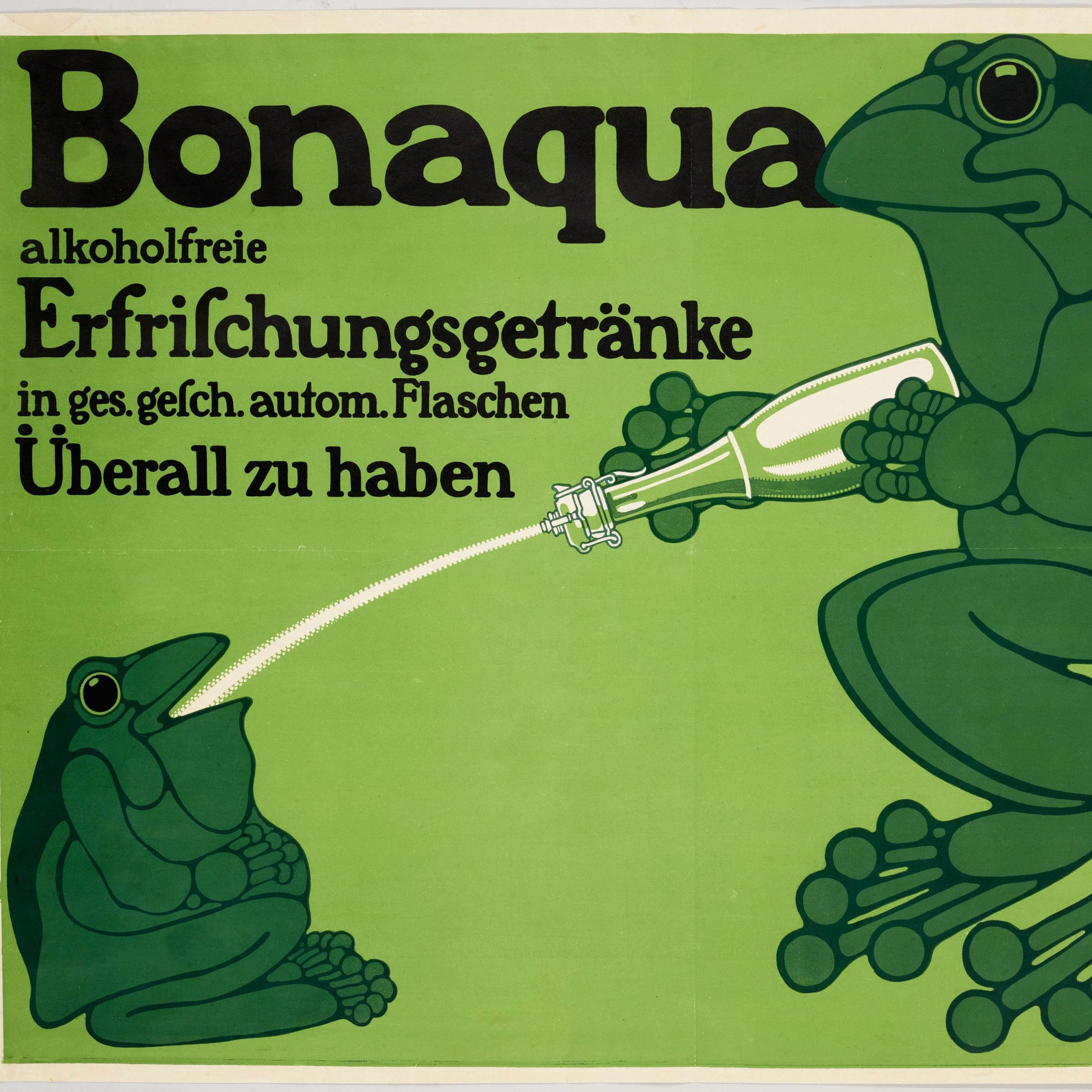
Poster House is thrilled to partner once again with its favorite type historian, Paul Shaw, for an afternoon exploring the lettering and type design of renowned poster designer Julius Klinger. This event is co-presented by Typographics.
Spanning nearly four decades, Klinger’s posters and other designs showcase a wide range of lettering styles. Some of them were common in Austria and Germany in the period between the formation of the Vienna Secession and the outbreak of The Great War; and some reflected themes common to Art Deco after the war. But others are unique to Klinger. Shaw will lead us on a detailed (even nerdy) look at the evolution of Klinger’s lettering and type, placing him in context with Koloman Moser, Alfred Roller and other members of the Vienna Secession; and the German sachplakat artists, such as Lucian Bernhard, associated with the printers Hollerbaum & Schmidt. His presentation will draw primarily from Julius Klinger: Posters for a Modern Age, on loan from the Wolfsonian in Miami Beach, is currently on view at Poster House in New York City.
Paul Shaw is a designer and design historian with a specialty in letterforms and type. He is the author of Revival Type, Helvetica and the New York City Subway System; co-author of Blackletter and National Identity; and editor of The Eternal Letter. He teaches at Parsons School of Design and The School of Visual Arts. He has previously done presentations for Poster House on the lettering of Alfons Mucha and the typography of post-World War II posters.
Julius Klinger: Posters for a Modern Age comes to Poster House from The Wolfsonian–Florida International University in Miami Beach, FL.

