


My first visual introduction to the African American performing team of Bert Williams and George Walker was more than two decades ago during a visit to the Connecticut home of Hugh and Cynthia Stubbs-Hill. There, I was introduced to the giant poster advertising “Williams & Walker’s Own Big Company,” currently on view in the Poster House exhibition Act Black: Posters from Black American Stage & Screen. The sheer scale and power of this composition literally stopped me in my tracks.
Williams & Walker (1903), Designer Unknown
Collection of Cynthia D. Stubbs-Hill and Hugh A. Hill
As a resident of Harlem and deeply immersed in its history, I became fascinated with the community’s Black and Jewish music culture from the decades between 1890 and 1930. While researching these topics, I began to view and collect any number of items related to Williams & Walker. To this day, however, nothing has rivaled the impact of my first encounter with this poster, and time has only expanded my appreciation of its uniqueness.
When one considers the team’s pivotal role in advancing the status of African American performers and establishing their musical talents in the theatrical and cultural mainstream both in the United States and abroad, this poster from around 1903 takes on even greater significance. It is worth noting in this context that the producers mentioned here are Hurtig & Seamon; Jules Hurtig and Harry Seaman were the original lease tenants of Hurtig & Seamon’s New Burlesque Theatre that opened on 125th Street in Harlem in 1914 and was transformed into the famed Apollo Theater in 1934. In 1903, Williams & Walker traveled to Europe, where the company gave a command performance of In Dahomey, the first all-Black musical to open on Broadway, for Edward VII at Buckingham Palace. Postcards of the performers in similar attire on cards postmarked from both sides of the Atlantic made me wonder if the poster shared the same degree of international exposure.
I also tried to imagine where a poster of this scale illustrating Black performers might have appeared in New York City. Would it have been relegated solely to the African American enclaves of the city or was it displayed more broadly in the theater districts of the day? Considering the era’s racial politics, its presence anywhere would have been significant and perhaps startling. I can only imagine the surprise of passersby at its commanding visual presence and its visceral impact on them.
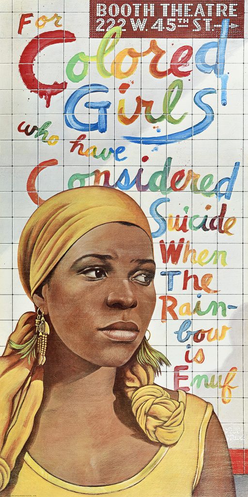
For Colored Girls (1976), by Paul Davis
Poster House Permanent Collection
When I was thinking about a poster that might have been of equal importance to my generation, I recalled my youthful visits to New York City in the 1970s and seeing large theater posters along city streets and subway platforms promoting productions mounted by the Public Theater. One of the most memorable examples is the poster for its 1976 “choreopoem” For Colored Girls Who Have Considered Suicide/When the Rainbow is Enuf, a production that transferred to the Booth Theatre on Broadway that year; the bold and striking image of its author and performer Ntozake Shange was unforgettable.
Art critic Hilton Als has described his very similar impressions of the poster when he saw it around the city in 1977 at the age of 16:
“We had seen posters advertising the piece months before we headed to midtown; Shange’s face, as painted by Paul Davis, had been plastered around the city…You couldn’t have mistaken Shange, with her head scarf and multiple earrings, for a jive tastemaker; her style wasn’t very different from that of my four older sisters, who took African-dance classes and swore by Back to Eden. In fact, when I watched “for colored girls” I found it difficult to distinguish between her characters and the black women I knew” (“Color Vision: Ntozake Shange,” The New Yorker, November 1, 2010).
Gladys Bentley & Willie Bryant (1936), Photographer Unknown
Source: Frank Driggs Collection/Getty Images
Postcard: Ubangi Club featuring Gladys Bentley (1936)
Source: queermusicheritage.com
Als captures the fact that the poster was intended to effectively communicate two signifying messages, one that was both contemporary and culturally personal to the Black viewer and the other promising a compelling entertainment to a broader audience—both rooted in the Blackness personified by the performer’s image on the poster. In contemplating this dual messaging, I recalled a 1930s photograph of two African American performers standing in front of bold typographic posters announcing their appearances at the Apollo Theater. The performers, blues singer and cross-dresser Gladys Bentley and bandleader Willie Bryant, though dressed in street clothes, offer up personas as individual and distinctive as Paul Davis’s rendering of Ntozake Shange. Bentley, a stout Black woman stands in mannish attire (apart from her skirt) beside the thin figure of Bryant, who towers over her in a three-piece suit—a Black man who looks white! Here, the photographer crafts a convenient marriage of the two performers who appear to merge graphically with the text of the background posters. They are surrounded by type blaring, “Apollo Theater,” “Bryant and his Band,” and the (partially obscured) word “Ubangi,” the name of a river and tribe in Africa as well as Bentley’s gender bending Harlem club of the era. The combination informs and elevates the message, suggesting to viewers that they are in for some decidedly non-traditional entertainment. Language is used here as a counterpoint to the image, much like that in the For Colored Girls poster and the Walker & Williams design. Shange’s words “For Colored Girls,” reflect antiquated idioms that stand in sharp contrast to her highly contemporary persona; they dangle in the background like shackles, items to be dealt with by her performance and then discarded. The same can be said for Williams & Walker’s tagline “Two Real Coons,” coined by them at a time when there were more white people in blackface on stage than actual African American performers. By declaring their “authenticity,” Williams & Walker defined their own identities, creating a performing vision that spoke to their own souls and issues as artists; they thus aimed to focus their audiences, Black and white, on the embrace of brighter possibilities and another paradigm.
Bring in ‘Da Noise Bring in ‘Da Funk (1995) by Paula Scher
Source: MoMA
Paula Scher’s design for the Public Theater’s production of Bring in Da Noise, Bring in Da Funk when it moved to the Ambassador Theatre on Broadway in April 1996 clearly reflects the same history and the same struggle. This musical production was centered around the tap-dancing performer Savion Glover, who taps, but not in the traditional style of, say, a Bill Robinson or with the effortless glide of Sammy Davis, Jr. The bold typography behind Savion promises to bring in “Da Noise” and “Da Funk,” and the dancer is pictured in what appear to be Timberland boots rather than traditional tap shoes. To theater audiences of the 1990s, tap dancing represented a “colored” performance style of the past, in some ways not unlike the stereotypical “coon” tag associated with 1890s Black performance. Here, “FUNK” and “NOISE,” spelled out in all caps, signal to the Black audience of the day that they are going to experience a funky good time set to a contemporary rap beat. Once again, at the same time, the poster and the performer’s image also suggest to a broader theater audience that something both innovative and Black is in the offing.
The artistry of Savion Glover and Ntosake Shange, like that of Williams & Walker before them, is heralded by the very specific imagery and messaging of such posters, their performing talents magically described and conveyed by the imaginative kinship and graphic design skills of other creative artists.