The Immigrant & American Advertising
.This post is adapted from a lecture our Chief Curator gave at the Ephemera Society of America‘s annual conference, where the topic was “Coming to America: The Immigrant Experience.” It has been edited for clarity.
As we all know, America is a melting pot. We’ve been taught that since grade school. Literally over 20 million people, primarily of European decent, entered the United States between 1880 and 1920, with Ellis Island opening in 1892 as the country’s first federally-run immigration checkpoint. This article begins a few years later, around the outbreak of World War I, when we first really see posters talking to a non-homogeneous audience.
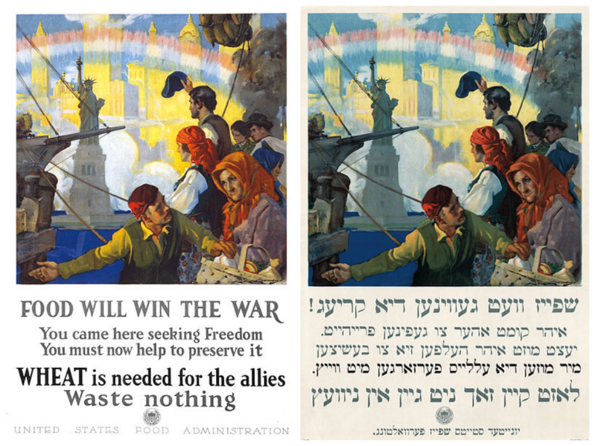
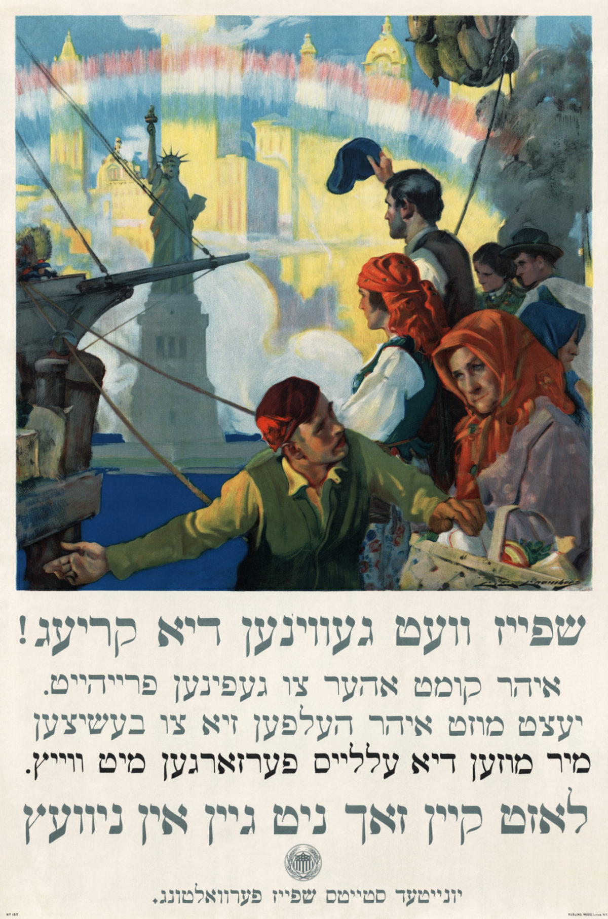
Two versions of Food Will Win the War by Charles Edward Chambers, 1917 (image c/o American Food Roots)
Here are two of at least four examples of a 1917 poster by Charles Edward Chambers. Printed in New York and published by the U.S. Food Administration, the imagery is meant to remind the viewer of the hope and promise they felt when first arriving in America. We see the Statue of Liberty, a rainbow-like arch in America’s signature tricolor, hints of a harbor, a magnificent skyline, and people in non-specific but undeniably ethnic dress of the Old Country waving to friends and being welcomed ashore. In case you can’t see it, the text reads in both Yiddish and English that “Food will win the war / You came here seeking Freedom / You must now help to preserve it / Wheat is needed for the allies / Waste nothing.”
Clearly meant for a specifically New York urban audience, this image in all its iterations is only speaking to the new American who remembers being at one point in time a foreigner, but who is now part of a different, inclusive American culture. And what does this new American need to do to support his or her new home country? Well, you take part in the war effort as best you can, in this case not by enlisting to fight, but by not wasting food and by avoiding eating wheat-based products, as they were shipped to troops abroad.
For anyone who doesn’t know, bread at that time was primarily white bread, the production of which only used part of the wheat shaft and disposed of the rest, which in and of itself is wasteful. Moreover, white bread, a comfort food, was seen as something troops in battle deserved and those at home could live without. And, finally, European farms had been ravaged through battle and neglect, so sending wheat abroad was encouraged to help save Allied countries from starvation.
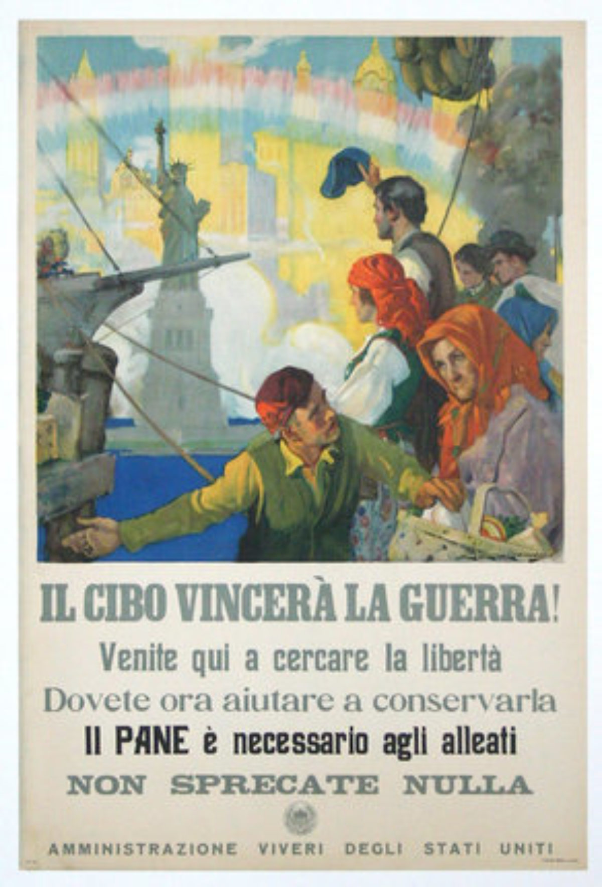
Food Will Win the War by Charles Edward Chambers, 1917 (image Chisholm-Larsson Gallery)
Here you have the same poster again, but this time in Italian. It was also issued in Hungarian, but that is the rarest version of the image to find.
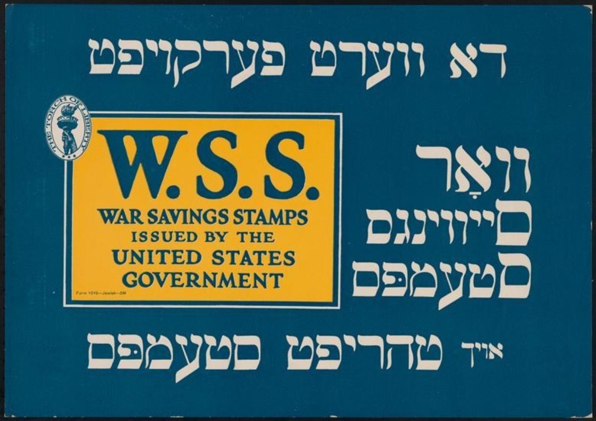
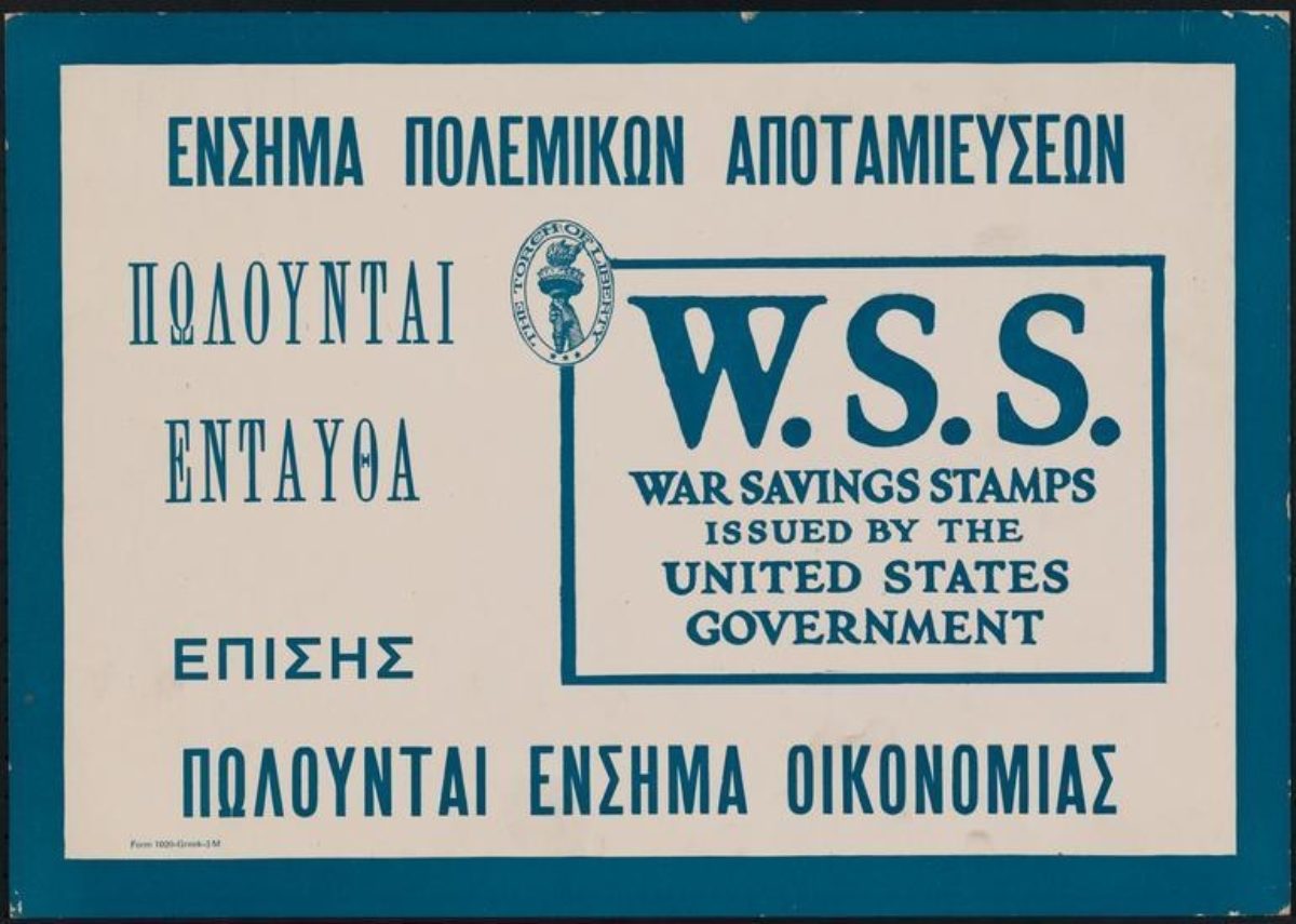
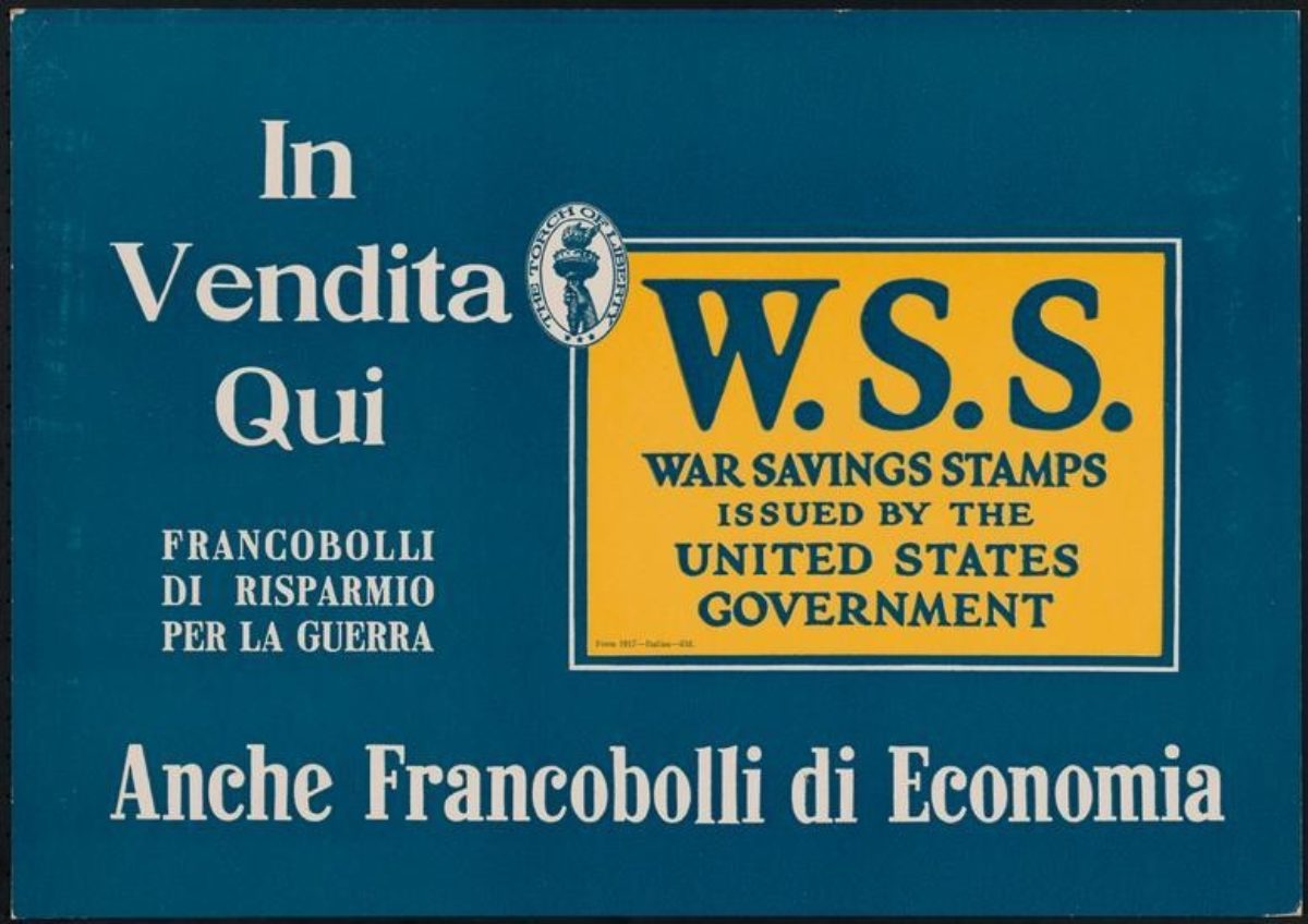
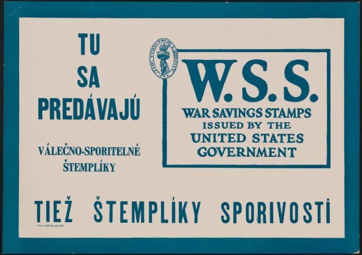
War Savings Stamps, 1917 (images c/o The Museum of the City of New York)
You see the same process of reissuing a poster in multiple languages here in these examples of very simple posters promoting the purchase of War Savings Stamps. As with the previous examples, these posters were addressing the immigrant at home in their new country, telling them how best to serve America and be American by assisting in the war effort. War Savings Stamps, issued by the U.S. Treasury starting in 1917 (the date of these posters), were different from Liberty Bonds or Postal Savings Stamps in that they were aimed almost exclusively at the common citizen. The resulting funds reached just under a billion dollars.
This poster series is currently in the collection of the Museum of the City of New York, so, like the Food Will Win the War series, it’s safe to presume they were focused on an urban New York audience. The text is, starting in the upper left and going clockwise, in Yiddish, Greek, Slovak, and Italian. Below, you will see four more in Polish, Chinese, Hungarian, and Japanese.
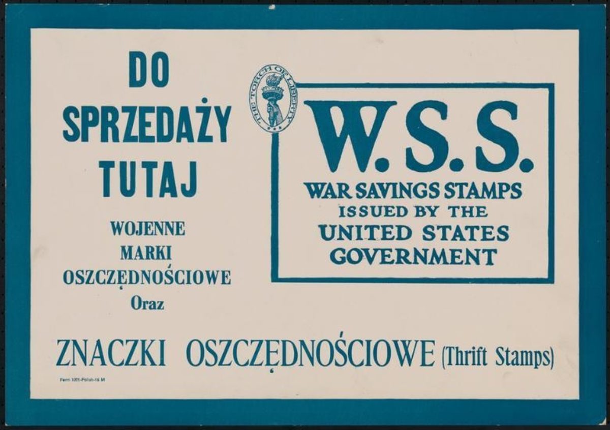
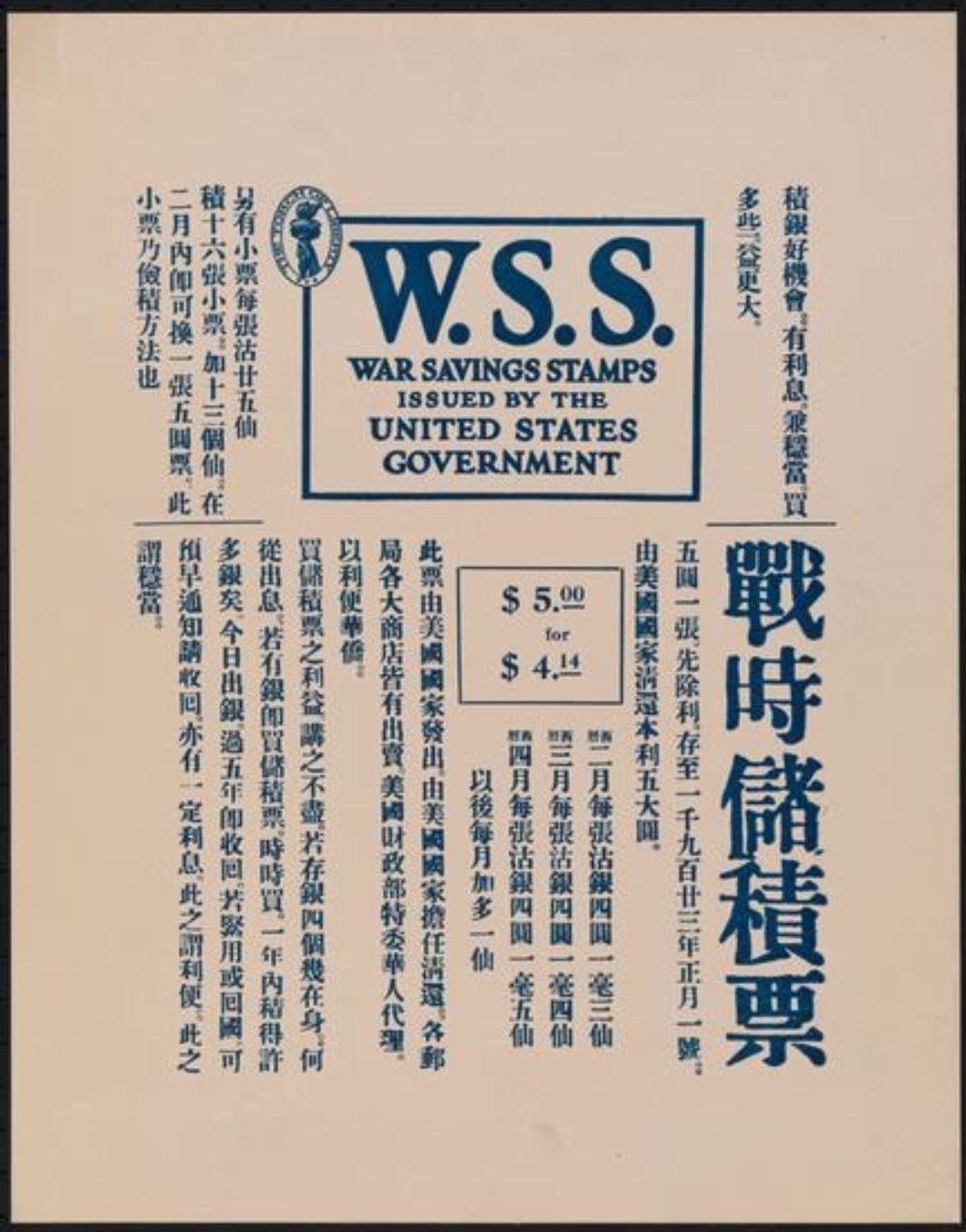
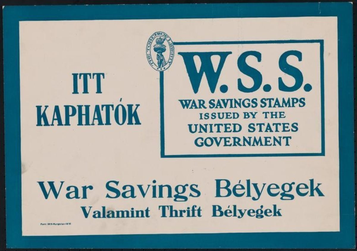
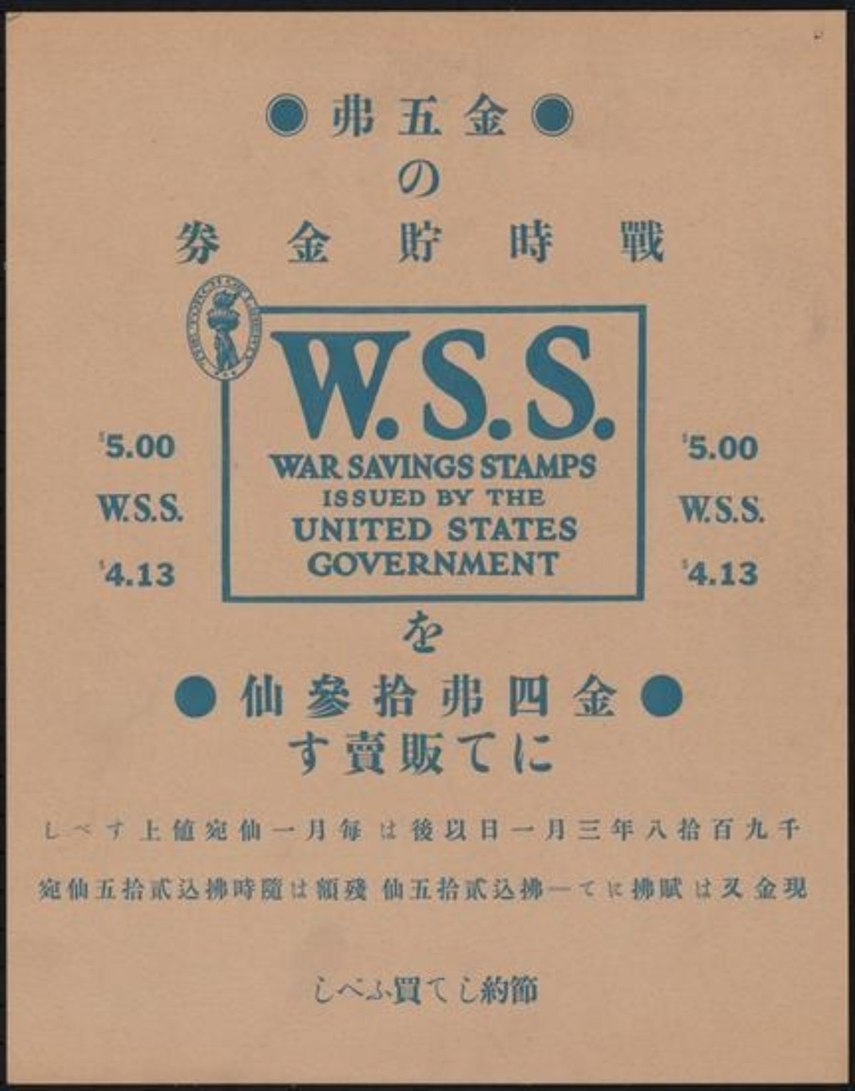
War Savings Stamps, 1917 (images c/o The Museum of the City of New York)
I find the Chinese version of this poster set especially interesting given that the Chinese Exclusion Act of 1882 – the first major law restricting immigration into the United States —had been renewed twice since its inception, with Chinese immigration being mandated as completely illegal in 1902. As such, Chinese people would not even be allowed to be considered for citizenship until 1943. My general theory (completely unproven, mind you) is that the Exclusion Act was more harshly felt on the West Coast, and these posters, being presumably for New Yorkers, potentially had less irony in their execution. That said, they are still asking for monetary support from people who were not necessarily feeling very welcome on their soil, and the desire to feel included, to feel like they belong, would probably have spurred participation by some Chinese immigrants.
It’s worth noting that in 1917, a second major immigration law was passed in the United States – simply titled the Immigration Act of 1917. In addition to turning away anyone of Asian origin (which further calls into question both the Chinese and Japanese posters seen above), it also required a literacy test be issued for anyone over 16 seeking entry into the U.S. While you only had to be able to read in you native language, this does help explain why so many posters at this time were issued in numerous languages—the assumption was that even if you couldn’t read English while you were in America, you certainly could read in your native tongue.
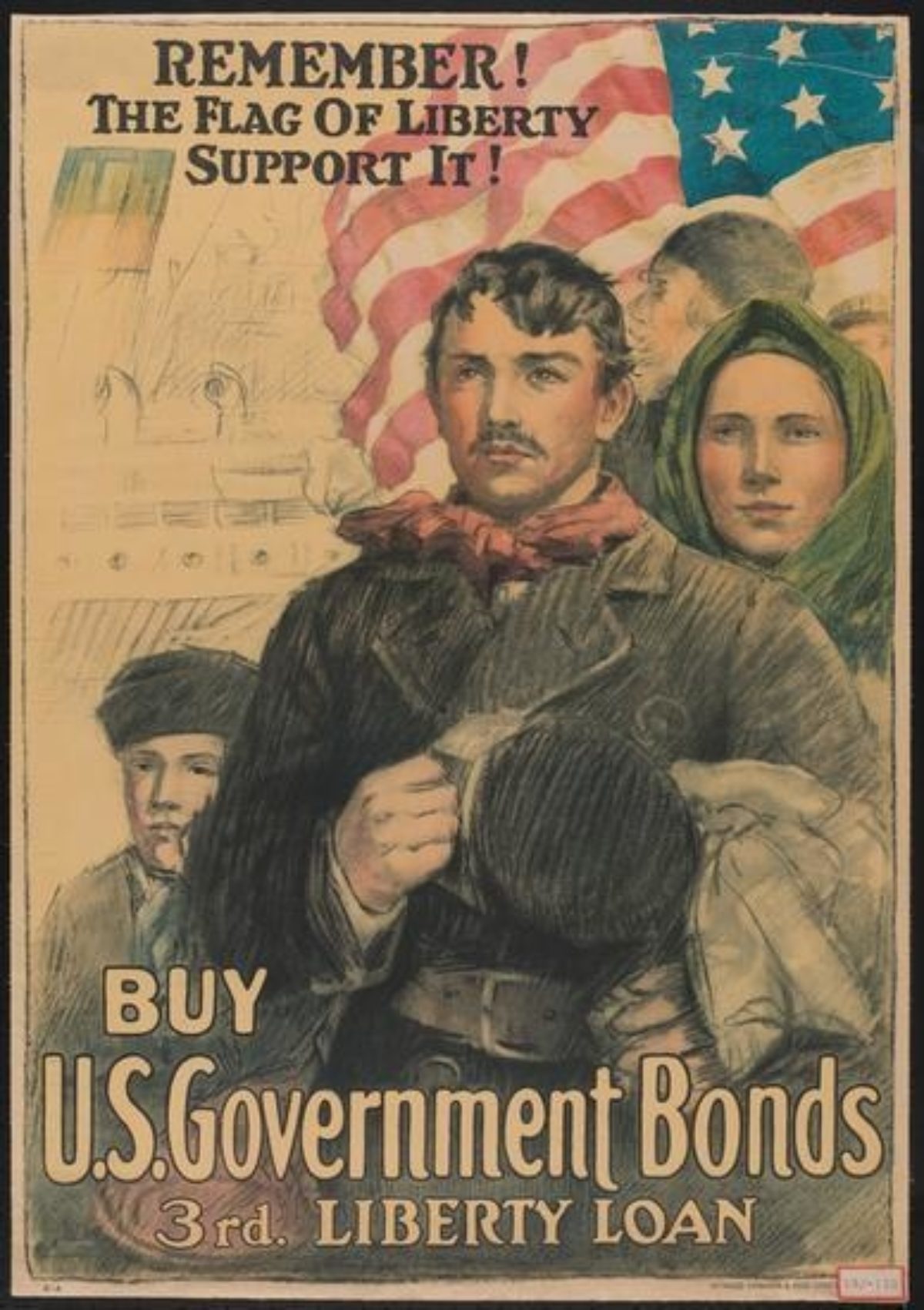
Left: U.S. Government Bonds by an Unknown Artist, ca. 1917 (image c/o The Museum of the City of New York)
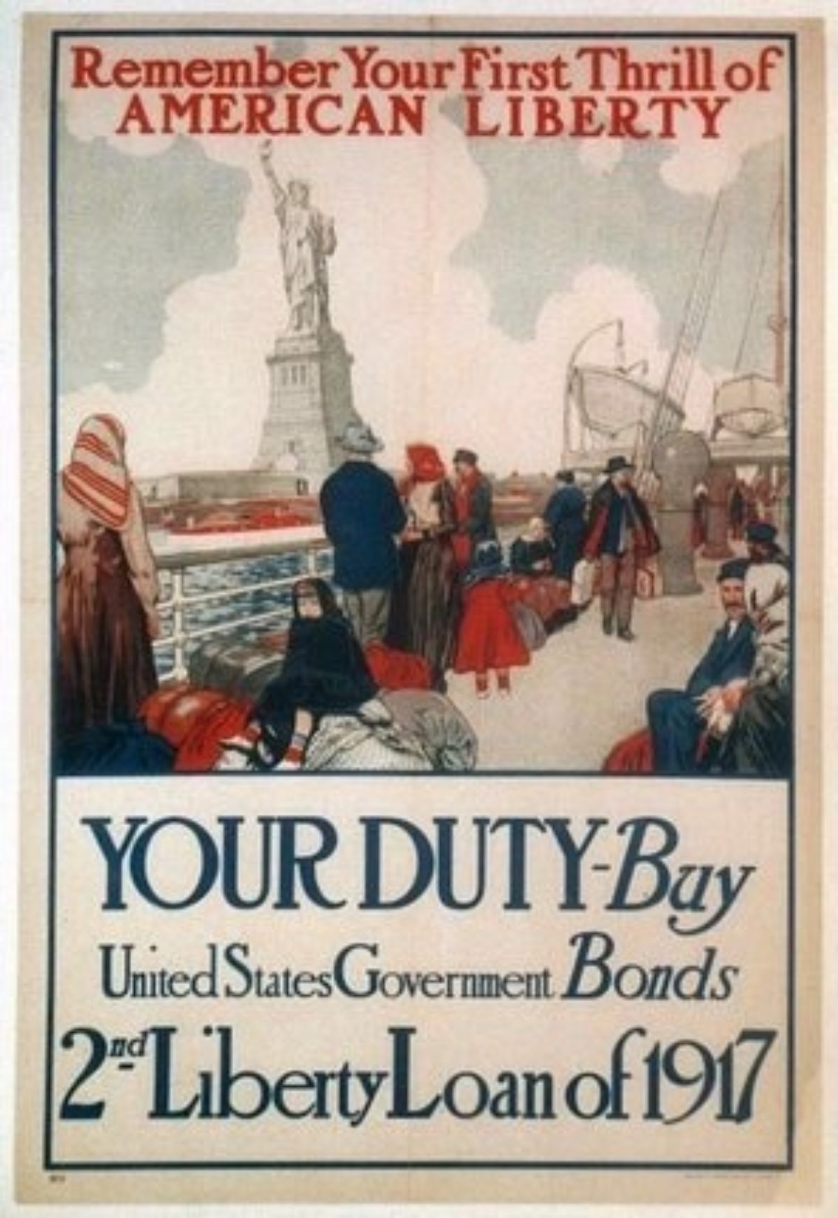
Right: Your Duty by an Unknown Artist, 1917 (image c/o Chisholm-Larsson Gallery)
That said, learning English was still a priority for most new American citizens, as a means of feeling like they belonged and that they were truly embracing their new home. Therefore, dozens of posters like these exist in which the advertiser—in this case the government—calls upon the newcomer’s memory of arriving in the United States—the “thrill of American Liberty;” the “flag of—and encourages them to repay that freedom, that thrill, by giving back and purchasing War Bonds. And, if that was too subtle for you, posters like the one below were also issued, making it quite clear that you were expected to prove your loyalty by participating in the war effort.
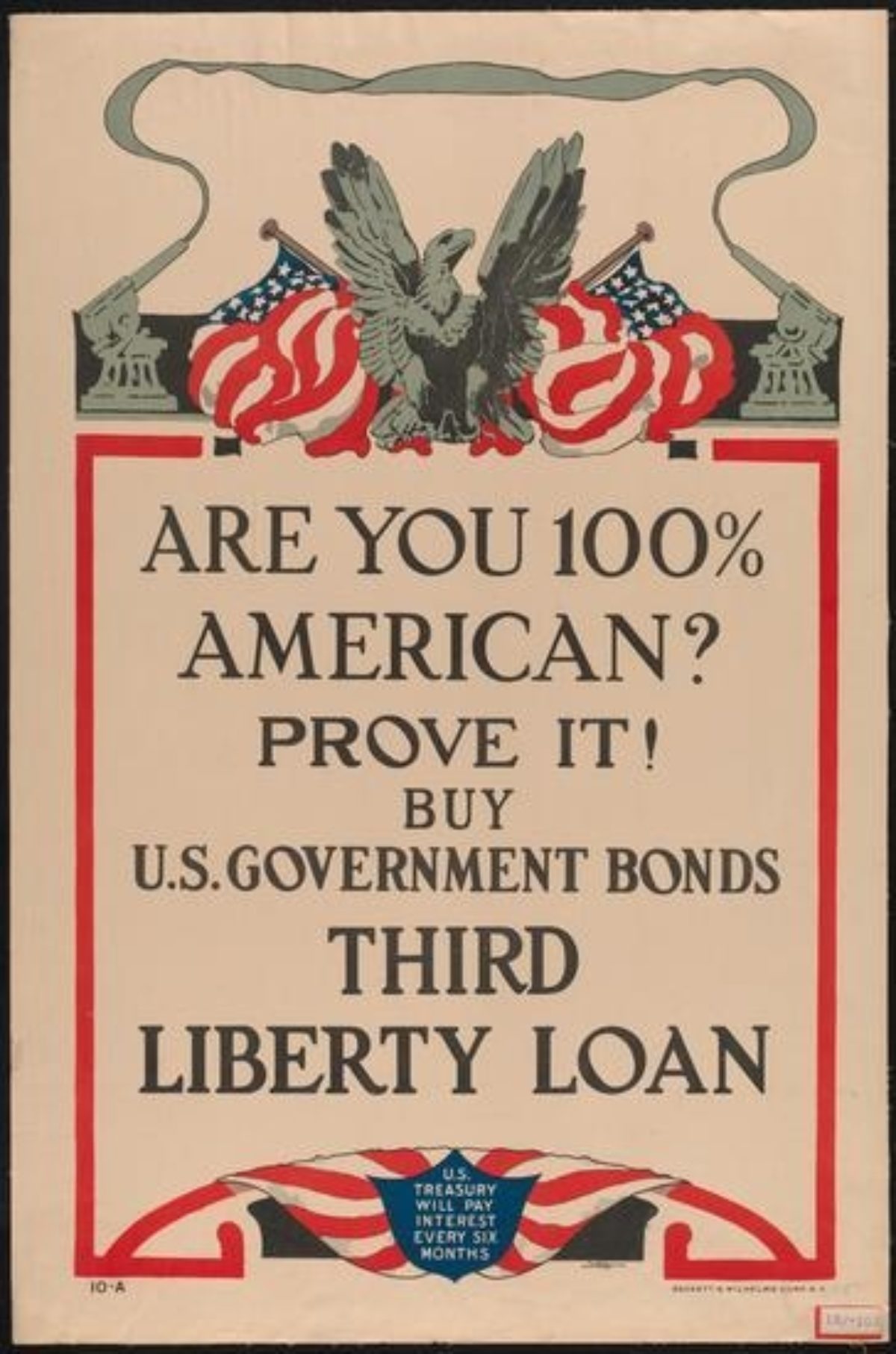
Are You 100% American? by an Unknown Artist, 1918 (image c/o The Museum of the City of New York)
Not all posters, however, had this shadow of a threat or a need to prove oneself intrinsic to their design. This poster (shown below) from 1917, uses the Fourth of July holiday to emphasize that we are a nation of many peoples, unified through citizenship. The text reads “Make it a day of welcome to all foreign-born citizens and an invitation to all residents to become citizens. Make our 13,000,000 immigrants feel that they are a part of and have a share in American institutions. Do your part by attending the Citizen’s Celebration on July 4th. Pledge allegiance to your Flag anew by helping others to become Americans First and keep it up.” Behind the figure of Uncle Sam and a worker are labeled images of home, school, and Citizen Papers, which further emphasize the American promise of opportunity for education, work, and land ownership.
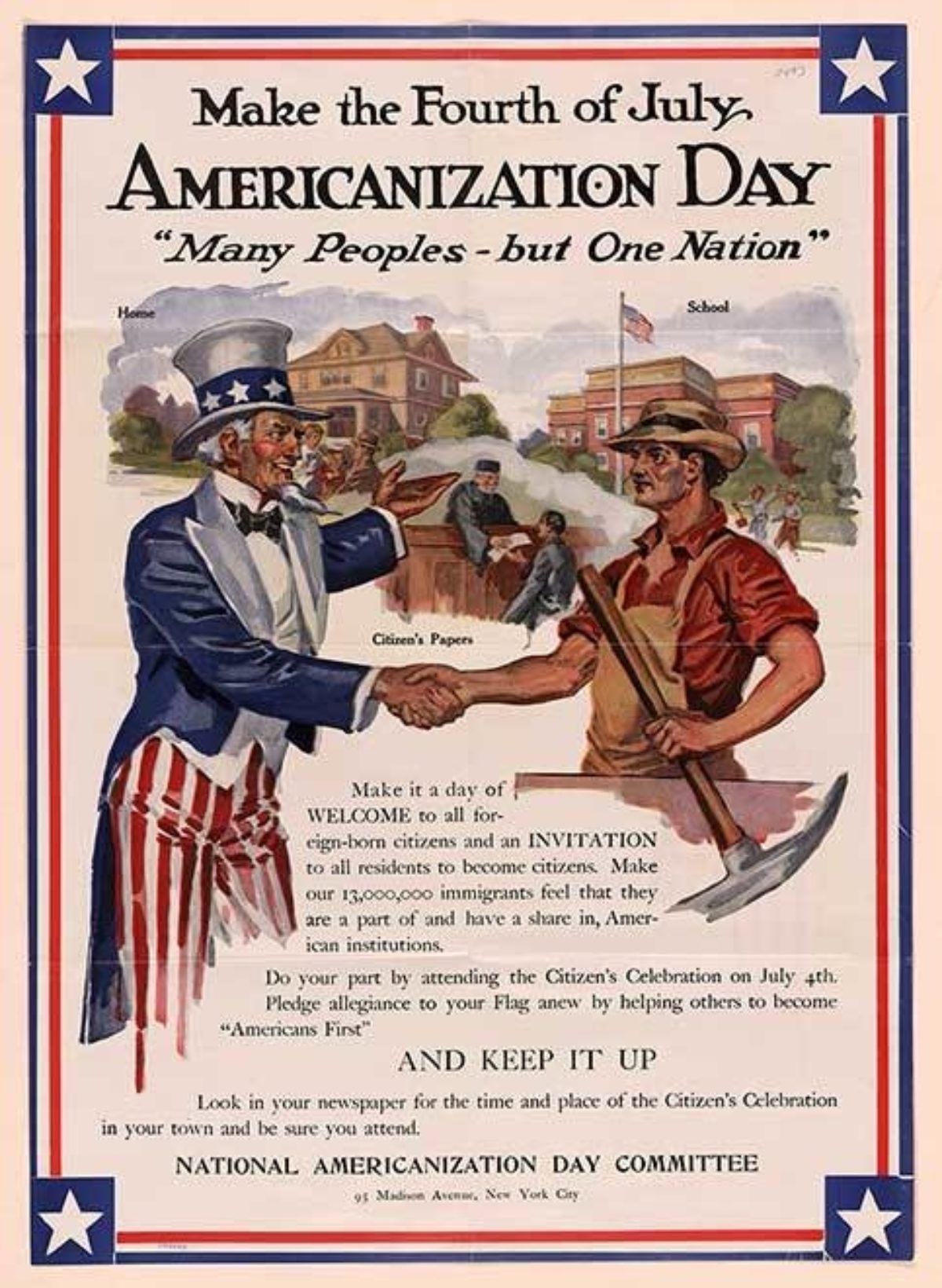
Left: Americanization Day by an Unknown Artist, ca. 1917 (image c/o The Library of Congress)
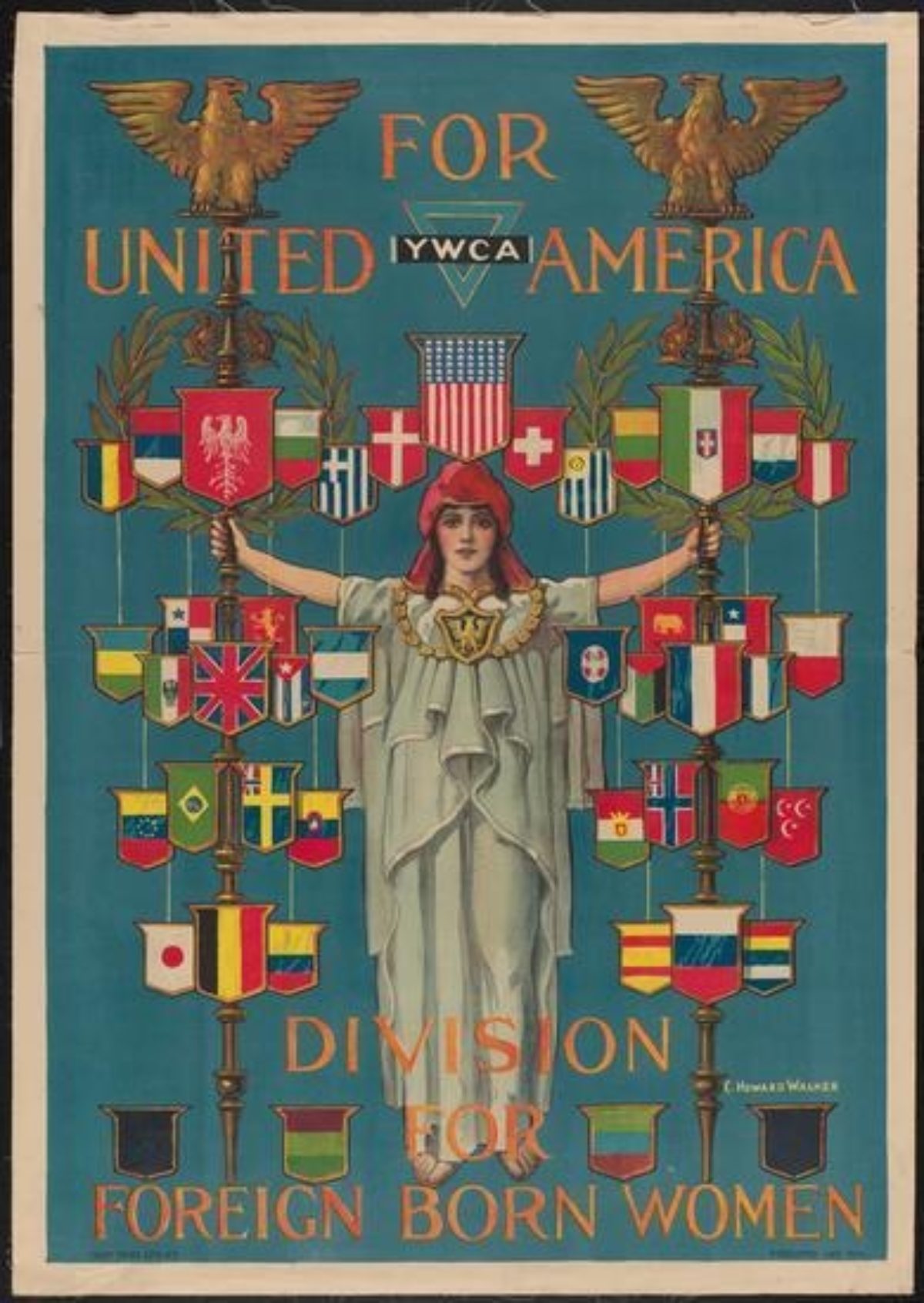
Right: YWCA by Charles Howard Walker, 1919 (image c/o The Museum of the City of New York)
Meanwhile, in the above right, we have a poster for the YWCA’S Division for Foreign Born Women, in which heraldic shields sporting every imaginable country’s flags are being held up by the mythical figure of Columbia, a symbol of America.
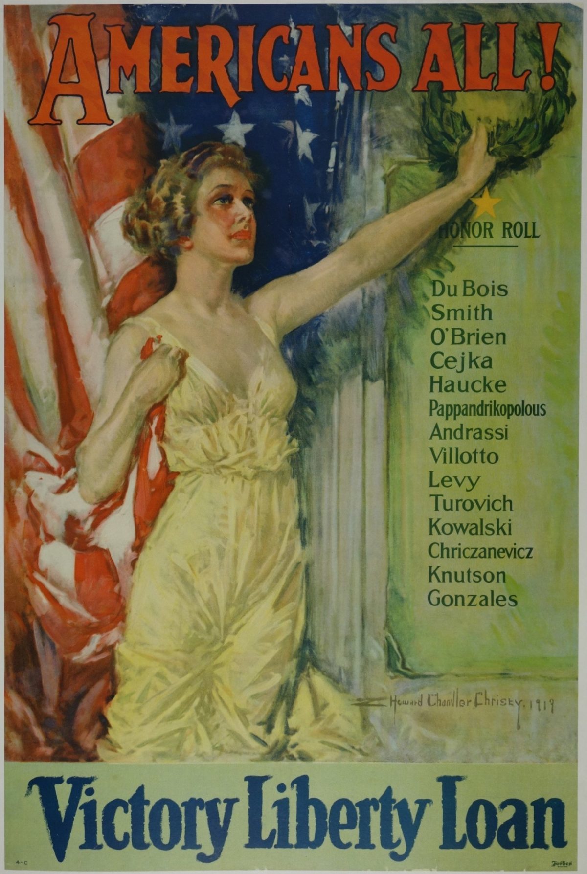
American All by Howard Chandler Christy, 1919 (image c/o Poster Museum)
This sentiment of unity within diversity also appeared in numerous posters speaking to the actions of soldiers abroad. This is one of my favorite posters from World War I, a design by the famous Howard Chandler Christy from 1919. Here, Columbia is holding a laurel wreath over an “Honor Roll” of names, noted above as being “Americans All!” What we may miss today is that all of these names would have been recognized as especially ethnic, including men from France, Ireland, Poland, Greece, Italy, Spain, and many other European countries. All in all, over half a million servicemen in America during World War I had been born abroad.
Such a focus on inclusion was felt all the way up to the highest government level, as Theodor Roosevelt stated in his Hippodrome Speech of 1919, “In the first place, we should insist that if the immigrant who comes here in good faith becomes an American and assimilates himself to us he shall be treated on the exact equality with everyone else, for it is an outrange to discriminate against any such man because of his creed or birthplace or origin.”
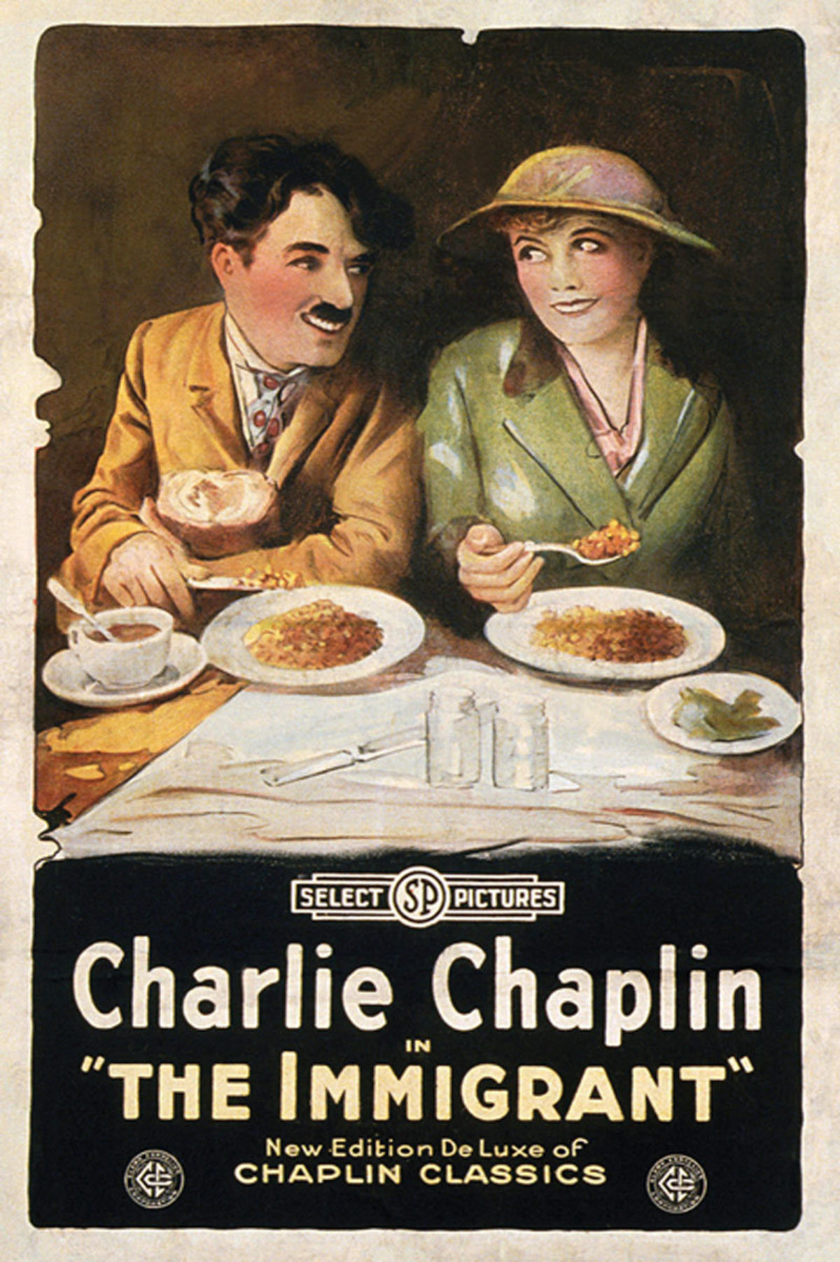
The Immigrant by an Unknown Artist, 1917 (image c/o MoviePoster.com)
This emphasis on unity and inclusion was also being echoed in Hollywood, as in 1917, Charlie Chaplin would come out with his aptly titled film The Immigrant. Chaplin himself, as we know, was born in England but superstar status in America, and his treatment of the immigrant experience in this film is full of pathos in addition to his signature comedic style. Looking at the poster for this film in combination with the few we’ve just explored, you can see that the humanization of The Other was really happening. In a few short years, we’ve gone from proving oneself as American to being the fabric of America.
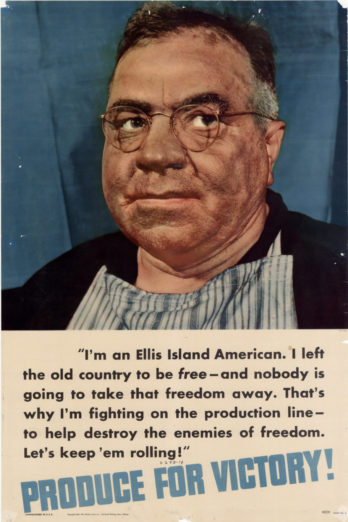
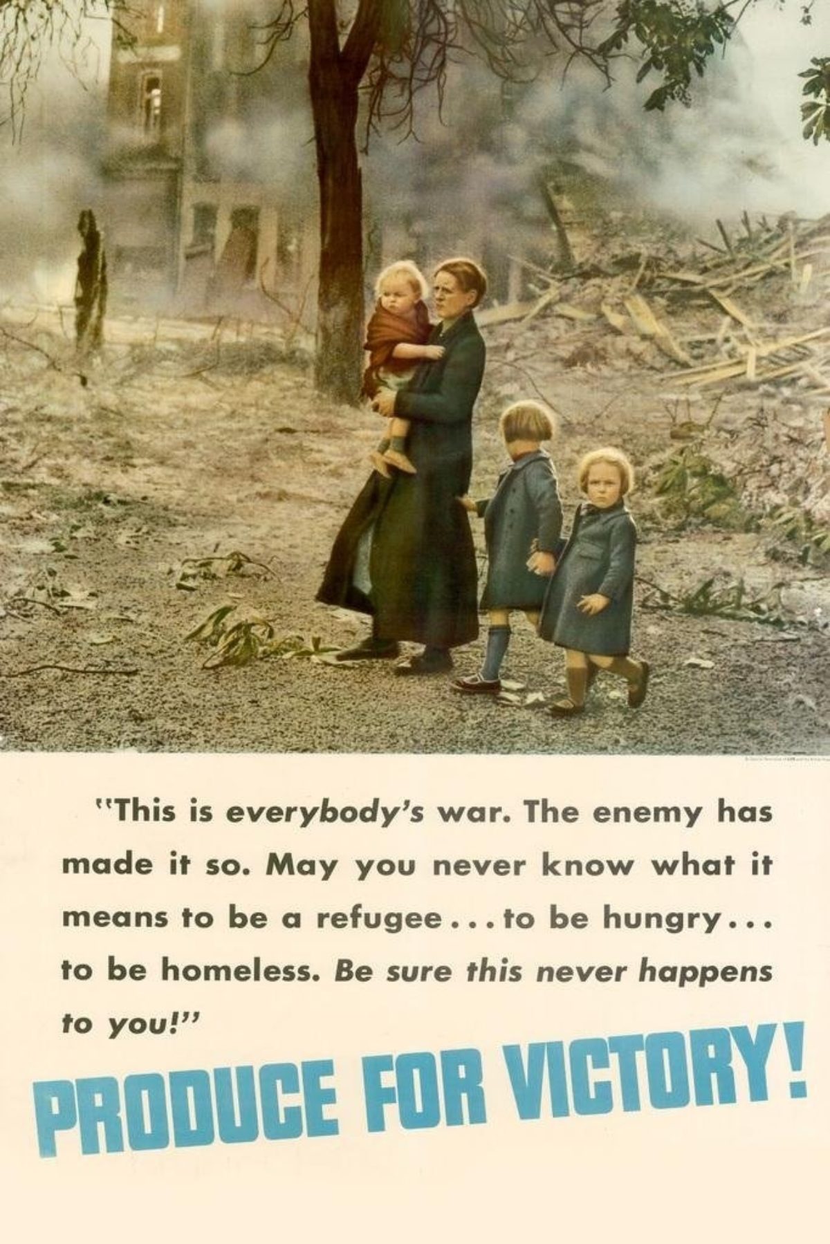
Left: Produce for Victory by an Unknown Artist, 1942 (image c/o The University of North Texas)
Right: Produce for Victory by an Unknown Artist, 1942 (image c/o Amazon)
We’re going to move forward a few years here and look at posters from the World War II era. At this point, millions of U.S. citizens are the children of immigrants or have been in the country so long that there is no doubt about their belonging. They have made lives, started businesses, voted, contributed. This Produce for Victory series includes over a dozen posters, but I am especially drawn to these two. On the left, we see a man who describes himself as “an Ellis Island American.” He goes on to say that he “left the old country to be free—and nobody is going to take that freedom away.” It’s a smart series because in this poster it calls on the immigrant’s memory of having to leave their birthplace for a better life, a life of freedom, and that the “bad guys” abroad are now threatening their current home, their current way of life. Whatever hardships they faced back in Europe are made to seem all too real once again, and therefore he, like all other Americans, are working together to produce whatever they can in support of the War Effort.
The poster on the right is equally evocative, showing a mother and children against a bomb-ravaged landscape. The line “may you never know what it means to be a refugee” would have spoken ten times more powerfully to the millions of Americans who at one point in time were refugees. So, while the posters are clearly meant for a general American audience, they’re doubly meant for anyone who had to leave their country to become American.
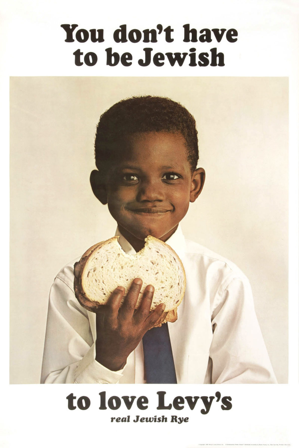
Levy’s by DDB, 1961 (image c/o Fonts In Use)
I’m going to jump ahead again here to the post-war period, specifically the early-to-mid-1960s, once again in New York City. In 1965, the Hart-Celler Act ended the mandate that favored European immigrants over those from other countries. Now, people from Latin America and Asia were able to emigrate to the United States more easily, spawning a new way of looking at a target advertising audience.
Product advertising up until this time was both incredibly white and incredibly WASPy. If you wanted to sell a product to a certain subset of citizens, you went to an ethnic agency—and ethnic products were not generally consumed by people outside of that group. Doyle Dane Berbach, better known as the ad agency DDB, was approached by Levy’s Rye to create a poster campaign. The brand up until that point was pretty much solely sold in Brooklyn to Jews. When other ethnic companies had tried to expand their audience previously, the typical method was to erase the signifiers of that ethnicity – to make it plain, inoffensive, nondescript, white and WASPy. DDB had the brilliant idea of celebrating that diversity instead, and ended up creating the first poster campaign which capitalized on the broad appeal of an ethnic product. You don’t have to be Jewish to love Levy’s. You really don’t. It’s that good.
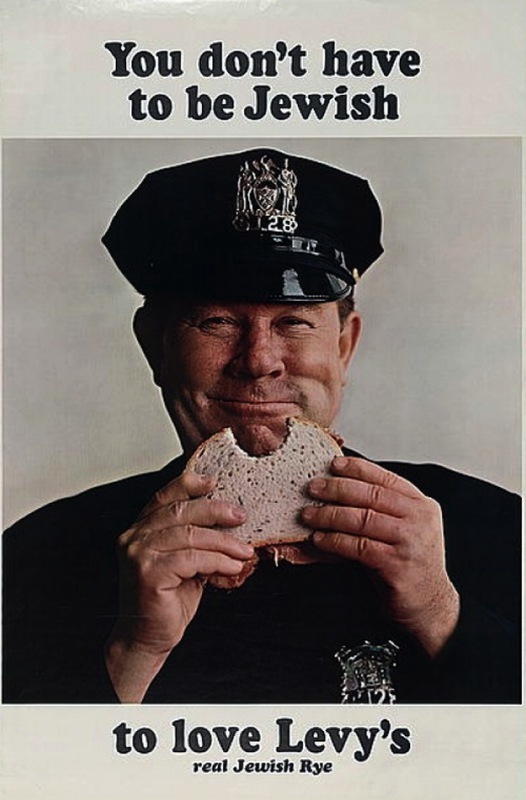
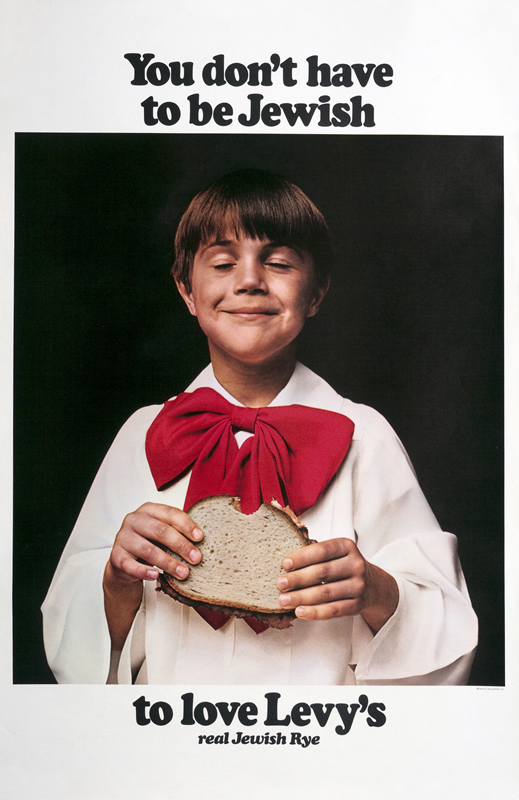
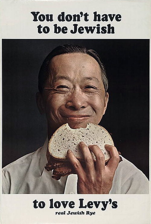
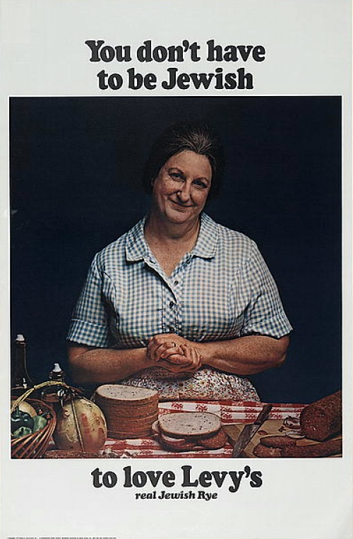
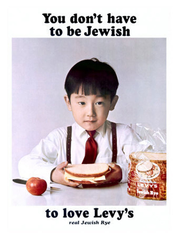
While the African American boy is the most famous from the series, a whole slew of characters emerged—a Chinese man, an Irish cop, an Italian mama, a Japanese boy, a Catholic choirboy. The campaign itself played up America’s diversity through its immigrants to help sell an immigrant product. Our similarities became the defining factor of the campaign—and our love of sandwiches. The posters also became so popular that they received national attention and were sold within a few years as posters for decor. I was in Houston, Texas a few years ago, and a local deli there hangs the series on its walls.
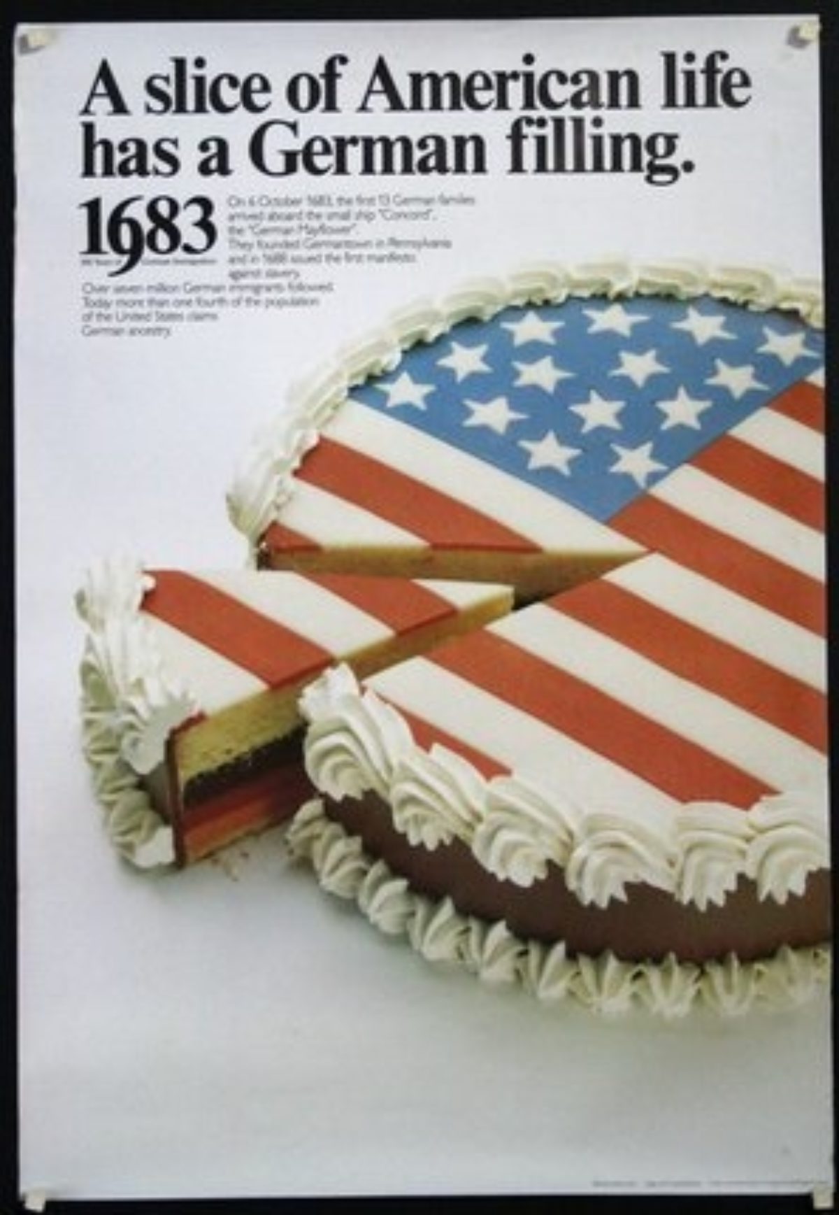
A Slice of American Life by an Unknown Artist, 1983 (image c/o Chisholm-Larsson Gallery)
The Levy’s campaign may have been the watershed moment for advertising outside of a narrow cultural barrier, because within a few more years, celebrating one’s heritage became just as important as being American. The hyphenated American was now not only a normal thing, but a point of pride (i.e. Irish-American, Chinese-American, etc). Rarely do we even say today that we’re just American. That trend started around this time. So, by the time we hit the 1980s, we’re getting posters like the one above, reminding us all that more Germans emigrated to this country than any other nationality, and that’s apparently something worth celebrating.
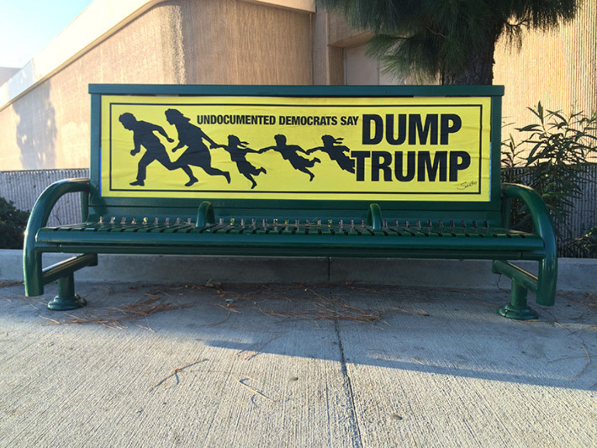
Dump Trump by Sabo, ca. 2017 (image c/o the artist’s website)
In the last few decades, as we know, immigration has become a heated topic to say the least. Racially-charged and xenophobic posters have popped up across the country, tearing apart the fabric which made America a prosperous and progressive nation for so long. There isn’t much in the way of “good graphic design” that supports this agenda; however, the poster artist Sabo in Los Angeles is generally considered the most polished artist speaking out against immigration. Here you see a poster he created in situ saying only undocumented Democrats are anti-Trump.
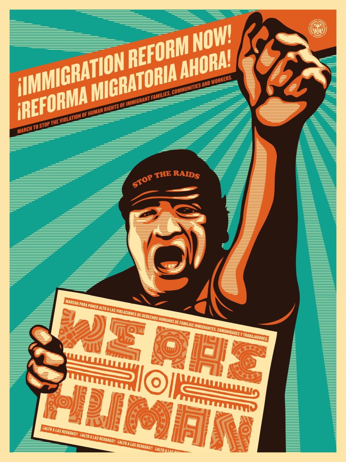
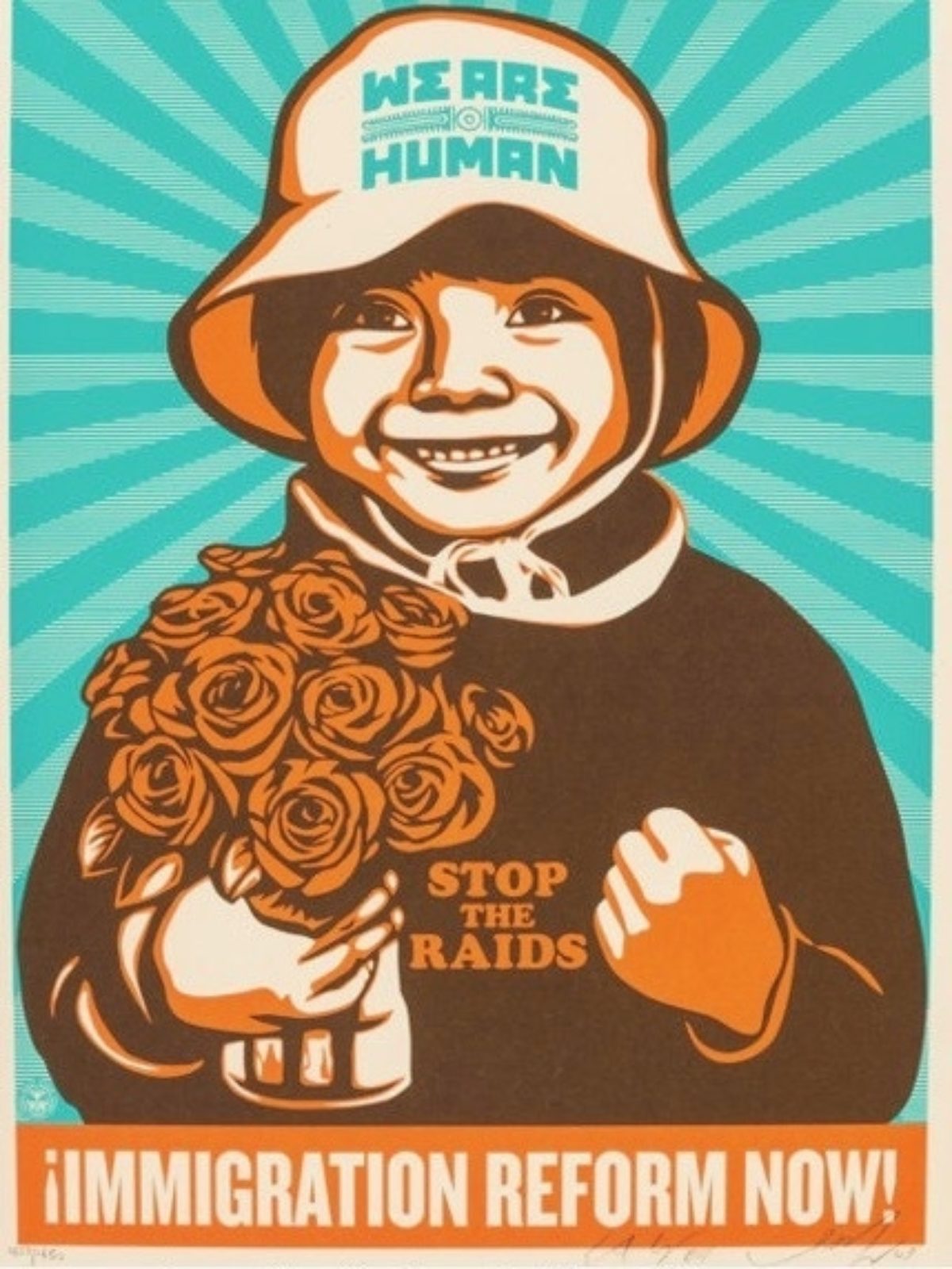
Posters by Ernesto Yerena & Shepard Fairey, ca. 2018 (images c/o Amplifier)
I really don’t want to spend an excessive amount of time sharing anti-immigration imagery, so instead I’d like to end this on a more optimistic note. Thousands of artists are currently creating posters speaking about the immigrant experience, both good and bad, and how they contribute to American society and culture. The most famous of those images are undoubtedly by Shepard Fairey, who here worked with Ernesto Yerena to create these two posters about immigration reform. Note that the one on the right is bilingual, a trend we are seeing more and more in public-facing advertisements and protest posters. A trend that certainly hearkens back to many of the posters I shared with you at the beginning of this article, except this time they are not asking for the immigrant to contribute to a government effort, but instead asking the government and its citizens to recognize the general humanity of immigrants.
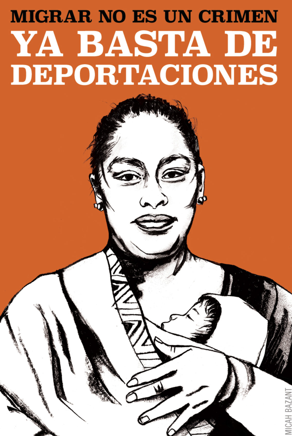
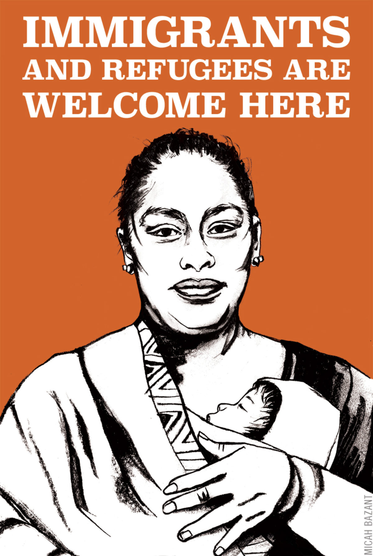
Immigrants Welcome by Micha Bazant, 2017 (images c/o artist’s website)
I’m going to close with this set of posters by Micha Bazant from 2017, not because they are especially graphically interesting or famous, but because they represent a recent movement toward digital posters. Posters like these are created by an artist or group and published in high resolution online, available for download by anyone and everyone. You then take the file to your local Kikos, print it in color or black and white, and have them glue it to poster board—or really, do anything else you want with it. The purpose of posters like this is to reach a truly global audience – anyone with an internet connection can see it, and anyone with access to a printer can print and use it. It can be in the Women’s March in 2017 and then printed freshly for any number of protests, marches, movements, exhibitions, or home decoration – each possible venue or owner proclaiming their love and support of immigrants everywhere.

