What is a poster?
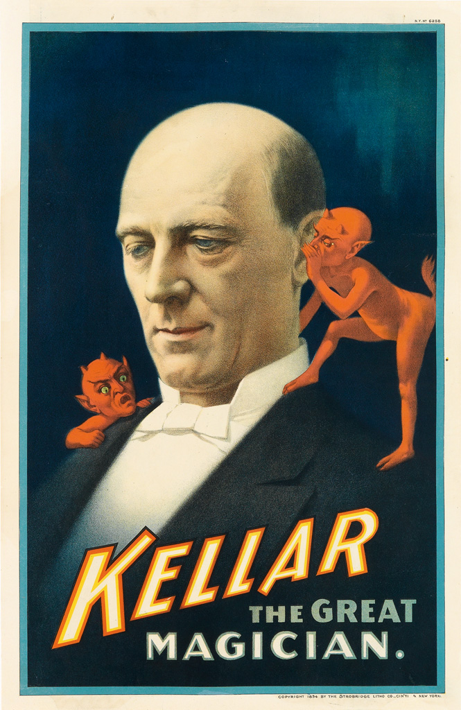
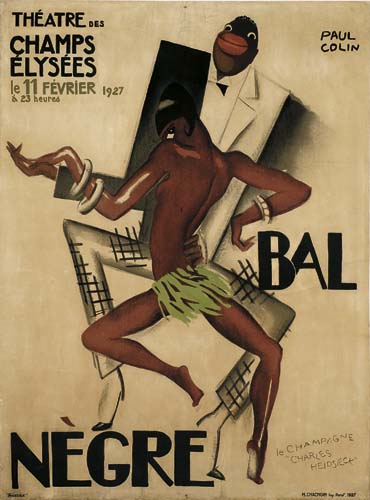
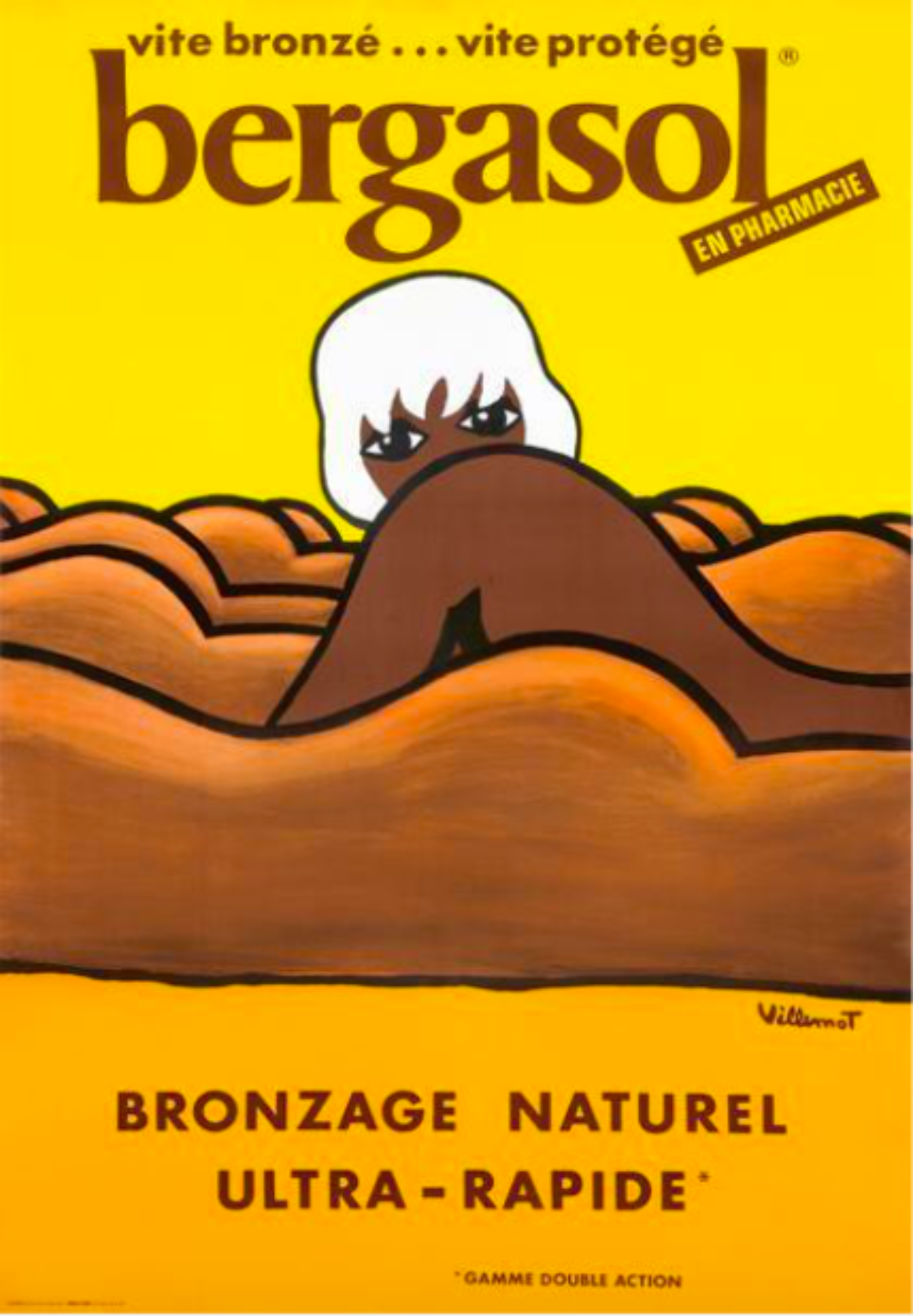
.In today’s world, a poster is many things. It can be a celebrity pinup you tear out of a magazine, an ad you see on the subway, a reproduction of a famous artwork you hang in your dorm room, a promotion for a concert on the side of a building, a notice from the Department of Health showing you how to perform the Heimlich Maneuver in a restaurant, a plea to vote or not vote for a particular candidate—the list is endless. In its most basic form, though, a poster is a temporary promotion of an idea, product, or event put up in a public space for mass consumption.
A poster is not high art. Unlike a painting you see in a museum, a poster isn’t unique—hundreds or thousands of copies of a given image would have been printed and disseminated around a city or country, allowing for tens of thousands of viewers to come in contact with it before it would be destroyed through weather, vandalism, or simply by being covered by the next ad. Unlike the Mona Lisa that has survived hundreds of years, a poster would sometimes only be seen for a few days or even hours before it would disappear, most likely forever. As the height of the poster craze happened in an era before photography, we have very little record of many of the designs created—in fact, the only posters that do survive are parts of the printing run that were never displayed in the first place.
Just like language, there is no definitive origin story of when or where the first poster appeared. There is evidence of signage and poster-like artifacts dating back to Ancient Egypt when a business owner would chisel his profession on the side of his shop or in Ancient Rome when bathhouses and taverns were marked by terracotta slabs featuring text and symbols to indicate what activities took place inside. Even in the ruins of Pompeii, there appear to be signs advertising bordellos—a physical object proving that as long as there has been something to sell or trade, man has found a way to promote it. In the East, rudimentary woodblock printing existed as early a 3000 BC, where swaths of silk would feature decorative images or chunks of theatrical text. These weren’t necessarily posters or signs, but the techniques developed and used would become the foundation of the modern printing industry.
By the 1440s, Guttenberg’s printing press made it easier to replicate handbills to promote an idea, event, or product, resulting in some of the small signs that remain advertising Shakespeare’s shows from the late 1500s. In 1631, Théophraste Renaudot began printing La Gazette, the first weekly newspaper, which, most important to the history of the poster, featured the earliest known personal ads promoting jobs and services available around Paris. Almost 150 years later, in 1786, William Tayler would open the first dedicated advertising agency in London, creating a network of small, regional newspaper printers with those eager to advertise to their specific communities.
All of these examples, however, are limited. Newspapers cost money, and were clearly geared toward an upper class, literate, male audience. Handbills could only reach those who passed by a given distributor, and, again, had to be read to be effective. Even with a printing press, reproducing the small posters and notices of the day was costly and time consuming – and there are only so many pages of text nailed to a board that a single person could realistically stop and read. They weren’t eye-catching – in fact, they pretty much looked all the same. From three feet away, an ad for a play would be virtually indistinguishable from one for a tailor.
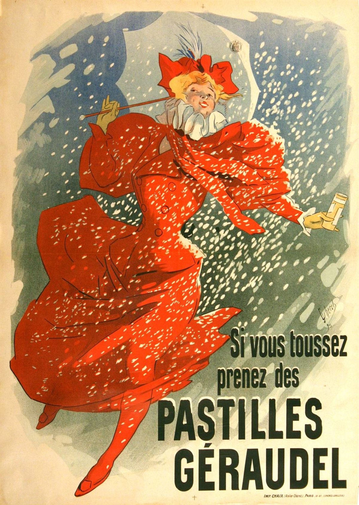
The real game changer was the birth of color lithography (more specifically, chromolithography) that rose to prominence in the late 1870s. While variations of this technique were being used around the world at the time, Jules Chéret is credited with being the first artisan to really see its potential in the world of advertising – hence, his nickname: The Father of the Poster.
Creating over 1,000 posters in his lifetime, Chéret enchanted the citizens of Paris with bubbly pastel designs promoting everything from cabaret shows to bicycles. His images would literally cover every available public wall, making the streets a veritable art gallery. A cat who appeared in his design for Dubonnet became an overnight celebrity (take that Marnie the Instagram dog!), and the effervescent women (particularly a redhead in a yellow dress) who populated his images were dubbed “Chérettes”—a new cult-like beauty icon for the female population to emulate.
Suddenly, advertisements were geared toward everyone. They were the great cultural unifier – bright images competed with each other to grab the attention of passersby regardless of class, education, or gender. A visual language developed featuring iconic characters and situations. The concepts of selling through sex, humor, and fear were born—and the public loved it.
Around the same time that Chéret was at the height of his popularity, Toulouse-Lautrec was commissioned to create his first—and most famous—poster: a three-sheet masterpiece promoting the Moulin Rouge. While today his posters are more prized and fetch higher prices than pretty much any other poster artist on the market, at the time his work was considered grotesque, obscure, and geared toward the seedy underbelly of Montmartre’s deviant residents. His work was the exact opposite of Chéret’s: dark, mischievous, perverse, even cruel – showcasing lesbian prostitutes splayed out before their patrons or men being hanged to death in the streets.
While all of this is happening, the Parisian economy is exploding with post-Industrial Revolution middle class money. This relatively new societal group is benefitting more than anyone else from mass production, acquiring everything these posters are advertising at record speed. Perhaps most importantly to us, though, is not that they’re buying the products, but that they’re also taking an interest in the art used in the ads themselves. Paintings are still a fairly expensive investment for any household, but lithographs aren’t that costly to make or buy, and yet they hold a comparable decorative value.
Print dealers were already capitalizing on the overwhelming interest in “affordable” art when Chéret’s posters hit the scene. Merchants like Edmond Sagot, however, recognized that the poster was the logical extension of the print, and began offering special copies of famous poster designs in his gallery as early as 1881. The public ate it up, and soon demand was so great that traveling exhibitions were arranged and poster collecting clubs formed. Every month, print dealers would clamor to get the overruns or additional printings of the best posters they could find, forming relationships with artists and printers that would last well into the 20th century. Those who subscribed to their club would receive an assortment of these designs, to be kept flat in print drawers in their homes. This is why you see a lot of long skinny drawers in antique cabinets from late the 1800s—furniture was literally being made and altered to better house posters.
Fun Fact: I mentioned earlier that Lautrec’s Moulin Rouge is a three-sheet design. The third sheet is seldom found today because it was too long for a standard print drawer when attached to its other sheets—and, as it is just text, most collectors just threw it out instead of saving it because it held no decorative value. Today, a copy of the Moulin Rouge featuring the original third sheet can run as high as half a million dollars.
In addition to the regular posters that print dealers took for their shops, some artists created versions of their designs without text to better attract regular print collectors. This variant on the original image is called the “before letters” version. It is not necessarily more or less valuable than the advertisement with text—it simply appeals to a different buyer. The truly rare state of these compositions comes with a remarque—a little caricature doodled by the artist on special printings of the poster meant for close friends or important collectors. While many artists included remarques on certain posters, Lautrec is best known for making the gesture legendary in the medium, incorporating writhing snakes and miniature elephants on some of these printings.
Many of the posters that survive today also have tax stamps on them. These were placed on posters once their advertising tax was paid to the city, allowing them to be pasted on a wall by a billposter. This means that any poster featuring a tax stamp was not obtained through a collector’s club or print dealer, but rather through someone who either paid off a billposter or simply stole one from his pile in the middle of the night. Like having the poster before-letters, this doesn’t necessarily add to or detract from the value of an image, but rather brings to it another layer of history.
Of course, with this history brings the question: is the poster a work of art or an artifact? Where does it sit on the spectrum between art and design? The first answer is yes to both. As I mentioned at the begging of this entry, the poster is not high art. It was never meant to be housed in a museum or even held onto for posterity. Its intent is every bit as ephemeral and purposeful as today’s television commercials. And yet, the greatest poster artists managed to stretch the medium beyond the realm of mere advertising, creating images as beautiful as Manet’s Olympia or Monet’s Water Lilies. These designers brought the essence of fine art to the streets, removing its exclusivity and its privilege. At the same time, posters serve as artifacts of their eras, bringing light to how people consumed their culture and the products made to serve it. I once saw a poster advertising velvet-cushioned balcony armrests – literally a product made to make it more comfortable for you to spy on your neighbors, a totally acceptable and normal hobby in 1901.
Posters are also not art for art’s sake. They have a specific purpose dictated by the client, and therefore sit within the realm of design. Where art presents beauty or challenges the viewer to think differently, posters use images to produce a clear reaction that gets its audience to buy/embrace/attend the product being shown in said image. There is a specific action, usually associated with commerce, that is intended behind every poster. Manet’s Olympia doesn’t do that. And while great posters can be appreciated for their artful beauty – and are even occasionally made by mainstream artists like Lautrec – they are more than just art. They are methods of simple communication, able to be understood and digested quickly by the broadest possible audience. If the poster falls short of expressing this idea, then no amount of beauty will make it a good poster – it fails if it’s too complicated or confusing.
As such, posters fit in that tricky liminal space between art and design, art and artifact. They shed a light on a specific moment in time, showcasing the values and interests of that culture through an aesthetically pleasant lens. Distance from that era and the surge in their market value may cause a contemporary audience to place them under the umbrella of fine art; however, we should never separate their aesthetic value from their original intent. The poster is the art of the street, the people’s art, and the art of commerce.


